|
|
|
Brendan Mudd
{K:431} 1/5/2006
|
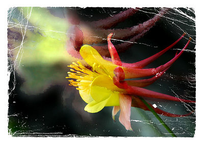
Hi Jude, thanks for your comments!! My last comment was not designed to force you to look at and comment on my work but it is nice that you have! On this particular piece of work, I agree 100% with your critique. I think you hit the nail on the head. I enjoyed the colour involved, but knew there was something wrong. It surpassed me that the colour was maybe too stark. I will make adjustments and repost and thank you again for your opinion. Regards, Brendan
|
|
|
|
|
jude .
{K:14625} 1/2/2006
|
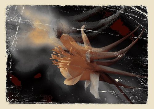
...but *not* as much as Merete did...
sorry...I'm caffeine-challenged this morning, hence typos abound...
|
|
|
|
|
jude .
{K:14625} 1/2/2006
|
I like Merete's version, Brendan, but I also like your original...something in the conflicting newness/bright hues versus the old/worn cracks appeals and intrigues. My suggestion would be to try desaturating the hues just a tad...push them just a bit more into the background, but as much as Merete did. Maybe add a hint of noise...
Still, I like this as is.
|
|
|
|
|
Brendan Mudd
{K:431} 12/3/2005
|
Hi Merete, only me again!! Ive submitted another couple of flowery pictures that I would love your opinion on. Please dont feel hassled to do this.....only if you have the time.
Many thanks Merete
|
|
|
|
|
Brendan Mudd
{K:431} 11/7/2005
|
Hi Merete, many thanks for your critique on my "painterly effect" attempt. I agree with your changes. It definitely "belongs" more on the frame. Being inspired by your comment I attempted another! The frame is wrong i think with this one.
Thank you again,
Brendan
|
|
|
|
|
Merete Westerdahl
{K:11079} 11/7/2005
|
Hi...  ) I think you did a very good job here...the only thing that I'll mention is that the effect..the cracks...don't fit the colourpicture. I have tried to changed it into sepia-toning..I think it sooths it much better. ) I think you did a very good job here...the only thing that I'll mention is that the effect..the cracks...don't fit the colourpicture. I have tried to changed it into sepia-toning..I think it sooths it much better.
Let them come.. ;o)
Kind regards
Merete
|

|
|