|
|
 Angelo Villaschi
{K:49617} 8/10/2005
|
Lauri,
Not yet ;)
|
|
|
|
|
Laurie Gould
{K:11942} 8/10/2005
|
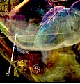
I love the texture of this petal and your choice of background is perfect. I hope this is hanging on your wall. :)
|
|
|
|
|
Darlene Boucher
{K:15739} 8/5/2005
|
Incredible red color against that white background, great macro and image Angelo! Very well done (as usual!)
|
|
|
|
 Angelo Villaschi
{K:49617} 8/4/2005
|
Barry,
Unfortunately... no... :(
The dried petal is gone, too. I'll have to buy some more tulips ;)
|
|
|
|
|
Barry Wakelin
{K:7838} 8/4/2005
|
You've been busy while I was away. This a great little series. I like the stark contrast of colour on white here and the intricate details in the petals are wonderful. It would have been interesting to try different depths of field. Is this something you experimented with?
|
|
|
|
Mary Brown
 {K:71879} 8/4/2005
|
I thought I'd like this without a border, but find I prefer this one with the minimum border. Anyhting larger would dtract from the beautiful petal. You captured the details and colour very well.
Mary
|
|
|
|
 Sun Shine
{K:6225} 8/4/2005
|
Angelo
Maravilha de portfolio o seu!!!!!!!!!!!! e essa já foi direto prás minhas favoritas....Que macro!!!!!!!!
Giselle ( Brasil)
|
|
|
|
|
Chris Spracklen
{K:32552} 8/3/2005
|
I'm not surprised this has had such a lot positive reaction, Angelo!
Excellent floral. Colourful and different! well done!
Best regards, Chris
|
|
|
|
 Michael Kanemoto
{K:22115} 8/3/2005
|
Suggestions?
Keep with the white backgrounds...
this one could use more DOF...
really like the colors.
Excellent composition.
|
|
|
|
 Brenda Guiles
{K:6128} 8/3/2005
|
Now this one again screams "ART"! I love how you took this Petal and made this into a natural abstract! I would prefer a tad more focus on the bottom, I mean the veins in this Petal are very intricate and deserve to be shown in all of its glory! I love this composition, even over number II! Geeze can't decide on a favorite! I think this is my favorite though to be honest, the composition is what does it for me here! MORE.... I wanna see MORE! And don't limit yourself, using this style, I love it. Geeze how many times I have wanted to send a private IM and it just isn't available, send me an email (it's in my profile, I want you to look at an image or two via link!)
|
|
|
|
|
Tiger Lily
{K:10966} 8/3/2005
|
Sorry Angelo it's probably the light going through it which softened it and fooled my eyes. What do you think of having the middle section where the yellow and red intermingle in sharper focus? Just a thought.
Yes, I do appreciate the lovely texture. It's beautiful. You have a good idea going here. :-)
|
|
|
|
 Thilo Bayer
{K:50358} 8/3/2005
|
Hi Angelo,
ah, you're leaving the well-known paths... It's always great to see that photographers change their subject. In this case, I'm probably not the right person to give tips =) I'm just wonderung about the difference in sharpness.
best wishes,
Thilo
|
|
|
|
|
Danny Brannigan
{K:19523} 8/3/2005
|
Angelo I would like to see this along side a sharp version The idea is grat and i'm sure there is a lot of milage in this type of image and I'm also sure it will get good comments .
|
|
|
|
 Gayle's Eclectic Photos
{K:91109} 8/3/2005
|
hi, funny you should say that about the translucent quality with my black as i thought of that "after" i left attachment of course and almost added another comment saying just to ignore it..LOL..because it doesn't make sense to have the black with the translucent petal!...oh well.....i love the boldness of red with black and always makes me think of spanish dancers (my maternal grandfather was from Barcelona)...thanks for reply and i will think twice before leaving attachments which make no sense visually...i do like the translucent quality of yours,tho'
|
|
|
|
 Egidija Smilingiene
{K:3227} 8/3/2005
|
very elegant and something different from other your works :)
|
|
|
|
 Angelo Villaschi
{K:49617} 8/3/2005
|
Thanks, Lily. The focus was on the upper part of the petal, where grooves were formed by the drying process, to form a very nice looking texture. Did you not find it sharp enought?
|
|
|
|
 Angelo Villaschi
{K:49617} 8/3/2005
|
Thanks for the time and effort, Gayle. I appreciate it.
I'm not sure the black works for me. Other than personal preferences against red&black combinations, it seems strange to have a black background and a petal which is semi-translucent showing a white background. It just does not seem to gel.
Maybe I'll try to repeat this set-up but using a black background to begin with. Should be a lot more tricky to light. For this one, I just put it down on white paper and used daylight from a window. To get the translucent feel with a black background I'll have to find som alternate light source or do something clever with angles...
Thanks again for the sugestion, though. Excellent comment. Just the sort of think I wanted.
|
|
|
|
 Angelo Villaschi
{K:49617} 8/3/2005
|
Thanks, Linda.
I hate black & red combinations. Something to do with Brazilian football rivalries... :)
|
|
|
|
Alastair Bell
 {K:29571} 8/3/2005
|
Can't really see much to improve this at all Angelo! Beautiful lines and colours and the details are excellent. The stark white background also works well to create a dramatic imae. Great work!
|
|
|
|
 Robert Kocs
{K:89085} 8/3/2005
|
Amazing macro details and colorful abstraction. I like it! Love the fine details, stirring textures. Great work dear Angelo! Well done!
Best wishes!
Robert
|
|
|
|
|
painsama
{K:4902} 8/3/2005
|
Abstract lines and colors. Very creative. Nice composition.
|
|
|
|
 Linda Imagefree
{K:72276} 8/3/2005
|
Beautiful and creative work Angelo..love the way you cropped this and the composition, the way the yellow portion leads the eye up and the veins in the petal lead the eye around the edges of the petal and back down...and I also love what Gayle did to it, that black looks beautiful against the red...Nice work....:):)Linda
|
|
|
|
 Gayle's Eclectic Photos
{K:91109} 8/3/2005
|
hi, i did a version with a black background and tried to add a bit more clarity just for you to see an alternative version which has more oomph to my eye...i love your composing,but have a prob with pt. of focus and the white BG bothers my vision personally...otherwise,a creative floral!...regards,gayle
|

|
|
|
|
 Burak Tanriover
{K:16610} 8/2/2005
|
very well composed,I like the colors a lot.
I am not sure about the white color of the background but I think there is not too much alternative.
best regards
|
|
|
|
 Jeanette Hägglund
{K:59855} 8/2/2005
|
Like a dress - a dance - the fabric - or the veins!!! Beautiful and romantic!
Jeanette
|
|
|
|
 Ameed El-Ghoul
{K:42215} 8/2/2005
|
Ahh, this is closer to my taste my friend, the DOF is perfect, the composition, and the cropping, it is just wonderful,
Btw .. I like it both ways, with and without frame, very well done, Cheers,
|
|
|
|
 György Szönyi
{K:10011} 8/2/2005
|
This is my favourite between the two petals. Excellent composition, great colors and technical quality, has a special eery character. Congrats, Gyorgy
|
|
|
|
|
Tiger Lily
{K:10966} 8/2/2005
|
The crop I love, I love. It's great. But my eyes are looking for a focused spot or even the entire petal being in focus. I love the texture and frame.
|
|
|
|
 Roger Williams
 {K:86139} 8/2/2005
|
Who could object to such a minimalist frame? You're right, of course; it does need this. I even have a couple of this type of frame myself... didn't think of them as "frames," though, and of course they're not in the normal Usefilm sense of the word! Lovely colour and texture in this BTW.
|
|
|
|
 Petal Wijnen
 {K:50989} 8/2/2005
|
I'm truly honored and almost as red as... me... LOL!!! Wonderful different shot!!! Great idea!!! Beautiful colors, super textures and I love the transluscentness of it, very nice composition... well done, indeed very creative!!!! The only thing... maybe a tad more DOF, but I'm not sure, the shallow DOF kind of adds to the overall 'feel'... vulnerable...
|
|
|
|
|
Carolyn Wiesbrock
{K:14051} 8/2/2005
|
Wonderful translucence in the petal of this beautiful flower. Excellent detail showing the texture. No improvement that I can see except for a little more depth of field.
Refreshing and beautiful, Angelo!
|
|
|
|
|
joanna ewa
{K:8061} 8/2/2005
|
good idea... different pose:)
|
|
|
|
|
Roberto Okamura
{K:22851} 8/2/2005
|
Excelente macro Angelo!
Lindos detalhes, cores e textura da pétala!
Parabéns!
Roberto.
|
|
|
|
|
Chris Nichols
{K:7068} 8/2/2005
|
Outstanding macro/abstract! Should be blown up huge and hanging on the wall!
|
|
|
|
|
Galal El Missary
{K:84569} 8/2/2005
|
what a beautiful composition Angelo , very well done .
Galal
|
|
|
|
 Magnus Beierlein
{K:853} 8/2/2005
|
Lovely macro as well as abstract.
Magnus
|
|


