|
|
 sara ahmed
{K:560} 4/25/2006
sara ahmed
{K:560} 4/25/2006
|
i lkie it with colors
|
|
|
|
|
sara ahmed
{K:560} 4/25/2006
|
good idea
|
|
|
|
|
Andrea Harris
{K:2496} 6/28/2005
|
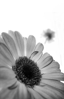
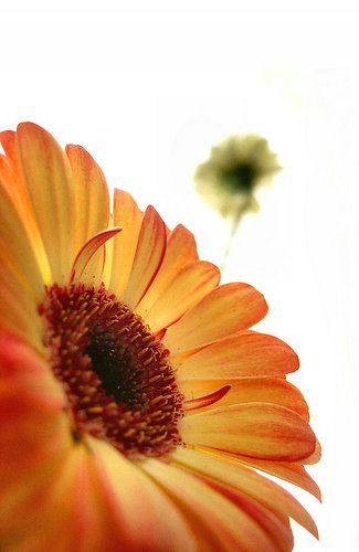
In color, this looks like a commercial shot - very well done. I think you should change projects on this one - isn't there one called the B&W flower? I haven't seen many flowers that work this well in black and white, and this one does. Looks great!
|
|
|
|
 Zsolt Radákovits
{K:10376} 6/28/2005
Zsolt Radákovits
{K:10376} 6/28/2005
|
Dear Stace this is really perfect in B&W.
Nice idea to convert!
Congrats from Hungary.
Cheers Radák
|
|
|
|
|
Joe Plocki
{K:779} 6/28/2005
|
I like both versions, but I'm leaning toward the color one, but that could be because I'm not familiar with this particular flower, and the yellow to reddish transition in the tips of the petals strikes me as particularly interesting. The white background simply rocks for this shot, and then there's more color stuck out there with the other flower. Very cool. Incidentally, I see the line Nate mentioned, which is odd, because I've got brightness and contrast jacked up to 100% each on my old monitor. Anyway, it's angled, so I don't think it's a UF background / border issue. Oddly, it's not there (on my monitor) in the color version. Just my humble opinion, though, I've got a discouraging amount yet to learn...
|
|
|
|
 Stace Walker
 {K:4175} 6/28/2005
|
i can't really see it, but then i know i have to have the brightness on my monitor up abnormally high because it's getting old =( i thought i got rid of it all, but it could also just be the differance between the pure white uf background and the slight grey of the background in the picture..
|
|
|
|
|
Nate Greuel
{K:38} 6/28/2005
|
Great concept and shot, I love the angle and depth of field. I think the b/w is my fav too but its close.. btw there's a faint line to the right of the blurred b/w flower, maybe remove that in ps?
|
|
|
|
|
Stace Walker
{K:4175} 6/28/2005
|
i think i like the black and white better tho..
|

|
|