|
|
|
Karen Ferranti
{K:2959} 10/31/2004
|
I like this one, great perspective.
|
|
|
|
 Fred Lord
{K:4844} 10/30/2004
|
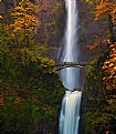
Sam: You are correct. It's very interesting composition. The monochromatic effect is very appropriate here. I like the converging lines very much.
|
|
|
|
|
arwa abdullah
{K:34415} 10/30/2004
|
beautiful line and symmetry!
I love those images of geometric shapes I have to try it!!
looks like fun
maybe it would look nicer if u cropped from the right and left sides
|
|
|
|
 Paul Maguire
{K:1113} 10/28/2004
|
The lead-in lines are what make this shot, and result in a very graphic composition. I wouldn't worry about the blown out highlights too much, as I think that in this case the white sky provides a balance to the dark foreground. Reminds me of Yin and Yang. For future reference, though, it's worth remembering that digital exposure works like slide film: you have to expose for the highlights to avoid losing detail in them as the become "burnt out". Using photoshop you can usually regain detail in the shadows of an underexposed (dark) shot, but burn out the highlights and they're gone forever. If the contrast is really extreme then you could consider taking two shots at different exposures and compositing them digitally, although in practise this is a lot of work.
|
|
|
|
|
YeeLin
{K:322} 10/24/2004
|
Great tones ! Nice perspective 
|
|
|
|
|
APPAVE José
{K:566} 10/23/2004
|
Good tones. I love these brownish colours. Great shot Sam. Jose
|
|
|
|
|
Sam Smith-Palomeque
{K:1680} 10/19/2004
|
True. Maybe it would look better if the top was more like the bottom; darker, so the middle looks more interesting.
Thanks for commenting!
Sam
|
|
|
|
 Manu
{K:13082} 10/19/2004
|
Hiya
I thinks the central disappearing lines work well but the top of the picture is a little blown out ie to white.
Maybe spend more time playing around with the image.
Good luck
Manu
|
|


