|
|
|
Alexey Sapa
{K:27174} 5/28/2004
|
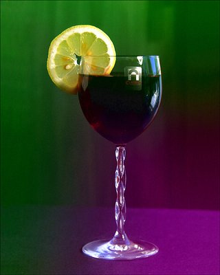
Lena! Ochen' nravitsia, osobenno kak zdorovo i tonko object zadaet colour tones i ih razdelenie... So storony limona v oblast' zelenogo, so storony krasnogo vina v ~krasno-fioletovyju... Niskol'ko ne udivlen, etot snimok (picture) mnogim nravitsia bol'she, on prosto chudesnyy!!! And want to drink again! :-) My kiss! A.
|
|
|
|
|
Kristina Kohut
{K:49990} 5/28/2004
|
Hm... this is a very interesting mix of colours... Very different and original! I don't feel any particular or special mood though, like I did on the other two. So, I think my answer is:
Brown is best, very good feeling contrast!
Red comes second, very strong "bloody" feeling.
Green-purple comes third, interesting & creative!
|
|
|
|
 Trish McCoy
{K:15897} 5/28/2004
Trish McCoy
{K:15897} 5/28/2004
|
very cool :)
|
|
|
|
|
B:)liana
{K:30945} 5/27/2004
|
Nice touch of colors dear!
Kisses, Biliana
|
|
|
|
|
Maya Bylina
{K:5925} 5/27/2004
|
Beautiful composition & colour! Ja rada videt' tvoi raboty!
Kiss!
Maya
|
|
|
|
|
John Hatziemmanouil
{K:40580} 5/27/2004
|
This is better for my taste! Fantastic colours!
|
|
|
|
|
Andrei Kislov
{K:4041} 5/27/2004
|
Len, ty znaesh, ya by v etom variante fioletovyi tsvet ne vvodil voobsche, ostavil by ego polnost'yu zelenym no s belym vinom i kist'yu vinograda:-)
warm regards _Andrei_
|
|
|
|
|
Hayri CALISKAN
{K:16195} 5/27/2004
|
Very nice color effects.
Regards, Hayri.
|
|
|
|
 Rob Ernsting
{K:8899} 5/27/2004
Rob Ernsting
{K:8899} 5/27/2004
|
Elena, this one is very obvious being altered. Alterations are to an extent acceptable depending on personal taste. The question is do you want it to be a replica of a possible true life situation or do you want "to play" and make it unreal. Personally I prefer resembling a realistic situation.
For instance in this one the glass should remain original and not being decolered by the color alteration that you made.
Warm regards, Rob.
|
|
|
|
 Teunis Haveman
{K:53426} 5/27/2004
Teunis Haveman
{K:53426} 5/27/2004
|
Elena. Beautiful compositie
Teunis
|
|