|
|
 Silvia Festa
{K:6008} 9/23/2004
Silvia Festa
{K:6008} 9/23/2004
|
great this diagonal!
|
|
|
|
 Aira Manna
{K:11187} 4/21/2004
Aira Manna
{K:11187} 4/21/2004
|
clever and ironic - a clear demonstration that people looking in the same direction can really see totally different things...
:)
|
|
|
|
|
B:)liana
{K:30945} 4/19/2004
|
great shadows dear Telmo. love the shapes too.. very interesting angle adn perspective sweety.
Kiss, Biliana
|
|
|
|
|
Alberto Calheiros
{K:2647} 4/18/2004
|
Belíssimo abstrato,com um grafismo lindíssimo!
Parabéns pela excelente galeria!
|
|
|
|
|
Gerhard Hoogterp
{K:4863} 4/17/2004
|
naughty.. but a nice find!
|
|
|
|
|
WALT MESK
{K:10691} 4/17/2004
|
eccellent composition.great style.walt.
|
|
|
|
 Verena Rentrop
 {K:15233} 4/17/2004
|
@Telmo, hahahahahahah.............
but now I see it, thanks for the very helpful advice
Kiss
Verena
|
|
|
|
|
Telmo Domingues
{K:9639} 4/17/2004
|
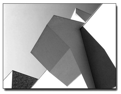
Hi good people!!!!
When I took this shot, I had no ideia about it's title... I just liked the way lines, shapes, volumes and contrasts played toghether... When I posted it, and thought about the captaion, I imagined a lady from behind, a little from the right, seen from the floor level, resting on a wall, talking with her neighbor, that sufers of "Claustrophobia"... heheheheh. See the attachement.
Thank you all for helping me on this passion, giving me the opportunity to understand my "lover", photography, a little better... Your hints are the flowers I give "her"!!!
THANK YOU!
|

|
|
|
|
|
Verena Rentrop
{K:15233} 4/17/2004
|
Hi Telmo,
now I try to find the female here, what I can see is a quite old working woman, the back is deeply afflicted, no wonder after several decades of hard working...perhaps too abstract, but my personal view!
Anyway a great shot, the pure lines are positively deranged from the tiles part in the left corner.
Kiss
Verena
|
|
|
|
|
Stefan Engström
{K:24473} 4/17/2004
|
I may be a little dense or just too tired but I don't get your title (and I have tried :-) Nevertheless... the geometry is great, but here I think the tones lack a little life. I like the gradient, but something is missing in the central structure (bust as Hugo likes to see it!) All the best - S.
|
|
|
|
|
João Martins
{K:2754} 4/16/2004
|
Mais um ângulo espectacular do tal edifício de gosto duvidoso. Algumas paredes parecem demasiado bright... O efeito B/W dá uma vida diferente, muito mais agradável. Gostei!
|
|
|
|
 Clifton Jones
{K:10688} 4/16/2004
Clifton Jones
{K:10688} 4/16/2004
|
I love the geometric design...the tone and contrast are excellent....great shot...
regards...Clifton...
|
|
|
|
 Hugo de Wolf
{K:185110} 4/16/2004
Hugo de Wolf
{K:185110} 4/16/2004
|
Hi Telmo, The structure and composition is fantastic! The tension is there, allright!
I agree with Anindya about the title, although I see what you are getting at... I feel it tries to imply a resembance that is not initially there.
I liked the subtle use of colour in Claustrophobia. Any particular reason why you converted this one into a B&W? I think the "heaving bosom" would've stood out perfectly against the clear blue sky, and the structure on the left hints at some colour....
In any case, a very good shot! Back with a Vengeance....;o)
Cheers,
Hugo
|
|
|
|
|
Kevin Collier
{K:19076} 4/16/2004
|
Very well done == near perfect -- K
|
|
|
|
 Roberto Arcari Farinetti
{K:209486} 4/16/2004
Roberto Arcari Farinetti
{K:209486} 4/16/2004
|
hi telmo..
LOL.. a great construction!!!
or building... nice work!
for me is 7.. i like this one!
roby
|
|
|
|
|
Gerhard Hoogterp
{K:4863} 4/16/2004
|
Where I search for abstracts in macro, you go completely the other direction and find it in architectonic works. An other great shot with smooth grays and nice textures. Maybe a tat more contrast, but an other great shot nevertheless!
|
|
|
|
|
Anindya Maity
{K:7880} 4/16/2004
|
I like the range of tones,the strong geometric shapes and the angle of the camera.Good play of light and shade too.I don't really get the caption though.
|
|