I was just listening to Elvis Costello, and I thought the song title matched the photo. :) I know some might not like the composition, but I think keeping the stem in frame adds weight (and therefore mood) to the flower. Please tell me if I'm wrong!
I agree with you on that one Becky. Floral and even waterfall images are always better without sunlight from my experience. Too much contrast! You are a good sport...I gave you an 8! Not quite a 9, but a whole lot better than a 4! Although I have seen Marc's images...they are excellent as well. Aloha.
Thank you for your suggestions, Marc. I have lots to learn about cameras, and flashes are no exception! I will keep your flash suggestions in mind, and when I'm rich enough to buy a decent flash, I'll definitely be lugging it everywhere I go.
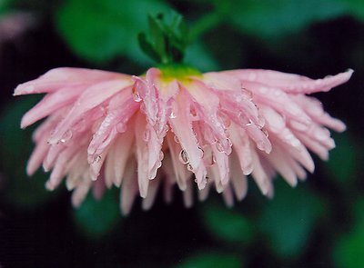
I must disagree with you, however, on taking flower macros on a sunny day. While I admit this is the preferable option, being forced to go to a gardens on a dark, dreary, rainy day convinced me that dark, dreary, rainy days can be good for flower macros as well. Colours are more saturated and the water adds new textures. In fact, I was quite happy with most of the rainy photos (4 of which I posted on Usefilm: Rains/Snows, Canopy, Wings and this one). It was just getting the proper exposure I found super challenging.
0
Marc Gougenheim{K:5398} 11/29/2002
Hi, Becky. Glad to see you take criticism very well. A few answers to your questions...
1) A better angle...? Mmmm... Not easy without being there, but if I still have to propose an angle, since you wanted this flower to look sad, I'd say "show me its face"... Meaning, maybe a lower angle looking up - where the background would be clear evidence that the flower is looking DOWN...
2) What to do about bad weather ? Well, the shining sun is the greatest light source available, of course, so what to do if you can't have the best ? Choice 1: wait for another day, another place if necessary. Sounds silly, but well, there are bad days where certain shots would just not be as nice as they should be... Choice 2: get a ring flash on camera - is it possible on your camera, I guess so, but I'm not sure, and it's not cheap. Choice 3: use a standard flash gun after learning "open flash technique". Basically, handheld flash diffused or bounced. Not easy, but worth it... Most people tend to scream when anyone speaks about flashing on a flower outdoor, but it works if it's done well... (Of course, wait for a sunny day will still be a lot easier...)
As for the high ratings, I am not saying that people rated this image dishonestly - at all ! But I know that many people just don't dare to be critical because they are affraid of annoying people... And sometimes, we all want to encourage friends, by acknowledging an improvement. I had a look at your folio, and well, I found another picture there, which had no ratings, but which was better than this imo. I think it is only good to encourage people, but it should be on the right pictures. Or else, it would just be missleading for you... I liked your reflection shot better because it had more of the ingredient that make a good picture in its own genre. Here you said you wanted this flower shot to be depressing... Yes, I understood that, but maybe beautiful and painful would even be more depressing - don't you think...? Best regards, and thanks for the interesting reply.
Marc: I rather like the green background in the photo, as I think it complements the pink dahlia well. I can see how you think it's messy though, and I'll play with darkening those leaves a bit (and eliminating the pink in the top left corner. That always bothered me!) Black backgrounds are indeed classy, but I feel they're overused at times. However, I just shot a bevy of flower macros against a black background and will probably be posting them here if they turn out, so stay tuned :-)
As for light, well, you have no idea how dark it really was! This photo was taken at a botannical garden. I had a free pass and I could only go on one certain day. It turned out to be a dark, dreary, rainy, foggy day. There was little light and few opportunities to use a tripod (which also explains why alot of my DOFs were shallow). If you could give some tips on shooting macros in this sort of situation, I'd love to hear them!
Similarily, I'd like to hear suggestions for an alternate angle. This flower was parallel to the ground, drooped from the weight of the rain & heavy dew. I spotted this flower from quite a distance and I felt it looked really sad (so if you felt sad and depressed looking at it, well mission accomplished!) I took 3 other shots of pink dahlias, but felt they were boring and conventional.
Julien - I'd like to hear your suggestions of a better angle too. Thank you for your detailed critique. :-)
Whoa - I step away from the computer for a few days and look what happens!
Where to start . . . First of all, thank you Marc, Altaf, and Julien for your thoughts. Personally, what I'm looking for in a comment (or a rating) is honesty. I want to know if people think the photo is good, bad or otherwise and why people think that way. I've analyzed this photo myself so much that I can't think about it objectively anymore. That's why it's so refreshing to hear other peoples' opinions, whatever they may be.
I'd be lying if I said seeing this pic in the Top Rated Photos category didn't bring a smile to my face. If X amount of people think this is a good photo (and they're voting honestly), then that's great. But Marc (and Julien's) ratings are great too because they explained why they voted that way in a satisfyingly thorough manner. I agree with some of those comments and will keep the suggestions in mind, and I disagree with other points - that's the beauty of it.
I can only speak for myself, but I don't want people to feel they can't comment on one of my photos if they don't like it. I don't want my photos trashed, but constructively criticized. On the other hand, a high rating did encourage me, as I'm rather intimidated by the quality of photos on this site at times. However if those were votes meant to make me feel better, well, I'd rather have the honest criticism instead.
What am I saying here? I don't know. I think I'm going on. How about this: honest encouragement. Good compromise. I likes it! :-)
Maybe not a 9 compared to great flower photos I've seen. But a 4... not sure there. From the thumbnail I would have agreed. But the drops of water are very clear and fresh, and I think the DOF... yes its nice, but maybe a bit more would have been better.
I also think a different angle would have been nice... less from the side like this.
All the crops I've seen are no improvement at all IMO. The things you tried to improve with the crops can only be improved by changing the angle I guess.
I'm dont think the background is all that interesting but I cant say it hurts the photo either...
As for the intensity of the colours... hmmm well I dont know... more light might have made the whites overexpose... but then again, I'm not really qualified when it comes to lighting. Actually the only thing I am good at is venting my personal opinions :-D
Now to come to a conclusion... I like the overall shot, and I think its better than average... but no its not as good as the good, let alone stand incredible flower photos I've seen. But I think this photo shows us that the photographer knows what she wants to show us... its now only a matter of trying more different angles and copmositions to see how what she wants to show can be best portrayed.
Well I hope this was of any use.
On to the irrealistic encouragments... I think Marc is right. Although they might be painfull a bit in the beginning, the "harsher" critiques, when honest and righteous help us the most. A nine IMO is unfair but a 4 is too. I have seen many boring flower shots, and I dont think this one is. At least not right away. I consider this a 6 or 7 :-D
0
Marc Gougenheim{K:5398} 11/28/2002
As I see it, a 9 is not an improvement to keep going, but rather an encouragement to stop improving, Al. Maybe I'm totally wrong here, and if so do let me know, but 9 means you have reached your best, and almost THE best one could reasonably dream to attain... Becky has certainly improved but is that to say that he or she can no longer improve ? Why does an encouragement need to be irrealistic ? As I said, I think an irrealistic encouragement doesn't do the photographer any good. And somehow I even feel it's a bit of an insult to Becky's intelligence - though it is probably not ment that way at all of course...
It's probably because becky is improving and everyone is encouraging her to keep going.
0
Marc Gougenheim{K:5398} 11/28/2002
If that's ok, I would be really interested in understanding why this picture was rated a 9 upon 10. I honestly can't understand. The photographer is very clear about being an amateur - whether "painfully" or not... (cute expression by the way, Becky...:-)
So I would personally suppose that he or she is here to actually learn something. Getting an average of 9 after nine ratings, how much more will there still be to learn ?
Encouraging people is imo a good thing, but "over-encouraging" them is imo detrimental to their improvement.
This being said, I rated this picture a 3, but that was a mouse accident, I actually meant a 4. I personally don't consider this to be an average flower shot, but slightly below average. I will try to explain why and would welcome any opposite explanation that would enlighten me if I have missed something...
1) A pure black background is often boring but can be classy as well. It all depends on how the flower looks like and on how much of background is visible in the composition. Here, there is A LOT of black completely surrounding the flower, but it isn't pure black, it has dark leaves in it, which suggests low light, and overall, the background is a bit "messy" rather than "classy".
2) The flower itself gets very little light, and colors and textures are pretty dull, apparently due to a cloudy whether or maybe because this was taken in the shade.
3) Angle ? I don't understand this angle at all, honestly. A side profile of a flower looking down, and looking sad ? If the purpose was to be depressing, well, that's exactly what I feel...
4) DOF ? I would like a bit more DOF
This is of course just an opinion, but the light, colors and angle seem to fail this picture. Feel free to tell me what I'm missing. Sorry to be harsh but I seriously doubt that this can be called close to perect, so let's see whether that leads us all to a more interesting discussion. Best regards - and don't let this discourage you in any way ! :-)
I like the original crop best - I might tone the greens down a little but i like the flower coming from it - the out of focus elements draw the eye to the center and the bubbles (my favorite things) give it some life - well done