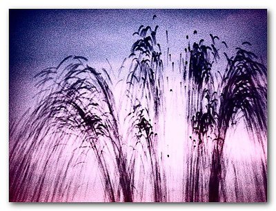
I have tried Marc. I can't get anything better out of it. As you can see from the original which I have attached here, there was not much to start with. In addition to the histogram equalization mentioned above, I applied the highest level of automatic colour saturation allowed to me in Paint Shop Pro, not once, but twice. The gradiant of background colour is a fairly good representation of the colours in the sky which were fading from sunset-reds to the blue-black of falling darkness overhead.
0
Marc Gougenheim{K:5398} 12/28/2002
You are a real artist...:-) I envy you for the talent you have to make something so great out of nothing, or rather, out of something photographed a million times more or less in the same way... You really manage to imprint your own style on totally (to me) uninteresting subject matters, and that's really fantastic.
Here, my only suggestion would be to try a shift in hue in Photoshop - overall. I often se these colors in studio, and I have noticed that pushing the hue towards yellow gives you a fantastic range of colors going from green to orange. Try it out. I'd be curious to see an alternative version with these modified colors... Possible ? Regards.