|
|
 Saad Salem
 {K:89003} 10/23/2011
|
my best regards for this series.
amazing to view.
|
|
|
|
 vehbi dileksiz
{K:37355} 10/3/2011
vehbi dileksiz
{K:37355} 10/3/2011
|
Thanks a lot dear Ania.
Hugs too.
vehbi.
|
|
|
|
|
vehbi dileksiz
{K:37355} 10/3/2011
|
Thank you so much Radovan.
Regards.
|
|
|
|
|
vehbi dileksiz
{K:37355} 10/3/2011
|
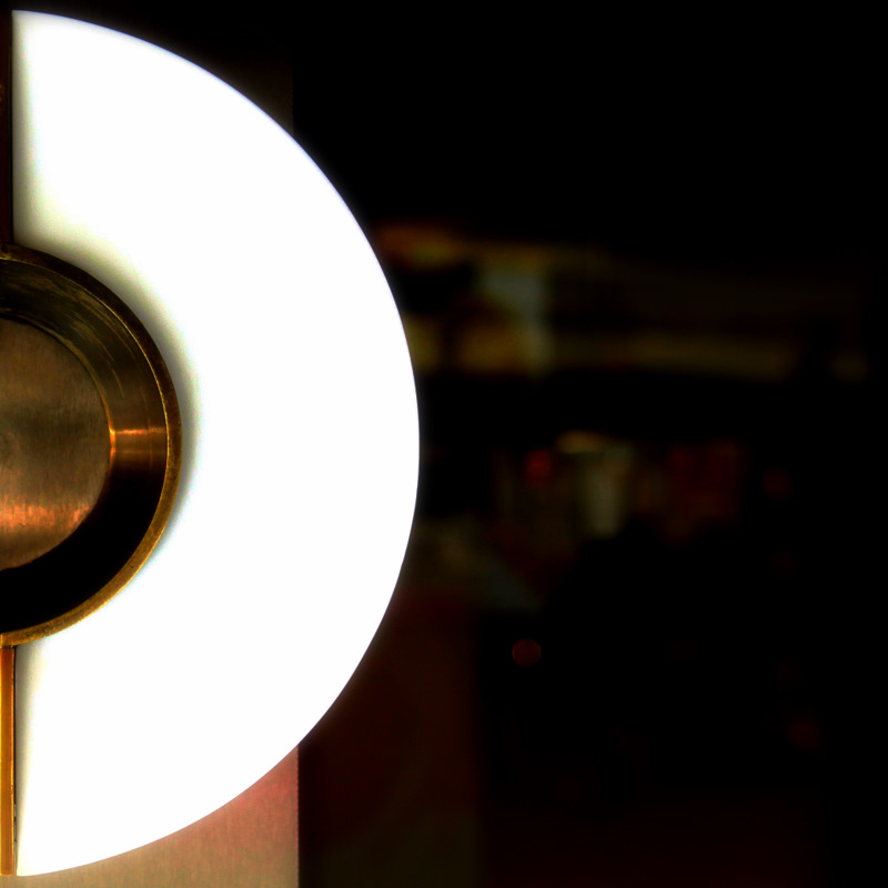
Thank you so much for constructive criticism Harry. I know your suggestion is better and right, just i scared large contrasts between background with saturated "D" and a little bit looks like a letter "C"
All the best.
vehbi.
|

Thanks Harry :) you are right. |
|
|
|
 Ania Zielińska-Hoşaf
{K:61374} 10/3/2011
Ania Zielińska-Hoşaf
{K:61374} 10/3/2011
|
Very nice!
Thank you for dedication :)
Hugs,
Ania
|
|
|
|
 Wolf Zorrito
{K:78768} 10/3/2011
Wolf Zorrito
{K:78768} 10/3/2011
|
You succeeded very well, still my first feeling is that the letter D should be dark against a whithe bg. Just imho ;-)
Harry
|
|
|
|
 Radovan Magdalenic
{K:32881} 10/2/2011
Radovan Magdalenic
{K:32881} 10/2/2011
|
Very nice Vehbi.Regards
|
|