|
|
 Nick Karagiaouroglou
 {K:127263} 8/17/2009
|
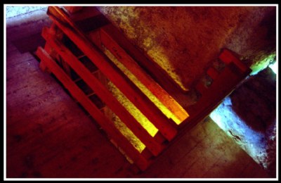
OK, so you meant rather that "the black revives colors *of this image*, however the white kills them", right? This is of course something else, as it isn't a general statement for all cases, and so let's see what happens of we remove the white frame around the image. (Attachment.)
Hmmm... the contrast against the now fully black frame seems to be less strong this way. I assume that this is because of the small distance (in color space) of the colors of the image against black. If you see the histogramm of the image then it has almost only deep, shadow-like components except for some more middle components in red. I am not sure about this as the reason for the appearance, though. But what about you? Do you find the colors better supported by the black frame?
Cheers!
Nick
|

Changed frame to black after Irena's idea |
|
|
|
 Irena - Marta
{K:4875} 8/16/2009
Irena - Marta
{K:4875} 8/16/2009
|
Yes, Nick, there is no one rule that says that black background is best for all colors. I was thinking of this specific composition, the color is so important. Of course this is just my suggestion.
kind regards,
Irena
|
|
|
|
|
Nick Karagiaouroglou
{K:127263} 8/16/2009
|
Of course perception of color on black background is different from perception on a white background, Irena. It doesn't take much physics to realize that. But this no way implies that "black revives colors, however the white kills them" as your original claim was, which is simply wrong. This was something completely different than stating that there are perception differences.
Think for yourself, how well would a black background enhance some dark earthy color? Take a dark brown and put it on black - does it stand out more powerfully than on white?
It is a question of contrast between foreground and background, and so there are exactly as many tones that get enhanced on a light background as there are tones that get enhanced on a dark one. There is no "general rule" that concludes which background is better for all colors. Actually one can even calculate how well some given color will be enhanced on black or on white.
Cheers!
Nick
|
|
|
|
|
Irena - Marta
{K:4875} 8/8/2009
|
Nick, perception of color on a black background is very different than on a white background. You can check it.
http://jnocook.net/colors/index.htm
Cheers! :)
|
|
|
|
|
Nick Karagiaouroglou
{K:127263} 7/21/2009
|
Thanks a lot Ian!
Another result of a not really controlled Fujichrome Velvia 100F.
Cheers!
Nick
|
|
|
|
|
Nick Karagiaouroglou
{K:127263} 7/20/2009
|
Thanks a lot for the nice comment and the idea, Irena.
About "black revivs colors however the white kills them", who told you that? What happens with dark and rich colors on a white background? And BTW, take a look at most brilliant designs of layouts. Most of the time you see... white space.
Your idea of a raised contrast and a black frame of the image turned it to something very interesting. Much like some drawings of comics novels, which I do like very much. In this case I was rather intending to get some more "twisted" but still "real2 looking image, which then the Fuji overenhanced for some reason. But the ting is that I wanted those old and dirty walls to be on the image. Your idea seems to make them look somewhat "cleaner" - this is my first impression. Still I should try the same shot with less exposure and see if it works the way you propose.
Thanks again and cheers!
Nick
|
|
|
|
 Ian McIntosh
{K:42997} 5/26/2009
Ian McIntosh
{K:42997} 5/26/2009
|
crystaline light, Nick!
|
|
|
|
|
Irena - Marta
{K:4875} 5/19/2009
|
Interesting abstract, Nick. I think the black wall is a better background for this coloristic composition, because the black revivs colors however the white kills them.
Nick, what do you think about more contrast in this picture and a less in this frame?
Cheers! :)
Irena
|

|
|
|
|
|
Nick Karagiaouroglou
{K:127263} 5/1/2009
|
Nightclub!!!! I like the idea since I like nightclubs! Now that you say, it reminds me of my times in Rock'O'La, my old metal pub when I was still in Duisburg, in Germany. ;-)
Cheers!
Nick
|
|
|
|
 Marcio Janousek
{K:32538} 4/29/2009
Marcio Janousek
{K:32538} 4/29/2009
|
It seems that the photo of the entry into a nightclub , boate...
It is interesting.
|
|
|
|
|
Nick Karagiaouroglou
{K:127263} 4/29/2009
|
Thanks a lot, Dave!
Nick
|
|
|
|
|
Nick Karagiaouroglou
{K:127263} 4/29/2009
|
Thanks a lot again, Marcio!
I am not really sure how the strong colors burned on film, so I am still try to understand what happened. There was no lamp or other light in that room. Only daylight from the windows and the door downstairs.
Nick
|
|
|
|
|
Nick Karagiaouroglou
{K:127263} 4/29/2009
|
Thanks a lot again, Gustavo!
Nick
|
|
|
|
|
Nick Karagiaouroglou
{K:127263} 4/29/2009
|
Thanks a lot, Miriam!
Cheers!
Nick
|
|
|
|
|
Nick Karagiaouroglou
{K:127263} 4/29/2009
|
Thanks a lot, Vehbi!
Cheers!
Nick
|
|
|
|
 Dave Stacey
{K:150877} 4/24/2009
Dave Stacey
{K:150877} 4/24/2009
|
Interesting with the colours and textures, Nick!
Dave.
|
|
|
|
|
Marcio Janousek
{K:32538} 4/23/2009
|
Another good ludic image to play ..
Who would not want to go across a room well lit?
The bars appear in flames .. great composition with the colors.
|
|
|
|
 Gustavo Scheverin
{K:164501} 4/23/2009
Gustavo Scheverin
{K:164501} 4/23/2009
|
Me gustan los colores intensos de esta foto, los rojos empastados y los amarillos brillantes. Bien por la composición usando la diagonales, le pone un interesante toque abstracto.
Felicitaciones!
|
|
|
|
 miriam leitner
{K:3457} 4/23/2009
miriam leitner
{K:3457} 4/23/2009
|
caught my eyes!
very well done!
|
|
|
|
 vehbi dileksiz
{K:37355} 4/23/2009
vehbi dileksiz
{K:37355} 4/23/2009
|
great colors and composition...congrats...vehbi...
|
|