|
|
 Nick Karagiaouroglou
 {K:127263} 12/13/2008
|
Thanks a lot for telling me the way you look at the images, Saad. Interesting. I also choose some thumbs to click on that look interesting to me. But I do comment whether I find the images good or bad. The latter is also a very necessary part, since also mistakes have to be identified and analyzed, or else there will be no possibility to recognize them and thus avoid them in future. (Except of course of the makes understands what the implicit absence of comments might mean - but this is dangerous too. It is too duggestive.)
I also don't look as much to pets, babies and waterdrops since most of them are technically terrible. The remaining 10% of them that are good technically I do inspect more closely for seeing how they were achieved. In general most "natural romanticists" of this site are really completely underskilled but several of them are really great too. One can learn a lot from the latter. And as it happens the latter are also the more quiet ones, who don't expect the already mentioned flowery comments under triumphal fanfares all the times.
Cheers!
Nick
|
|
|
|
 Saad Salem
{K:89003} 12/12/2008
Saad Salem
{K:89003} 12/12/2008
|
Nick,I take a preliminary looks at the shots,I choose the the shots that attracts me with their subjects and concept first,after I opened them for viewing,my priorities are ,the subject and concept first, if there is any ,and I liked the shot,I comment on its photographic elements,if it is technically below average,or I do not like it,I just close its window without commenting,
that Nick,does not mean every photo,that I don't comment,is bad,or I found in it nothing,cause I do not look at Fashions,flowers,pets,objects,babies,and water droplets, and those constitute the major bulk of the site,
my best regards as always,and for you cheers,
Saad.
|
|
|
|
|
Nick Karagiaouroglou
{K:127263} 12/12/2008
|
You can't do... what, Saad? What is against you? And what is your BIO? You mean the UF-box for info about one's person?
Anyway, I was talking about comments that are of rich input and show some things that one might otherwise oversee. So we get enriched by a steadily growing collection of thoughts, ideas, considerations, and the like. So we can have a more and more integrated, wholistic view of anything.
Cheers!
Nick
|
|
|
|
|
Saad Salem
{K:89003} 12/11/2008
|
I can not do that ,it is against me,and that is stated at my BIO,the subjects comes first,if non then the photo itself,if non leave ,I do not comment,but from the beginning there should be something in the shot that tie me to see it,
my best wishes as always,
Saad.
|
|
|
|
|
Nick Karagiaouroglou
{K:127263} 12/11/2008
|
You don't say that to me explicitly, Saad, but I am very glad to have comments that spur me on. The best possible influence of a comment is to not leave one in peace. So that one still tries to improve insteas of relying on flowery comments.
Cheers!
Nick
|
|
|
|
|
Saad Salem
{K:89003} 12/10/2008
|
I would never ever say to you don't be lazy,for me it is as good as it gets,
my best wishes and regards,
Saad.
|
|
|
|
|
Nick Karagiaouroglou
{K:127263} 12/10/2008
|
Much better in the sense of the intented image, Saad! This one really comes very close, much closer than my originl did. And thus, we see once more, I needed more overexposure.
I don't do retoucing for any other reason than for using it as a backward engineering to what might had helped me get my image better when I was shooting it. So, for example here, we see that more exposure would have been a closer approach to what I was intending to do. I thank you very much for this enlightening of my mind! It says to me: "Don't be lazy Nick, and work for what you say you love! Take the camera and try again."
Cheers!
Nick
|
|
|
|
|
Nick Karagiaouroglou
{K:127263} 12/9/2008
|
Thanks a lot Ian!
But it doesn't work that well on the image, I guess. It needed more overexposure for that.
Anyway, still trying to accomplish that.
Cheers!
Nick
|
|
|
|
|
Saad Salem
{K:89003} 12/9/2008
|
well dear Nick,I do resort to retouching as a luxury,with the idea that I am improving my works and for me,just a little,I am not that re toucher,but deep inside me there is the idea there some editing people that they could any thing you want,and I have seen few of them at Linda.com,
anyhow it is exactly as you said ,I have changed the photo a lot,and make it lose its intension of being a wing flow in the emptiness,
I tried again,and this time I haven't touch any single pixel out side the dark lower right quadrant,please do look at the attachment and tell me your opinion,
my regards,
Saad.
|

|
|
|
|
|
Saad Salem
{K:89003} 12/9/2008
|
well dear Nick,I do resort to retouching as a luxury,with the idea that I am improving my works and for me,just a little,I am not that re toucher,but deep inside me there is the idea there some editing people that they could any thing you want,and I have seen few of them at Linda.com,
anyhow it is exactly as you said ,I have changed the photo a lot,and make it lose its intension of being a wing flow in the emptiness,
I tried again,and this time I haven't touch any single pixel out side the dark lower right quadrant,please do look at the attachment and tell me your opinion,
my regards,
Saad.
|
|
|
|
|
Nick Karagiaouroglou
{K:127263} 12/9/2008
|
Thanks a lot for the idea and the work, Saad!
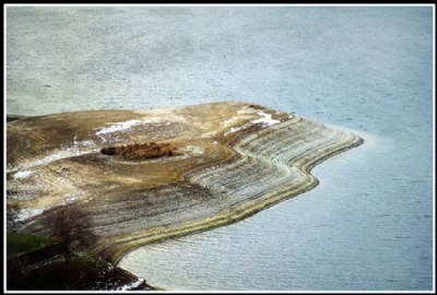
The idea was to let the land be "hovering in nothing", which demands the water to lose as much as possible of its surface texture for resembling as much as possible the emoty sky. In this way it would look as if the land was "flying", or "hiovering" without being really embdedded in some kind of natural geographic coordinates.
What did the "equalisation" with ACDsee did? It converted the image to the more "standard" image, in which all elements are depicted as well as possible. It gave more color and detail to the water and it raised the luminosity of the bottom left corner. The "correctness" of the image was introduced, a "correctness" that is based on some few criteria. But it neglects many other criteria.
For example look at the water (on your attachment) and the boosted color differences between its different areas. This phenomenon is of course also natural and had to do with different temperatures and wave textures of the different areas of water. But the "equalisation" boosted that mercilessly since the software has no way of knowing when it shouldn't proceed as mercilessly. It simply follows some algorithm and presents you some achieved advantages as if they were the only things to consider. (This is what photography was reduced to by accepting all those tools without really *looking* at the results.)
Now, from the "average" point of view the edited image might pass the typical amateuric "tests" but what is the general result? It is a "standard" image. This is not at all bad by itself, but the problem here is that the chosen rectangle of the world doesn't say anything as a "standard image". And this was my intention, namely to let it look a bit stronger in its own idiosyncracy. I failed because I should have overexposed more. This is the quintessence of this story. After that, I could also try to change this and that and equalize, etc, etc. How photographic would that be?
The moral of the story is, I am greatful for your work and your comments (as also for everybody else's) but they show me *not* how to "save the image". They show me how to master my *camera* better the next time. This will allow me (hopefully) to better my approach, and thus all additional editings I can take as a backward engineering for what my mistakes were. If I know them I can try to avoid them next time. If I rely on ACDsee (and similar things) I will never get better.
Cheers!
Nick
|
|
|
|
|
Nick Karagiaouroglou
{K:127263} 12/8/2008
|
Thanks a lot for the nice comment, Stan!
Do you mean something like the attachment? Well... hmmm.. I start getting an appetite to do that as you say. Two shots both appropriately overexposed and stiched. It could really work!! Thanks a lot!
Cheers!
Nick
|

Cropped as Stan suggested (hopefully) and cloned a bit of the tree at the bottom left |
|
|
|
|
Nick Karagiaouroglou
{K:127263} 12/8/2008
|
I wish I had overexposed mire, Indranil. Still, thanks a lot for the nice comment!
Cheers!
Nick
|
|
|
|
|
Nick Karagiaouroglou
{K:127263} 12/8/2008
|
Oh well, it is not in agreement with the real zones, Vandi. It is rather a region and less a zone. But thanks a lot for the nice comment again!
Nick
|
|
|
|
|
Nick Karagiaouroglou
{K:127263} 12/8/2008
|
Thanks a lot for the nice comment and your idea, Steve! The attachment is interesting but nit my idea of nowhere. I thought of the land in a naturally looking kind of "sky". For this I guess I needed more overexposure, as it would wash out most waves but still keep the blue color. And it could also lighten up that lower left corner. The other reason for your idea being not my case is that I don't like this kind of afterward manipulation, especially of it is so much like here. I find it too... "amateurically artificial" or "cheap trick" then - something like that.
Still thanks a lot for the attachment. It gave me the idea to try also underexposure in some late evening time. Let's see.
Cheers!
Nick
|
|
|
|
 Ian McIntosh
{K:42997} 12/5/2008
Ian McIntosh
{K:42997} 12/5/2008
|
The nowhere look certainly works in thumbnail. Very intriguing introduction to the comp and I think a nice reminder of how lakes work with their rise and fall.
|
|
|
|
|
Saad Salem
{K:89003} 12/3/2008
|
for me Nick,the idea of yours could be established ,by just equalizes the shadows of that black spot to become an even part of the shot,and I have done it by ACDsee pro 2.5 as in the attachment,
regards,
Saad.
|

|
|
|
|
 Stan Hill
{K:35352} 12/3/2008
Stan Hill
{K:35352} 12/3/2008
|
I like the tone of the water marked shoreline and the diagonal position of the land in the water. I would make it more of a landscape pano with crop as a possibility of eliminating the dark area on the bottom left. Here is a link to one of the T90 shots I posted. http://www.usefilm.com/Image.asp?ID=1475544
Be well, Stan
|
|
|
|
 Indranil Ray
{K:5050} 12/3/2008
Indranil Ray
{K:5050} 12/3/2008
|
Idea is good Nick. Nice landscape and well captured :)
Cheers!
Indranil
|
|
|
|
 Vandy Neculae
{K:7990} 12/3/2008
Vandy Neculae
{K:7990} 12/3/2008
|
Pleasant landscape and good composition, Nick.
The dark corner is only another zones here.
Vandi
|
|
|
|
 Steve Aronoff
{K:18393} 12/2/2008
Steve Aronoff
{K:18393} 12/2/2008
|
The shot has great potential, Nick, there's a lot of interesting stuff going on in it, but I agree that the dark corner is distracting. I think that if you want the land to be "nowhere", the waves on the water give too much impression that the land is 'somewhere'. One solution might be to crop the photo and make the surrounding truly no place. See my possible solution below.
Steve
|

|
|