|
|
|
Patrick Cowley
{K:2095} 11/22/2006
|
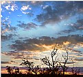
this is a great foto! nice job! :^)
|
|
|
|
 Matt Mitchel
{K:3149} 9/17/2006
|
Although I am a little late but I think "Award-winning photography" is taking away from your nice picture and should be moved under your web site info with same color and may be a little smaller font!
|
|
|
|
 Paul Lara
 {K:88111} 9/16/2006
|
Thanks, Brian, I will.
Thanks for the honest feedback.
|
|
|
|
|
Brian T. Ach
{K:1742} 9/16/2006
|
Paul, while I dig the picture, I am not sure it is the best for a card. It looks nice here, but when printed 3.5x2, it will be hard to pick out what it is immediately...the people will be very small. Print one out at that size and see what you think. Just a thought...
|
|
|
|
 Sheila Carson
{K:5924} 9/8/2006
|
I like it! The photo is very interesting and I think it works well for the card. It's nice to look at without dominating the card too much.
|
|
|
|
 Paul Lara
 {K:88111} 9/7/2006
|
I like your idea, Melanie, and it won't clutter the front. Thanks!
|
|
|
|
 Melanie Reynolds
{K:9096} 9/7/2006
|
I like it. The silhouette is great.
I'm wondering if you can have more detailed services listed on the back. I recently saw someone's professionally printed cards that had their services neatly listed on the back of the card in a light colored ink.
It's just an idea! I think this will give people a better idea of the types of photography you do.
|
|
|
|
 Benedetto Riba
{K:15792} 9/7/2006
|
Hello Paul, will not lack the occasion in order to see your website.!!!
Best regards
|
|
|
|
 Aniko Heart
 {K:26503} 9/7/2006
|
Hiya Paul:
You know my feelings re this business card design. As a large image it works really well. But as I have stated before, how does it translate in a business card size? The tones are wonderful. The silhouette is great! Love the fonts you have chosen... oh... I also agree with Dave Arnold... an e-mail address is often a good idea included on a business card.
You are very talented, Paul.
Warm Wishes,
Ani :)
|
|
|
|
 Dave Arnold
{K:55680} 9/6/2006
|
Oh, Paul. One other thing I just thought of. If your e mail address on the web site is paul@, you might not want to get that printed on the card. I have many web sites and all addresses on the sites end up getting inundated with spam. So I change them regularly.
Therefore, give yourself a specific, non-web published e mail account to be printed on ONLY the card. It will save you lots of grief down the road when you are stuck with what is on the card being the same as what is on the web.
Dave
|
|
|
|
 Dave Arnold
{K:55680} 9/6/2006
|
I think it looks good, Paul. And I like the image you used, too.
Are you printing it yourself or having it done by a shop? I have misplaced a shop name in KC that does these (front and back printed) for $95 a thousand. One of these day, I need to find that number.
Dave
|
|
|
|
 João F * Photography
 {K:41945} 9/6/2006
|
Well done Lara !!
jo
|
|
|
|
 Joggie van Staden
{K:41700} 9/6/2006
|
Very good choice, creative and different - go for it!
Joggie
|
|
|
|
Mary Sue Hayward
 {K:17558} 9/6/2006
|
Paul, as a basic business card design, this image works nicely. The silhouette at the bottom of the image is interesting, but does not distract from the text. Normally I prefer that text not distract from the image, but in this case it is the text that is most important.
Now...from the perspective of the business card...I'm not sure exactly what you are selling. Do you plan to offer a specific service (like weddings, etc.) or do you intend to include a card with prints for sale? If it is important to you to sell a specific product or service, you might want to add some text that is relevant.
|
|


