|
|
 Phillip Minnis
 {K:13131} 6/12/2006
|
Michael, now I see what Joel was referring to!
What an incredible collage! Just stunning!
Congratulations on the award! Well deserved!
Cheers
Phil
|
|
|
|
 Morgan Estill
{K:3786} 4/26/2006
Morgan Estill
{K:3786} 4/26/2006
|
Car wreak? That sounds fun! Hope you're alright. Got any shots? Would make for a moving photo... Anyways... Looking forward to more photos.
|
|
|
|
 Michael Kanemoto
{K:22115} 4/17/2006
Michael Kanemoto
{K:22115} 4/17/2006
|
Morgan:
Thanks - I plan to get back to shooting, just have a delay of game, car wreak and I have some work to do with Hugo.
|
|
|
|
|
Michael Kanemoto
{K:22115} 4/17/2006
|
Morgan:
I posted the final composition to these trout lilies. Turned out really nice based on the help on this photograph.
www.usefilm.com/image/1088849.html
|
|
|
|
|
Morgan Estill
{K:3786} 4/17/2006
|
Very very nice. That combination of shots works great. Excellent work. I really like your floral shots - not your everyday florals.
|
|
|
|
|
Michael Kanemoto
{K:22115} 4/12/2006
|
Morgan:
Final Tonality.
|

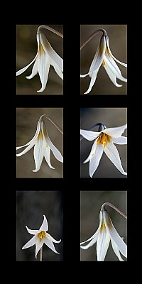
Trout Lilies |
|
|
|
|
Michael Kanemoto
{K:22115} 4/7/2006
|
Color tones, minor dust, but slight fuzzy in DOF.
|
|
|
|
|
Morgan Estill
{K:3786} 4/7/2006
|
I like your choice even better. I especially like how the two of the sides of the flower have a soft brown background, while the the middle will have the nice gray.
What kind of problems are you having with 12" x 18" prints?
|
|
|
|
 Patrick Ziegler
{K:21797} 4/7/2006
Patrick Ziegler
{K:21797} 4/7/2006
|
Good Stuff Michael! Fine artwork... My only critique would be that number 1,3 and 6 are a bit redundant angels. Never the less, it works..
|
|
|
|
|
Michael Kanemoto
{K:22115} 4/7/2006
|
Morgan:
It will be 3, 4, 2. I just got the prints back, and you can't see this online, but some have some problems at 12" x 18". Also, I have to spend some time matching the tonality and feel.
But I hear ya.
|
|
|
|
|
Morgan Estill
{K:3786} 4/7/2006
|
Another idea would be to make a trio of shots, like you were saying, but the entire right side (2, 4, 6). The top and bottom on the side are great opposites, while #4 works great in the middle of those two.
|
|
|
|
|
Morgan Estill
{K:3786} 4/7/2006
|
This is another great collage, Michael. I don't like it as much as your other, mostly because I
feel that the shots, if labeled like this:
[1][2]
[3][4]
[5][6]
numbers 1, 3, and 6 are too similar - they're all great shots - well composed, good definition, attractive tones, etc., but I would rather see a wider variety of shots (angles, DoF, etc.).
Here's an idea, maybe get a set of 9 shots arrange them in a 3x3 grid and do a similar thing but work with patterns, such as having a wide DoF shot of the flower (looking directly into the flower, similar to #5) in the middle while having other, shallower DoF shots surrounding the middle. The outer shots could be very strange viewpoints and very highly stylized.
Great work for just being on a walk! BTW, I really like the natural background on this series - adds wonderful tones to the shots, but isn't distracting.
|
|
|
|
|
Michael Kanemoto
{K:22115} 4/6/2006
|
Joel:
Printed 4 12 x 18 prints and the Top left, Top right, Bottom left. seem to make a really killer trio.
I'm going to try the same with the more chocolate background (yellow not removed). Thanks for all the kind notes.
|
|
|
|
|
Michael Kanemoto
{K:22115} 4/6/2006
|
Mehul:
Now I have to post a real formal multi-shot composition!
I had not intended this to be a formal composition - I just took what I thought were 8 nice photos of the same subject and threw them together in photoshop. I like the idea of making a multi-shot composition, but for this critique this is just supposed to be 8 photos that people can judge seperately.
|
|
|
|
 Joel Aron
{K:14920} 4/6/2006
Joel Aron
{K:14920} 4/6/2006
|
Howdy Michael.
first off... I gotta get to costco this weekend and get me some 5k flashlights for a serious light painting session that I have to try this weekend! (thank you very much for the link!)
I so enjoy your variation compositions. Been looking at this one since you posted it. Earlier in the day, I was drawn to the elegant version on the top right. Now, after some wine, and playing with some images of my own, I look at this again...and like very much the energy, and composition of the bottom left image. So... that one works for me! Plus... it's different from the others.
Just noticed the award!! Well done Michael! your presentations are always flawless!
cheers,
-Joel
|
|
|
|
 Mehul Chimthankar
{K:18655} 4/6/2006
Mehul Chimthankar
{K:18655} 4/6/2006
|
Hi Michael,
The composition could have been better, like there could have been better balance in the frames for example...4 pictures are almost similar, and the other to seam to have different shooting distances, It would make a great frame if you can re-arrange the pictures.
Mehul
|
|
|
|
|
Michael Kanemoto
{K:22115} 4/5/2006
|
Salvatore:
I had not intended this to be a formal composition - I just took what I thought were 8 nice photos of the same subject and threw them together in photoshop. I like the idea of making a multi-shot composition, but for this critique this is just supposed to be 8 photos that people can judge seperately.
Honored that you think it is a good multi-shot, but the image placement is purely coincidental.
|
|
|
|
|
Salvatore Rossignolo
{K:13559} 4/5/2006
|
Michael, this is about as good as this sort of multi-shot can get. You might have cropped the bottom right pic more so as to have had all of the shots having some petals ending out of the frame and I had to struggled to come up with that. Nice construct.
Sal
|
|
|
|
 AHMAD BORHAM
{K:1362} 4/5/2006
AHMAD BORHAM
{K:1362} 4/5/2006
|
i noticed u connected every two pairs by the direction of the stem but the last pair below??!!
the lighting is good in general and acpture the texture well only but for the one below on the left....three of the positions r almost the same the top two on the left column and the lower one on the right column..i like the red color of the stem of the one in the middle of the right column..this picture in particular is the best of them all...plz check mine for a similar presentation..ur feedback is much appreciated!!
|
|