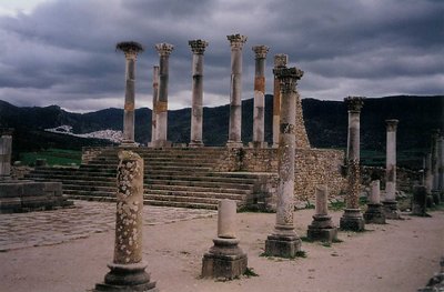
I think the basic composition is very good. There are small details that needed to be addressed, like the base of the nearest column being cut off slightly, and the stone blow in the lower right corner (could be cloned out). The lighting is too dark for me, at least. The contrast for the stonework can be increased, while the clouds and hills can be kept as is. The left side could be cropped to remove the portion of the stone base. It's a good effort though, and its appeal is readily apparent.
Amy, it is a nice photo. Just ask yourself, what do I want to tell with my picture. I think it is a bit too cluttered to effectively convey a message. Still, good job.