|
|
|
Andre Fersen
{K:1679} 6/12/2003
|
The back does look artificial, but it's an effect I could use. How was it done?
|
|
|
|
|
Marek Krol
{K:9791} 5/28/2003
|
Nice play on the word decorated :P Now tell me how big was your FCB? ;) Was the original backgroundtoo messy?
|
|
|
|
|
Ron Bergeron
{K:262} 5/27/2003
|
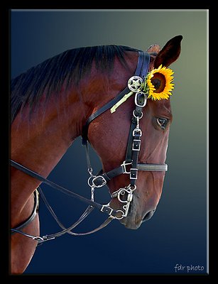
The horse looks great, but the background looks too artificial. I think that a selective blur of the background would have been better than completely replacing it with a gradient fill. I like the horse's pose and the bright yellow flower really stands out well.
|
|
|
|
|
Judy Kessler
{K:6316} 5/27/2003
|
Splendid work. One of my favorites!
|
|
|
|
|
Yiannis Gabrilis
{K:2548} 5/27/2003
|
Beautiful portrait, nicely composed, like the gradient background.
Regards
|
|
|
|
|
Marco Grandi
{K:16680} 5/27/2003
|
Nice portrait,Uncle!Well composed.Great light and perfect DOF!
Bye Marco.
|
|
|
|
 Andy Simmons
{K:7704} 5/27/2003
Andy Simmons
{K:7704} 5/27/2003
|
The colors here are subtle, the horse against the dark background. But the flower is bright yellow, so it really stands out, as do the metal links of the tack. The use of the color contrast really adds impact to the photo. Furthermore, the content is amusing. Good work, and technically perfect too.
|
|
|
|
|
Derek Kennedy
{K:2270} 5/27/2003
|
beautiful portrait. Lovely detail but, i find the backgound seems a little too 'phony'.
|
|
|
|
 Dick van Breda
{K:4655} 5/27/2003
Dick van Breda
{K:4655} 5/27/2003
|
Very good shot. Great sharpness and colors. I like it very much. Great job you did here. Regards, Dick
|
|