|
|
 Kelly Duntley
 {K:13889} 4/2/2006
|
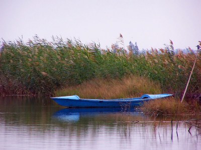
I love boat images. I am tied to the water for some reason. I love this capture. The serenity is awsome. The small splash of blue is an excellent find on the river bank. The texture of the grasses is very allurig and graceful.
Kelly
|
|
|
|
 Engy Farahat
{K:11591} 2/27/2006
Engy Farahat
{K:11591} 2/27/2006
|
Peaceful shot Yahya. beautiful composition.
and fantastic colors. excellent clarity.
well done
ng..
|
|
|
|
 Ina Nicolae
{K:44481} 2/5/2006
Ina Nicolae
{K:44481} 2/5/2006
|
Hi Yahya, I couldn't agree more with Mark Longo, the sepia version is my preference too, for the same reasons that he's stated. Regarding the light color sky, you can add a bit of gradient to soften the contrast. The bird is a kingfisher, a rare capture! Lovely blue boat, very painterly and romantic in both versions! Ina
|
|
|
|
 Alberto Romano
{K:2407} 2/5/2006
Alberto Romano
{K:2407} 2/5/2006
|
Wonderful image!
Great composition and lovely tones...Amazing contrast...
Great work
Congrats
Alberto
|
|
|
|
 vanessa shakesheff
{K:68840} 2/4/2006
vanessa shakesheff
{K:68840} 2/4/2006
|
Lovely image and great colours.best wishes nessa
|
|
|
|
|
Galal El Missary
{K:84569} 2/3/2006
|
Beautiful composition , Great colors & reflections .
Galal
|
|
|
|
 Mohamed Banna
{K:34237} 2/3/2006
Mohamed Banna
{K:34237} 2/3/2006
|
love the blue boat here
amazing peaceful shot
great composition dear Yehia
perfect reflections
well done
|
|
|
|
 Mark Longo
{K:12760} 2/3/2006
Mark Longo
{K:12760} 2/3/2006
|
The colors are very pretty and I think the blue of the boat creats a nice standout. But I personally prefer the sepia version of this. In the sepia version that the flatly colored sky helps the meloncholy mood of the comnposition whereas here is seems to detract slightly. Also, the natural elements of water and vegetation seem to be in more harmony in the sepai version. The lighting of this shot seems better suited to a monochrome treatment where is can briung a more moody feeling and seems to be more thought provoking somehow... Both are excellent, but I credit your eye more in seeing the possibilities of the sepia version. My personal preference anyway! Great work my friend!
Mark
|
|
|
|
 Yahya El Hosafy
{K:8369} 2/3/2006
Yahya El Hosafy
{K:8369} 2/3/2006
|
Hey Zahraa, nice to be hearing from you again, and thanx for the many comments :)
i did try this level of color boosting, but i felt that i separated the forground from the background, the sky color fades at the middle too u feel that the forground has a sort of a reddish scheme, the one i posted has a general blue color scheme that keeps the photo together i guess.i addmit it looks pale though.
Guess what, i did took some interesting MACROs there too, the type of photography you like :)
stay tuned ;)
|
|
|
|
 AlZahraa Sulie
{K:7255} 2/3/2006
AlZahraa Sulie
{K:7255} 2/3/2006
|
I truly like the coloured version of it too!
I gave the colours a little bit of a boost,
Check it out, just out of experimenting.
All the best,
Z.S
|

Resting |
|
|
|
 Gorilla K
{K:17526} 2/3/2006
Gorilla K
{K:17526} 2/3/2006
|
very beautiful still life and nice color!!!
best regards,
Winfried
|
|
|
|
 Kambiz K
{K:37420} 2/3/2006
Kambiz K
{K:37420} 2/3/2006
|
Salam
very good composition and wonderful details and contrast
|
|
|
|
|
waldemar ebner filho
{K:5242} 2/3/2006
|
Yahya,
Excellent colors and tones,beautiful scenery and composition.Hug
|
|
|
|
 Kathy Hillard
{K:25721} 2/3/2006
Kathy Hillard
{K:25721} 2/3/2006
|
I can't decide which I like best Yahya. I really liked the tones of last night's post, but it looks good in color also! Very nice reflection!
Kathy
|
|