|
|
Critique By:
Hugo de Wolf (K:185110)
6/9/2004 9:48:07 PM
There's an incredible sadness about this shot. Looking back at the one where she sits at the same table with her bra on, the strength in this portrait is created by the less forced pose. It's a more natural scene, a view taken from everyday life. Looking at this one, I do agree with In Transits' comment on the previous one.
The DOF is excellently shallow. And maybe it's not so much of sadness as well as unhappyness about the burden of everyday life I see in this girl's eye. Very moving shot. Excellent capture!
Cheers,
Hugo
|
| Photo By: zosia zija
(K:11106)
|
|
|
Critique By:
Kristina Kohut (K:49990)
6/8/2004 3:35:10 AM
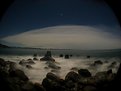
Video lens adaptor... is that what makes it look like horizon is bow formed, and adds that dark on top sides? It looks very interesting and mystical! Also such fantastic scene and view! I don't know if that little red spot in distance is the sun, or perhaps just a lighthouse or something, but it's really incredible that it is so small and still adding so much extra! And the water, flowing like soft fluff among the rocks... mmmmm. Very beautiful, Ian!
|
| Photo By: Ian McIntosh
(K:42997)
|
|
|
Critique By:
Mark Beltran (K:32612)
6/8/2004 3:48:12 AM
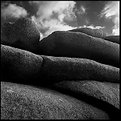
This is a little more complex than the other one. But it's no less spectacular. Just a totally different composition. I like the texture of the rock, contrasting yet harmonious with the sky. Very nice, rich tones.
|
| Photo By: Simon Crinks
(K:-54)
|
|
|
Critique By:
Saeed Al Shamsi (K:47735)

6/6/2004 8:23:45 PM
The moon isn't moving so fast relative to your camera. Therefore, it's always a good idea to bracket your exposure. For full moon shot, in addition to 1/250 and 1/500 at f/16, you could give a little less exposure by making a photo at 1/1000 at f/16, and a little more by shooting at 1/125 at f/16. You can achieve the same bracket of exposure by keeping your shutter speed at 1/250 but using different aperture openings, such as one exposure each at f/16, f/22, f/11 and f/8.
You need to turning off your auto exposure and setting your exposure manually when you photograph the moon. The main reason is that when you point your camera at the full moon, the moon is a little bright spot in a sea of darkness. Your automatic metering will give too much emphasis to the dark sky and therefore request for too much exposure with the result that the moon will be overexposed.
Another reason to exposure manually and to bracket your exposure is that the exact amount of light coming from the moon will depend in part on how clear the sky is when you make your photograph. High humidity, dust in the air if it is windy. More exposure needed at sea level or low altitude like UAE. These factors will require small exposure changes.
Finally the best you bracket your exposure, means that you make a photo at the setting you think is correct, but you also shoot the same subject several times, making slight changes in either the shutter or aperture TRIPOD AND RELEASE CABLE MUST. Attached two image one of evening (day) moon and the eclipse( not that good). I hope it is useful info. Saeed
|
| Photo By: Amna Al Shamsi
(K:21795)
|
|
|
Critique By:
Kevin Collier (K:19076)
6/5/2004 2:33:40 AM
Chuck, I can see the whole tradition of southern photographers in your work. You are carrying on the great tradition on William Chistenberry and Walker Evans...but with your own personal vision...great stuff.
My father is from the south, North Carolina, and your images take me back to the road trips there from southern California in the late 50's/early 60's...again exceptional portfolio.You also add a great hisorical touch with your commentay. The older photo's with the notes on film, print size and paper add great significance to older photographers (not that we are that old) that learned the craft during many hours in the dark, thanks for the memories.
Kev
Kev
|
| Photo By: Chuck Freeman
(K:13616)
|
|
|
Critique By:
Mark Beltran (K:32612)
6/3/2004 7:05:25 AM
It looks like it's been worked quite a bit with all that burning in and dodging. But the bottom line is that it's done well. The statement comes across not right away, but when it does, it's like a revelation.
|
| Photo By: Ron Browne
(K:1282)
|
|
|
Critique By:
Bradley Prue (K:30678)
6/2/2004 4:23:04 AM
Giannis, I love this shot...especially the tones that you have developed. I hope you don't mind me offering a peek at a more tightly cropped version. I think more emphasis on the vertical lines works here. Great shot ..Brad
|
| Photo By: Johnny K
(K:12635)
|
|
|
Critique By:
Neil Dolman (K:26883)
5/31/2004 8:41:39 PM
Hi Ian, i have to give you a +6 for this one (that is from me an excellent ;-)) Why well i admire your courage and creativity. You have something that i wish i had. When i look at my own portfolio i find them all to tame, almost boring, too safe. But when i look at yours i can see the work of an artist - i mean that sincerly!
This one i find a little dark and sinistre, but i can see a good photo in it. My congrats and best wishes - your friend, Neil
PS: The rivets on the roof are stones holding the slating down! It's quite common here.
|
| Photo By: Ian McIntosh
(K:42997)
|
|
|
Critique By:
Richard Marriner (K:6657)
12/19/2003 5:53:42 PM
Yeah I can see an uncertain smile lurking in the background... Very nice abstract work Alisa.
|
| Photo By: Alisa Mudge
(K:7511)
|
|
|
Critique By:
Mary Sue Hayward (K:17558)
5/30/2004 1:30:51 PM
Perfectly dreamy. This has that ethereal quality that you capture so well. Somehow it feels that a step into the image would lead you to a wonderful world where the breeze is cool, the sunshine warm, and troubles are far away. Really nice, John.
Technical question: On the 4 shots that were panned, what is the range of pan? Hope that question makes sense. I am curious if you moved the camera just a little bit (it doesn't look slight big motion blur) or if you moved it so that the entire field of view whooshed past in the viewfinder.
Also...was each of the 4 shots a blur of the same field of view, or of a different segment?
Obviously I need to reread Patterson and Gallant's book, Photo Impressionism, but maybe you can share some insight too.
Again, LOVELY image.
|
| Photo By: John Barclay
(K:3650)
|
|
|
Critique By:
Gerry Pacher (K:7303)
5/27/2004 5:10:27 PM
Dear Megan, I like your composition - it's a first great step into the right direction. The headlight is a little bit to bright (perhaps a diffuser will help) and the sheet at the right corner below is a little bit dark. In such cases I use a flash and it helps (in most cases).
And by the way, I like the background - it's perfect.
Regads, Gerry
|
| Photo By: Megan McCluskey
(K:3762)
|
|
|
Critique By:
Christian Barrette (K:21125)
5/25/2004 12:43:15 PM
Excellent exposure of the sky makes that predominent part interesting to look at. Otherwise, the low horizon, the figure set at the first third on the left, and the open space ahead of his walking direction, are all elements of a well composed image.
|
| Photo By: Dhimant Vyas
(K:2509)
|
|
|
Critique By:
ARMANDO ALCÁZAR (K:42404)
5/21/2004 2:59:15 AM
Dan: The picture is excellent and I don't have none criticize for it. With reference to your stepchildren and your friends' of Usefilm godchildren, I can tell you for what you narrate that you are making an excellent work as mother substitute, it is very well that you put them alive food so that they look for it by themself, because that will prepare them for the real life. There is a final part that you will have to make if you want that they are not in danger when coming closer to the humans, I have experience in that because I have returned to the nature several breedings of birds of prey. This can break your heart, but when they can already be worth by themselves you will teach them to fear the humans, frightening them with branches every time that they are brought near you, or requesting to your friends that make it when they come closer to them, this should be made until they have distrust and don't come closer to people, although it sounds hard it is necessary for their own welfare, because nobody knows to what kind of person they will come closer.
|
| Photo By: Dan Lightner
(K:12684)
|
|
|
Critique By:
Jonathan Wollin (K:958)
5/16/2004 12:36:01 PM
This portrait is a beautiful example of how a simple pose can catch the eye of the viewer. The model is wonderful, elegant, sensual, beautiful. The mood is perfect. You have caught very well the expression. If you look at the model the light that goes to the model is also coming to the background. That is because you used just one strobe (or used natural light) and the model was too close to the background. So separate the model to the background and use the two lights? If you wanted to try something different next time. That simple way you will be able to stand out the model. Nice picture. Thanks for sharing. And don't forget to do want makes you smile  , thanks for your time. , thanks for your time.
|
| Photo By: Tamara L
(K:1387)
|
|
|
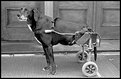
Critique By:
Bill Morgenstern (K:7157)
5/17/2004 2:12:40 AM
Perfect control of your exposure to obtain such a fine tonal range. Thanks for showing such aunique image of this dog. He is one determined guy and his owner is a fine person to rig this up for him. I'd send this in for consideration for publication to the Humane Society.
Regards - Bill
|
| Photo By: Dennis Couvillion
(K:165)
|
|
|
Critique By:
Roger Williams (K:86139)
5/17/2004 5:38:24 AM
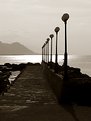
It's VERY difficult to put into words what you look for in an image. I've just spent 6 months on Usefilm trying to learn how to comment truthfully on what I like about the wonderful photos to be found here. I notice you use a Bessa and 35mm lens. That's a combination I often use (though 21/4 is more common these days). In this one, I like the way it still works well after breaking the "rule" on splayed verticals (feels quite natural to me, as if I really were looking up). I like the warm blacks (slight sepia toning?), and the depth of field that keeps nearby flag and distant buildings all sharp. I love both the almost stereoscopic sense of perspective, and the realistic rendering of the various textures, particularly the ornate lamp and the patterns in relief on the wall (both on the right). Even so, the overall effect is greater than the sum of these individual attractions. Great shot! And congrats on POD!
|
| Photo By: John Strazza
(K:11535)
|
|
|
Critique By:
Lee Harris (K:14694)
5/17/2004 3:12:25 AM
Bobby this is absolutely awesome.
The detail is tack sharp, the lighting and shadows are perfect.
The neon soft background not only brings the subject right out at you, but it also adds very much to a even color flow for a fantastic composition.
I would like very much to see the other one as well...hint hint
Adding to my favorites.
Lee
|
| Photo By: Bobby Mun
(K:3709)
|
|
|
Critique By:
John Hatziemmanouil (K:40580)
5/15/2004 10:13:15 AM
Hallo Gunter. Except that the pland is really something original (I love the top of the leafs, very nice shape) the photo has rich lighting support and at the same time gives nice tone scales! Great strong colours too! (again for this the lighting adds a lot)
See you!
|
| Photo By: Günter Koth
(K:13841)
|
|
|
Critique By:
Terry McCully (K:9221)
5/13/2004 8:59:05 PM
WOW... VERY VERY cool... I'm not sure how you modified your camera to keep the shutter open for this long.. I though Polaroid cameras were simply point and shoot with no shutter options. No matter how this was done.. its one of the very very few Polaroid star trail photos that I have ever seen. Great submission here in the Alternative Process catagory. Some information on how you did this using your Polaroid camera with a Mamiya lense would be helpfull. Or was it just a Polaroid back unit on a med format camera ?
|
| Photo By: Kevin King
(K:139)
|
|
|
Critique By:
George T. (K:73)
5/13/2004 5:41:16 AM
This is an outstanding capture of an emotional moment, puntuated by the clutching of the hand that is skillfully framed in the center of the composition. You could almost feel the little girl pulling down on it with all her strength and determination. I also like the adult perspective looking down on the child, whose face is partially revealed. I don't know why she is crying, but I am intrigued by her gown, which looks like a party dress or a ballerina outfit. Perhaps she was experiencing stage-fright or simply didn't want to leave a festive party with her playmates. Would love to know the story behind the image. Outstanding job, Dina. 6.5+ rating
-George T.
|
| Photo By: Dina Marie
(K:-1410)
|
|
|
Critique By:
David McClenaghan (K:9481)
5/10/2004 1:01:31 AM
Great portrait and very interesting angle Johann.
You have really captured something about this lady and the eyes are absolutely stunning.
Only problems I see are that the highlights are ever so slightly blown out (not easy to avoid with such fair skin tho) and their is some kind of reflected light which is throwing a shadow upwards on the line under her right eye.
Possibly the umbrella or diffuser was at a relatively low angle and her upwards tilt has made the light pick up on that line. I would not remove the line but i would soften the shadow a bit in photoshop.
|
| Photo By: Johann Pinto
(K:-720)
|
|
|
Critique By:
C W (K:4458)
5/11/2004 4:39:21 AM
Very beautiful Vikram! I just came across the same quote by Dorothy Lange and it is so true. Isn't it? I think we (photographers) see so much differently than the average person. Sometimes this can be good and at other times it can be bad. At any rate, lovely shot!
|
| Photo By: Vikram Bose-Mullick
(K:554)
|
|
|
Critique By:
Al S (K:5131)
5/8/2004 11:41:58 PM
Great shot Adam! Interesting subject and you've shot it well! Nice patterns of the structure too!
I totally agree with you about the future being now, infact I always say how lucky we are to be living in these times where the future really is now. But I guess that has always been and will always be the case? Great topic for discussion isn't it?
Cheers
Alan
|
| Photo By: Adam Borkowski
(K:1335)
|
|
|
Critique By:
Terry McCully (K:9221)
5/7/2004 6:29:04 PM
7/7 for this fantastic looking Pinhole photo here. I never used a Zero 2000. I have however created my own pinhole camera from a coffee tin if you care to view my pictures. You just have to love the unlimited DOF with pinhole pictures. I also like the color of the image...Photoshop? I'm taking a closer look into your pictures on this site after I finish writing this to you in hopes that there is also come other pinhole images. As for this one though.. It's a wicked pinhole that you should be proud of.
|
| Photo By: Petros Pavlopoulos
(K:366)
|
|
|
Critique By:
Bill Morgenstern (K:7157)
5/6/2004 12:57:49 PM
Liling - this is a very dynamic image. You have done a fine job capturing the motion of vehicles in this timedexposure. I like the reflecting lights that come in from upper left and merge with the movement of headlights. This keeps a focus in the frame. Your sky is good also.
I think you are following in your father's footsteps from viewing this image and your portfolio. Very good so keep exploring with your camera.
Thanks for your comment on my image also.
Regards - Bill
|
| Photo By: liling wee
(K:251)
|
|
|
Critique By:
Sérgio Vieira (K:3384)
5/5/2004 4:16:17 PM
Amanda,
I think this is one of your best photos here!
This is so well done... the proportions, the angle, the softness, the red and it's shadows...
There is one thing though that bothers me, the framing. Horizontally I think is quite good that those shadows were left out of it. They would unbalance the composition. You could howhever changed the angle a bit? I think I would like a litle more spacce there. But vertically I think you should have left more space above rather then bellow the flower. If you think in terms of colours, and thats what your photo is about, the stem doesn't have a relevant part in there. Your composition includes it as relevant for it. I just think you should have given it a lesser role in it.
But that is just a detail Amanda, I really like this photo. I'm sure you have more of those, just upload them!
Rated it 6 for:
originality (as always)
great eye
composition
colour
I didn't rate it 7 (EC like quality) for:
framing
Best regards,
Sérgio
|
| Photo By: Amanda Hensley
(K:360)
|
|
|
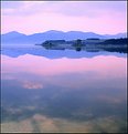
Critique By:
Roberto Arcari Farinetti (K:209486)
5/3/2004 7:56:10 AM
hello jan..
I am bewitched in front of therefore much beauty. simple effect of the nature an optimal linear composition and the "castles" that seem alive. to stan out and to exit from the lake! it was not that discounted to be scozia... a simple and and mysterious earth with its open spaces! I have not never seen it "from the alive one" but always through photo of great testimonies!
7 and praise
cheers
roby
|
| Photo By: Jan Symank
(K:22030)
|
|
|
Critique By:
Natalie Papadopoulos (K:5247)
9/27/2003 6:40:10 AM
tamara this is really beautiful. lovely soft lighting and great expression. i think the shadow of her on the wall really says a lot about the mood - seeing that her back is so rounded adds a lot of emotion. Congrats!
|
| Photo By: Tamara L
(K:1387)
|
|
|
Critique By:
Keith Naylor (K:13064)
5/1/2004 10:22:12 PM
Hi Chris, thanks for posting the orig file, that give me a good feel for your work. I agree with all the work you have done here, it needed doing.
The main thing I get from this photo is that the grass takes on the most important element in the frame. I think this is because itscentral and the brightest. Maybe try to tone it down a little, or, and I think this might be the better option, step right a little to get the house to fill more of the frame than the 50% it does now.
Hopr that helps a little.
Cheers
Keith
|
| Photo By: Chris Spracklen
(K:32552)
|
|
|
Critique By:
John Williamson (K:1145)
4/30/2004 11:03:25 PM
Unbelievable! I love this picture. The tones are amazing and the definition in the surf is almost surreal. It is a gorgeous all-round picture. The only suggestion I would have is to see if you could re-take the shot without people in the view. I realize how difficult it would be to recapture the exact same feeling or mood, but it may be worth the effort to try. I would say to crop also, but you wouldn't want to loose the horizon so possibly crop off to the side vertical, that may work. Again, great picture!
|
| Photo By: JL E
(K:9693)
|
|