|
|
Critique By:
Barry Henshaw (K:343)
4/7/2005 12:45:13 PM
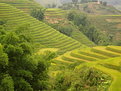
A pleasant scene well captured. I would to have more of the rice terrace on the right included to lead me into the picture more.
|
| Photo By: kemal servi
(K:49)
|
|
|
Critique By:
Barry Henshaw (K:343)
4/7/2005 12:41:01 PM
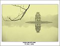
Lovely lighting and colours, misty atmosphere. The twig from the tree I find really distracting. I hope you took some without it.
|
| Photo By: Nason Nguyen
(K:648)
|
|
|
Critique By:
Barry Henshaw (K:343)
3/16/2005 1:53:59 PM
Well seen, good composition. I would crop off the bottom part to exclude the sky, to give it more impact.
|
| Photo By: Pawel Sadowski
(K:288)
|
|
|
Critique By:
Barry Henshaw (K:343)
3/16/2005 1:36:56 PM
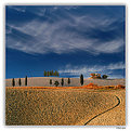
I really like the cloud formations, like waves. Great colours! Where was this taken, looks like Tuscany.
|
| Photo By: Paolo Pagnini
(K:828)
|
|
|
Critique By:
Barry Henshaw (K:343)
3/16/2005 1:25:48 PM
Excellent photo, love the colours.
|
| Photo By: Castillion .
(K:1570)
|
|
|
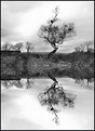
Critique By:
Barry Henshaw (K:343)
3/16/2005 12:52:49 PM
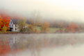
I like the misty soft lighting, lovely colours. The colour near to the house is quite dominate, I would tone this down slighty. Did you take some photos of just the reflections? These are beautifully difussed.
|
| Photo By: Evangelos Koutsavdis
(K:379)
|
|
|
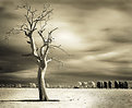
Critique By:
Barry Henshaw (K:343)
3/16/2005 12:48:29 PM
great infrared effect. One of the best digital IR photos I've seen
|
| Photo By: Juergen Kollmorgen
(K:6)
|
|
|
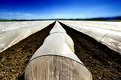
Critique By:
Barry Henshaw (K:343)
3/16/2005 12:43:55 PM
Good use of wide angle but I find the plastic dominates the landscape too much. Maybe be a higher position would have worked better.
|
| Photo By: WALT MESK
(K:10691)
|
|
|
Critique By:
Barry Henshaw (K:343)
3/15/2005 2:13:34 PM
Yes I thought the reflection was too good to be true, also the reflection is usually darker than the sky. Good idea and sharp but not really for me.
|
Photo By: KEVIN TEMPLE
(K:8657)

|
|
|
Critique By:
Barry Henshaw (K:343)
3/9/2005 10:05:58 AM
Great shot from a fairly straitforward subject.
|
| Photo By: Manu
(K:13082)
|
|
|
Critique By:
Barry Henshaw (K:343)
3/9/2005 10:03:09 AM
Sharp enough and I like the colours. Could be more creative with the composition. Pity about the white marks on the leaf.
|
| Photo By: Yusuf Y
(K:804)
|
|
|
Critique By:
Barry Henshaw (K:343)
3/9/2005 9:59:21 AM
I like the steps and composition. The front steps are slightly out of focus which is a shame as they are in a dominate part of the photo. I do not like the person, I find the red colour to be out of context with the rest of the picture, I would prefer if he was not in colour.
|
| Photo By: Yusuf Y
(K:804)
|
|
|
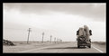
Critique By:
Barry Henshaw (K:343)
3/9/2005 9:53:18 AM
The main problem I think is the printing, it lacks depth and is gray, not black and white. Not sure how it was printed but needs more contrast.
Were the poles really leaning over like that?
|
| Photo By: Andy Ly
(K:716)
|
|
|
Critique By:
Barry Henshaw (K:343)
3/7/2005 1:56:53 PM
Good idea. Interesting use of depth of field or lack of. Not the sort of photo I can look at for long though.
|
| Photo By: John Griep
(K:2521)
|
|
|
Critique By:
Barry Henshaw (K:343)
3/4/2005 1:43:27 PM
This I take it the same as the colour photo of this scene converted to B&W. Where as the colour one which I prefer is a little dark, this I find to be too light and lacking contrast. Increase the contrast to make it more black and white than grey.
|
| Photo By: Zbigniew Biejat
(K:243)
|
|
|
Critique By:
Barry Henshaw (K:343)
3/4/2005 1:39:31 PM
More good photos, a tad heavy in the foreground.
|
| Photo By: Zbigniew Biejat
(K:243)
|
|
|
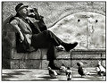
Critique By:
Barry Henshaw (K:343)
3/4/2005 1:36:29 PM
Great shot, the pigeon makes it. Slight distortion due to wide lens is the only critism. Could be corrected in Photoshop.
|
| Photo By: Zbigniew Biejat
(K:243)
|
|
|
Critique By:
Barry Henshaw (K:343)
3/4/2005 1:33:15 PM
Lovely subtle colours, soft lighting suits the subject.
|
| Photo By: Zbigniew Biejat
(K:243)
|
|
|
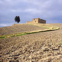
Critique By:
Barry Henshaw (K:343)
3/4/2005 1:11:07 PM
Pleasant shot but I find this overexposed, the lighting is flat also. Too much foreground. I think there is a better view from the gate where the track leads you up to the house, try again early or evening. Polariser may help to saturate the colours.
|
| Photo By: Domenico Franco
(K:1381)
|
|
|
Critique By:
Barry Henshaw (K:343)
3/3/2005 2:06:38 PM
Excellent lighting, really makes this photo. Is this near Siena.
|
| Photo By: Francesco Martini
(K:12249)
|
|
|
Critique By:
Barry Henshaw (K:343)
3/2/2005 2:13:22 PM
Not a bad effort, I would crop off the bottom half of the foreground as out of focus and there is too much of it. Also you should use a slower film ASA 100, try Fuji Reala for prints or Fuji Sensia for slides and a tripod and you would get much sharper images. Could try using a grey grad filter to daren the sky.
|
| Photo By: Alex Hadley
(K:9)
|
|
|
Critique By:
Barry Henshaw (K:343)
3/2/2005 9:21:55 AM
Pretty weird, you have done well to get a photo out of this scene, but not my cup of tea.
|
| Photo By: Zeev Scharf
(K:25603)
|
|
|
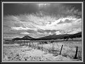
Critique By:
Barry Henshaw (K:343)
3/1/2005 2:01:29 PM
A lovely simple image. Pity about the reflection going into the dark area. Not sure if it would be better if the reeds went a bit higher to break horizon, top of reeds against the sky.
|
| Photo By: Alessandro Lavagna
(K:2231)
|
|
|
Critique By:
Barry Henshaw (K:343)
3/1/2005 9:31:17 AM
Good scene and well captured. Only thing I would do is get rid the brightness at the top of the photo. You could burn this in or crop it off. Yes the snow does look like sand.
|
| Photo By: Lori Stitt
(K:75282)
|
|
|
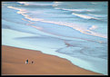
Critique By:
Barry Henshaw (K:343)
3/1/2005 9:17:41 AM
Lovely scene well captured. Fine lighting. Composition works well. Not sure you needed to enlarge the figures, maybe you could post the original photo. The exposure looks a little on the light side, just my taste as slide worker.
|
| Photo By: ken krishnan
(K:19102)
|
|
|
Critique By:
Barry Henshaw (K:343)
3/1/2005 9:09:07 AM
Good colours and reflections. As the main subject is the cousins need to go into closer and have horizon higher in the photo. Try cropping top 1/4 off to see what I mean. Also need to seprate the three children as one is obscuring the other.
|
| Photo By: Sian
(K:2487)
|
|
|
Critique By:
Barry Henshaw (K:343)
2/28/2005 3:04:31 PM
I have been asked to rate this so here goes. There are some good colours but I find there is too much included and the stalks in the foregrond are distracting. The depth of focus is shallow for digital try to use a small aperature f8 or more. I would try to pick out one flower like the lupin and then frame by the blue and yellows in the background, make sure there are no distractions in foreground/background.
|
| Photo By: Coral Barclay
(K:321)
|
|
|
Critique By:
Barry Henshaw (K:343)
2/28/2005 2:56:54 PM
A good view from this terrace. Not sure about the composition here, could lose the plants pots or include them both, I find it a bit messy. The pigeon does add but sloping terrace is distracting. Great sky.
|
| Photo By: Luigi Parisi
(K:1167)
|
|
|
Critique By:
Barry Henshaw (K:343)
2/28/2005 2:49:27 PM
Good shot. I would have cropped off the right hand side from the gap in between the pigeons, I find this side a bit bright.
|
| Photo By: Luigi Parisi
(K:1167)
|
|
|
Critique By:
Barry Henshaw (K:343)
2/28/2005 2:45:08 PM
Well seen and I like the colours. Lighting a touch bright for the subject maybe. A diffuser filter may benefit this sort of photo
|
| Photo By: Luigi Parisi
(K:1167)
|
|