|
|
Critique By:
Paulo Sézio de Carvalho (K:2273)
10/28/2006 5:11:31 AM
Bom trabalho
|
| Photo By: Sandra Esher
(K:3)
|
|
|
Critique By:
zero kid (K:94)
7/11/2005 1:11:30 AM
"punctum"... interessantísima cena... que olhar revelador. boas fotos...
|
| Photo By: Sandra Esher
(K:3)
|
|
|
Critique By:
greg goodwin (K:7089)
7/6/2005 7:54:43 AM
great landscape shot... love the use of b&w
Greg
|
| Photo By: Sandra Esher
(K:3)
|
|
|
Critique By:
Marcos Benedicto (K:1100)
5/13/2005 5:16:33 PM
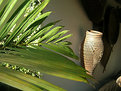
Oi Shan, você teria duas opções nesta foto, uma seria deixar aquele ganho dividir os dois ambiente, chão X arvores... ou focar mais o cogumelo.
[]?s
Marcos
|
| Photo By: Sandra Esher
(K:3)
|
|
|
Critique By:
Alberto Calheiros (K:2647)
5/3/2005 4:21:36 PM
Olá Sandra, pena o cogumelo ( amanita muscária)não estar focado!
Mas gostei de ver, adoro cogumelos!
Beijos!
|
| Photo By: Sandra Esher
(K:3)
|
|
|
Critique By:
DELETE ACCOUNT (K:5655)
4/26/2005 6:19:20 PM
Good abstract shot. You should take the timestamp off on your camera. Interesting title. It makes you wonder who "he" is.
|
| Photo By: Sandra Esher
(K:3)
|
|
|
Critique By:
DELETE ACCOUNT (K:5655)
4/26/2005 6:16:14 PM
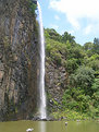
Beautiful photo. I would like to see a little more of the top of the falls as the sky really helps to create the appealing nature of this photo. Nice work.
|
| Photo By: Sandra Esher
(K:3)
|
|
|
Critique By:
H t (K:568)
4/18/2005 12:33:20 PM
cheers
|
| Photo By: Sandra Esher
(K:3)
|
|
|
Critique By:
Jim Gamble (K:12164)

4/16/2005 2:29:35 PM
Sandra, another great photo, another great angle.
Have to say though, I'm with Cetin about the date, it distracts from the photo.
Jim Gamble
|
| Photo By: Sandra Esher
(K:3)
|
|
|
Critique By:
Cetin Ozer (K:2732)
4/16/2005 2:22:57 PM
Dear Sandra,
I like "New Angle" but the date on the photograph
isn't good for the image.. isn't it? 
|
| Photo By: Sandra Esher
(K:3)
|
|
|
Critique By:
Jim Gamble (K:12164)
4/13/2005 11:56:23 AM
Interesting angle
I like it
Jim Gamble
|
| Photo By: Sandra Esher
(K:3)
|
|
|
Critique By:
Ray Witter (K:6149)
4/10/2005 3:49:40 AM
Sandra,
Glad to see you keeping up the good work, this is a great intimate portrait. Great lighting, and excellent composition, the only suggestion I might have is to crop it a little to get rid of the bright window light in the upper left hand corner. Let me know what you think.
Reguards,
Ray W.
|
| Photo By: Sandra Esher
(K:3)
|
|
|
Critique By:
C.A. Mikulice (K:13300)
4/4/2005 6:43:03 PM
sandra-- repost the picture, please-- it seems to be gone...
|
| Photo By: Sandra Esher
(K:3)
|
|
|
Critique By:
ahmet özkan (K:7216)
3/16/2005 11:46:38 AM
so beautiful..
|
| Photo By: Sandra Esher
(K:3)
|
|
|
Critique By:
Ray Witter (K:6149)
3/11/2005 9:57:36 PM
Sandra,
Both this image and your earlier one entitled "Big Flower" are excellent color compositions with good detail and great colors. However, they both have overexposed highlights, sometimes called "blown out", this is not the fault of the camera, but because you probably took the images in bright sunlight. The problem is one of dynamic range, i.e. the difference between the brightest part of the image and darkest exceeded the capability which the ccd chip in your camera could record (same thing happens with film by the way). When taking photos in these conditions, you have to choose between exposing the highlights correctly and losing detail in the shadows, or retaining detail in the shadows and blowing out the highlights, neither of which is the optium choice. One solution is to take the photos when the difference between the brighest part of the subject and darkest is not so great. This can be done by taking the photo on an overcast or foggy day, taking it when the entire subject is in shadow, or taking it just before or after sunset or sunrise when the light is better. Bright midday sunlight is usually just about the worst conditions to shoot color in, if you want to retain detail throughout the image. You might try to reshoot these images under several of the above conditions and see the difference.
Keep up the good work and take lots of photos.
Reguards,
Ray W.
|
| Photo By: Sandra Esher
(K:3)
|
|
|
Critique By:
Marcos Benedicto (K:1100)
3/11/2005 4:30:20 PM
Esta ficou bem legal tbem!
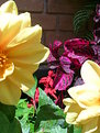
A unica coisa é sobre o macro e a claridade, quando pegar uma imagem de macro você não pode deixar que os detalhes da imagem fiquem fora da foto talvez fosse legal abrir um pouco mais o zoom e depois dar crop, quanto a claridade.. a foto de macro é dificil mesmo, para você conseguir bastante cor não pode deixar entrar muita luz, talvez tirar a foto de algum lugar sem sol, assim você aumenta as cores e define melhor a imagem.
Beijo!
Marcos
|
| Photo By: Sandra Esher
(K:3)
|
|
|
Critique By:
Marcos Benedicto (K:1100)
3/11/2005 4:24:49 PM
Oi, Shan!
A foto ficou legal mesmo, mas quando não quiser tirar "macro" e quiser foco em toda a foto pode setar a máquina para "paisagem", neste tipo de foto a perspectiva da bicicleta é o que mais chama a atenção então tirando o foto da manopla você acaba perdendo um pouco das linhas.
Ah, fica mais legal sem a data mesmo. :-)
|
| Photo By: Sandra Esher
(K:3)
|
|
|
Critique By:
Ray Witter (K:6149)
3/5/2005 1:54:00 AM
Excuse me, that should have said, "lower left cornor"
Ray W.
|
| Photo By: Sandra Esher
(K:3)
|
|
|
Critique By:
Ray Witter (K:6149)
3/5/2005 1:51:42 AM
Sandra,
This is a great B&W composition, the lines of the frame lead the viewer's eye right into the central point of interest, the brakes. The combination of horzional, vertical, and diagonial lines and the circle formed by the wheel really make a excellent image. Even the handlebar being out of focus, gives the image a great sense of depth. The only criticism I have is the white spot in the lower right hand cornor, and the silly date stamp. turn the date feature off on your camera if you can. You say in your bio, that you're not a photographer, but will be someday, Well, I think you have reached that day.
Excellent Work!
Reguards,
Ray W.
|
| Photo By: Sandra Esher
(K:3)
|
|
|
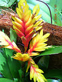
Critique By:
Peter Daniel (K:33866)
2/26/2005 7:05:37 PM
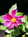
Wonderful Photograph Sandra, Great colors, clarity and Composition. Could be posted bigger. I feel it needs some of the left and bottom cropped to keep your attention on the main part of the flower.
Thanks for sharing?
Peter Daniel
|
| Photo By: Sandra Esher
(K:3)
|
|
|
Critique By:
Vlad Sournine (K:2397)
2/15/2005 2:35:43 PM
Very interesting: vertical of mountain & of fountain is equal. Nice composition. But a few free place in top of shot.
|
| Photo By: Sandra Esher
(K:3)
|
|