|
|
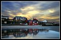
Critique By:
Kyle Turgeon (K:727)
2/25/2005 2:22:45 AM
Very cool, very cool. Very interesting sight and composition. How do you get all of your photos to take on such an "artsy" effect?
|
Photo By: andree lerat
(K:17476)

|
|
|
Critique By:
Kyle Turgeon (K:727)
2/18/2005 3:09:30 AM
Here is the other image. Im not sure which I like your better. What is your opinion?
|
| Photo By: Kyle Turgeon
(K:727)
|
|
|
Critique By:
Kyle Turgeon (K:727)
2/14/2005 9:31:47 PM
Yes. It is very dreamy, almost another world. This could be an awesome backdrop for a ps edited version
Do you mind if I use it?
|
| Photo By: Pyzik PP
(K:0)
|
|
|
Critique By:
Kyle Turgeon (K:727)
2/14/2005 4:50:14 AM
Hey Mark. I love your photos, and the surrealistic quality that they have. I learned about you from Keith, you are both very, very good. Any tips on creating this surrealism that is so apparent in both of your photos?
|
| Photo By: Mark Evans
(K:17428)
|
|
|
Critique By:
Kyle Turgeon (K:727)
2/14/2005 2:39:27 AM
That is INSANE. you added nothing to it???
|
| Photo By: Warren Simons
(K:741)
|
|
|
Critique By:
Kyle Turgeon (K:727)
2/14/2005 2:35:26 AM
I just looked in my history of comments. Mitchell Miller is the man's name. Check his work out
|
| Photo By: Kyle Turgeon
(K:727)
|
|
|
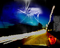
Critique By:
Kyle Turgeon (K:727)
2/14/2005 2:33:16 AM
It is funny you say that. One night I was browsing usefilm and found some AMAZING photos by some man, I forget his name, but he inspired me completely. He used different layers in photos and made me try it. The composition was my first one, and though while I personally like it better, it was 'thrown together.' This one I spent quite some time on. Anyways, I don't know if anyone has seen his work, but one of his pictures has a crow standing on a fence in front of trees. They are amazing, i wish i could link you to him. He tends to use orange/brown 'tinting' in a lot of his photos. Anyways, Thanks for the comment, and you are completely correct
|
| Photo By: Kyle Turgeon
(K:727)
|
|
|
Critique By:
Kyle Turgeon (K:727)
2/13/2005 6:11:54 AM
Wow, thats really nice. Dramatic, I like it. Nice!
|
| Photo By: Scott Whitelaw
(K:1434)
|
|
|
Critique By:
Kyle Turgeon (K:727)
2/13/2005 6:09:07 AM
Actually, not too sure what I was going for, not much of anything, or "interpretive" meaning, as I like to say. Thank you very much
|
| Photo By: Kyle Turgeon
(K:727)
|
|
|
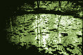
Critique By:
Kyle Turgeon (K:727)
2/13/2005 5:55:14 AM
Nice depth of field
|
| Photo By: vincent pribish
(K:39)
|
|
|
Critique By:
Kyle Turgeon (K:727)
2/13/2005 5:52:08 AM
This is incredible. I love the way the sky is going up and to the right. You used a filter to make the lights "twinkle"?
|
| Photo By: Tamara N
(K:2617)
|
|
|
Critique By:
Kyle Turgeon (K:727)
2/13/2005 5:49:42 AM
Cool. What a good editing job. Try cropping out the top half
|
| Photo By: Derek Turgeon
(K:14)
|
|
|
Critique By:
Kyle Turgeon (K:727)
2/13/2005 5:20:54 AM
This is a very powerful image, I like it a lot. Nice job!
|
| Photo By: andree lerat
(K:17476)
|
|
|
Critique By:
Kyle Turgeon (K:727)
2/13/2005 5:20:08 AM
Very good camera angle
|
| Photo By: Larry Frisch
(K:69)
|
|
|
Critique By:
Kyle Turgeon (K:727)
2/13/2005 5:19:09 AM
Thats really cool, I love the curviness of the trees
|
| Photo By: Warren Simons
(K:741)
|
|
|
Critique By:
Kyle Turgeon (K:727)
2/12/2005 9:26:25 PM
Shutup Alex, you know you posted that one. Hahaha
|
| Photo By: Alex Perkins
(K:52)
|
|
|
Critique By:
Kyle Turgeon (K:727)
2/12/2005 9:24:28 PM
I like it like this. Too boring otherwise, The car lights wouldn't be as dramatic
|
| Photo By: Alex Perkins
(K:52)
|
|
|
Critique By:
Kyle Turgeon (K:727)
2/12/2005 5:08:19 AM
Nice, Very nice, I believe that the border does it all
|
| Photo By: Arthur Yeo
(K:890)
|
|
|
Critique By:
Kyle Turgeon (K:727)
2/12/2005 5:07:41 AM
Very Cool. whats interesting is that there aren't a lot of straight lines. Very interesting, Nice job!
|
| Photo By: Caglar Tukel
(K:39)
|
|
|
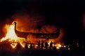
Critique By:
Kyle Turgeon (K:727)
2/11/2005 2:51:20 AM
This is unbelievable. How did you ever do this????
|
| Photo By: Mitchell Miller
(K:3009)
|
|
|
Critique By:
Kyle Turgeon (K:727)
2/11/2005 2:45:37 AM
yES. I agree, Aphrodite. I really like the warmness of this shot. Very good!
|
| Photo By: Pradeep B
(K:2235)
|
|
|
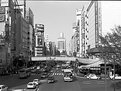
Critique By:
Kyle Turgeon (K:727)
2/11/2005 2:33:38 AM
Very awesome picture, the mood is excellent. However, I disagree with Dave, I think that the image might be better cropped just above the cars on the right, so just on top of the bottom of the bridge? just a suggestion. Nice Photo
|
| Photo By: Gregory McLemore
(K:35129)
|
|
|
Critique By:
Kyle Turgeon (K:727)
2/11/2005 2:28:01 AM
That is awesome. How'd you create that effect? I like the use of depth of field.
|
| Photo By: SAYGIN Mavinil
(K:281)
|
|
|
Critique By:
Kyle Turgeon (K:727)
2/8/2005 9:19:17 PM
That is very cool. HOw'd you achieve it?
|
| Photo By: James Taylor
(K:106)
|
|
|
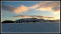
Critique By:
Kyle Turgeon (K:727)
2/7/2005 8:26:46 PM
Very effective in black and white. Nice!
|
| Photo By: Stephen Morgan
(K:585)
|
|
|
Critique By:
Kyle Turgeon (K:727)
2/7/2005 8:25:10 PM
I believe that I like this better. The non-colored section of the sky at the top... I cannot decide whether or not I like it. I think it adds a lot of character to a somewhat stereotypical picture, but it changes the mood and it is not evenly shaped. Awesome shot though, I love the horizon, how it is black against the orange. Beautiful.
|
| Photo By: David Wade
(K:2123)
|
|
|
Critique By:
Kyle Turgeon (K:727)
2/7/2005 8:21:51 PM
That is awesome. I have yet to check out the first... Are these completely original colors? I mean, did you saturate it at all?
|
| Photo By: David Wade
(K:2123)
|
|
|
Critique By:
Kyle Turgeon (K:727)
2/3/2005 3:31:49 AM
Neat image, Conrad. What is the white "disturbance" in the upper right hand side of the clouds?
|
| Photo By: Conrad Smith
(K:17)
|
|
|
Critique By:
Kyle Turgeon (K:727)
2/3/2005 3:30:25 AM
Nice composition. My favorite part is the reflection of sun on the clouds
|
| Photo By: Garreth Szakall
(K:0)
|
|
|
Critique By:
Kyle Turgeon (K:727)
2/3/2005 3:29:27 AM
This is really cool. Its stonehenge, right?
|
| Photo By: Marie Johnston
(K:1635)
|
|