|
|
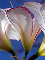
Critique By:
Lea Mulqueen (K:7396)
9/12/2005 1:00:26 AM
Great idea. Nice composition and color. But, it need to be sharper.
|
| Photo By: painsama
(K:4902)
|
|
|
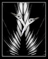
Critique By:
Lea Mulqueen (K:7396)
9/12/2005 12:52:20 AM
A lovely macro. It appears you are new to Usefilm...so, welcome! I am looking forward to seeing more of you images.
|
| Photo By: Jos Henkes
(K:33)
|
|
|
Critique By:
Lea Mulqueen (K:7396)
9/12/2005 12:46:51 AM
I like this very much, it tells a a great story.
|
| Photo By: Omar Rifaat
(K:10141)
|
|
|
Critique By:
Lea Mulqueen (K:7396)
9/11/2005 11:30:10 PM
Beautiful afternoon light. The duck adds a nice touch!
|
| Photo By: Gabriela Veteanu ( Ada )
(K:292)
|
|
|
Critique By:
Lea Mulqueen (K:7396)
9/11/2005 11:28:15 PM
Very creative. Nice tones
|
| Photo By: Tom Ross
(K:6453)
|
|
|
Critique By:
Lea Mulqueen (K:7396)
9/11/2005 11:15:10 PM
Thanks, Chuck. Sorry it took so long for me to thank you. I've been out of town.
I like your rose!
|
| Photo By: Lea Mulqueen
(K:7396)
|
|
|
Critique By:
Lea Mulqueen (K:7396)
8/24/2005 1:28:23 PM
True Sheldon, but it hardly qualifies as a real nature photo! AND, the originals of both combined photos were in color!!!
Many thanks for your comment!
|
| Photo By: Lea Mulqueen
(K:7396)
|
|
|
Critique By:
Lea Mulqueen (K:7396)
8/24/2005 10:11:20 AM
Nice image Sheldon. I do wish it were in color! (sorry, black and white nature photos don't appeal to me nearly as much as color).
Wonderful lines on that tree!
|
Photo By: Sheldon Katz
(K:-287)

|
|
|
Critique By:
Lea Mulqueen (K:7396)
8/20/2005 1:20:55 PM
A nice image. That shutter speed worked well to capture the flow of the water.
One question...you have a vertical subject...why did you use a horizontal composition? I think it would have been better composed vertically with a bit of space between the back of the boat and the edge.
Still, I like it...I don't usually like subjects centered, but with this, it works very well!
|
| Photo By: Larry Fosse
(K:66493)
|
|
|
Critique By:
Lea Mulqueen (K:7396)
8/20/2005 1:15:32 PM
I really like this. You have done a great job with the toning. I like the gradual fall off of light and sharpness. I also like the point of view you have chosen and the eye contact. Very well done!!!
I would crop off some from the top...nothing of interest there and it's slightly distracting.
|
| Photo By: Bec Brittliffe
(K:88)
|
|
|
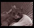
Critique By:
Lea Mulqueen (K:7396)
8/20/2005 1:08:33 PM
Not bad for a video camera shot. I think the composition could be improved by getting the cats eyes out of dead center. Am attaching my suggested crop. Just my opinion...no offence intended!
|
| Photo By: Bec Brittliffe
(K:88)
|
|
|
Critique By:
Lea Mulqueen (K:7396)
8/18/2005 11:58:00 AM
What a cutie!! Nice collage. I'd flip the bottom right frame so her eyes lead back into the image rather than out of it.
|
| Photo By: Joe Ciccone
(K:3684)
|
|
|
Critique By:
Lea Mulqueen (K:7396)
8/18/2005 11:50:45 AM
She's a beauty! Very nice cat portrait.
|
| Photo By: Marwan Albinali
(K:465)
|
|
|
Critique By:
Lea Mulqueen (K:7396)
8/16/2005 12:27:02 AM
It makes my dizzy looking at this! It's certainly an interesting point of view!
|
| Photo By: Rob Keijzer
(K:17)
|
|
|
Critique By:
Lea Mulqueen (K:7396)
8/16/2005 12:21:44 AM
Really, really nice. You caught this perfectly. And it's sharp where it needs to be. The dark background is a nice plus.
|
| Photo By: Darlene Boucher
(K:15739)
|
|
|
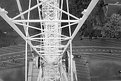
Critique By:
Lea Mulqueen (K:7396)
8/15/2005 11:48:46 PM
Yikes!!! I didn't notice the numbers! Must have had the film backwards in my scanner.Thank you!!
As to the red border...just did it 'cause it's the stadium of the US Navel Academy so figured a red, white and blue theme...
|
| Photo By: Lea Mulqueen
(K:7396)
|
|
|
Critique By:
Lea Mulqueen (K:7396)
8/14/2005 9:20:23 PM
Ya could of invited my over Debi! They look good enough to eat!
|
| Photo By: Debby Biri
(K:4775)
|
|
|
Critique By:
Lea Mulqueen (K:7396)
8/14/2005 9:17:47 PM
What a lovely image. It reminds me a bit of a drawing. Really nice composition and the overexposure works to your advantage here.
|
| Photo By: Paul Compton
(K:785)
|
|
|
Critique By:
Lea Mulqueen (K:7396)
8/14/2005 6:38:33 PM
Nice photo. Good use of DOF. How did you persuade him to pose for you?
|
| Photo By: Chelsea Burke
(K:5750)
|
|
|
Critique By:
Lea Mulqueen (K:7396)
8/13/2005 7:46:08 PM
Robert, better to make those corrections before taking the picture! Get yourself a polarizer and keep practicing in framing properly in the viewfinder.
|
| Photo By: Robert Lewis
(K:491)
|
|
|
Critique By:
Lea Mulqueen (K:7396)
8/13/2005 5:08:30 PM
I really like this. Excellent use of DOF and composition. I think if you could burn in the top left corner a bit, it would be perfect!
|
| Photo By: Robert Lewis
(K:491)
|
|
|
Critique By:
Lea Mulqueen (K:7396)
8/13/2005 4:59:53 PM
Robert, this is a nice idea for an image and you did well to get all of that long bird in without cutting off his tail!
I fooled with this a bit in PS to illustrate my thoughts on improvemnet. Most of what I did in PS could have been done better in the camera, by framing it with just a bit more space on the bottom and by using a polarizer to intensify the colors.
My PS work is quick and dirty, but I think it illustrates my thoughts better than I can write them!
|
| Photo By: Robert Lewis
(K:491)
|
|
|
Critique By:
Lea Mulqueen (K:7396)
8/10/2005 10:08:53 PM
Roger, I never heard back from Dan!
Lea
|
| Photo By: Lea Mulqueen
(K:7396)
|
|
|
Critique By:
Lea Mulqueen (K:7396)
8/10/2005 12:35:52 PM
Thanks Roger. It never occured to me to try for bubble reflections...but of course, it makes sense. Will give it a try!
|
| Photo By: Lea Mulqueen
(K:7396)
|
|
|
Critique By:
Lea Mulqueen (K:7396)
8/10/2005 12:08:08 AM
I love this. It has almost a folk are quality to it. Wish it were bigger!!!!!
|
| Photo By: Larry Donnelly
(K:644)
|
|
|
Critique By:
Lea Mulqueen (K:7396)
8/10/2005 12:05:46 AM
A wonderful image. Great lighting and I love the title!
|
| Photo By: Angelo Villaschi
(K:49617)
|
|
|
Critique By:
Lea Mulqueen (K:7396)
8/9/2005 11:58:09 PM
I love the high angle of view of this image and the high contrast. A lovely image.
And, GO AUNT DORIS!!!! ;-)
|
| Photo By: david henderson
(K:16659)
|
|
|
Critique By:
Lea Mulqueen (K:7396)
8/9/2005 11:52:45 PM
A great street scene, it really shows the atmosphere. I love the sense of activity and the colorful, cluttered look of the street.
I'd be tempted to crop off the top of the photo to just above the highest banner. The white sky detracts and by cropping out the top it would heighten the feeling of a crowded street. Please don't be offended...I'm almost afraid to give an honest opinion given one of the current threads in the forum!
|
| Photo By: Roger Williams
(K:86139)
|
|
|
Critique By:
Lea Mulqueen (K:7396)
8/9/2005 5:55:57 PM
Very nice. The window sidelight really makes this interesting and natural looking. A nice casual portrait of a very pretty little girl.
|
| Photo By: Massimo Mulas
(K:1536)
|
|
|
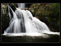
Critique By:
Lea Mulqueen (K:7396)
8/9/2005 5:53:31 PM
Absolutely stunning. One of the nicest aterfall photos I have ever seen. Perfect shutter speed!
|
| Photo By: Angelo Villaschi
(K:49617)
|
|