|
|
Critique By:
Piero Toffano (K:703)
11/29/2005 3:36:26 AM
Really original capture, the blurring of the birds in the background make it a much better picture, good job!!!!!!!!!!!!!!!
|
| Photo By: Vlad Shtrom
(K:117)
|
|
|
Critique By:
Daniel S. Garcia (K:13946)
11/29/2005 3:30:48 AM
Vlad this is most beautiful! Well done!
|
| Photo By: Vlad Shtrom
(K:117)
|
|
|
Critique By:
Gustavo Scheverin (K:164501)

11/29/2005 2:18:30 AM
Interesante composición.
Felicitaciones!
|
| Photo By: Vlad Shtrom
(K:117)
|
|
|
Critique By:
Tony Diana (K:13396)
3/20/2005 10:07:47 AM
Exquisita
|
| Photo By: Vlad Shtrom
(K:117)
|
|
|
Critique By:
Tony Diana (K:13396)
3/20/2005 10:07:41 AM
Buen uso del reflejo,saludos
|
| Photo By: Vlad Shtrom
(K:117)
|
|
|
Critique By:
Evelyn Mayes (K:8132)
2/3/2005 2:50:31 PM
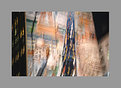
Hmm -- interesting combinations of images and movement. Makes me study it to make "sense" of what you did. What DID you do? Looks almost like a curtain with Paris icons blowing through a window in NYC. Cool effect.
|
| Photo By: Vlad Shtrom
(K:117)
|
|
|
Critique By:
Maurizio Spadaccino (K:5132)
2/3/2005 2:49:59 PM
interesting artistic idea
I wonder how you got it done!
Regards
Maurizio
|
| Photo By: Vlad Shtrom
(K:117)
|
|
|
Critique By:
John Lamb (K:9687)
2/2/2005 8:48:56 AM
Nice observation and the colours and exposure are great. Not too sure about the gray border though. Regards John
|
| Photo By: Vlad Shtrom
(K:117)
|
|
|
Critique By:
Kevin Collier (K:19076)
2/2/2005 4:36:34 AM
excellent tone and composition - I agree with Dot - a tint thumbnail does not do justice to this fine image - K
|
| Photo By: Vlad Shtrom
(K:117)
|
|
|
Critique By:
Rada Marin (K:1187)
2/2/2005 3:57:27 AM
small bits of huge world icons blended together into one piece. exactly the spirit and soul of new york city! interesting abstract, beautiful colors.
|
| Photo By: Vlad Shtrom
(K:117)
|
|
|
Critique By:
Mark Wlaz (K:4564)
2/2/2005 3:56:28 AM
Humorous...
|
| Photo By: Vlad Shtrom
(K:117)
|
|
|
Critique By:
Marcia . (K:16108)
1/24/2005 5:28:17 PM
Well seen. The title is perfect and i liked the tones used here.
Congrats.
Márcia
|
| Photo By: Vlad Shtrom
(K:117)
|
|
|
Critique By:
Dorothy Di Liddo (K:13787)
1/24/2005 5:15:14 PM
Awesome photo, the thumbnail does not do it justice. Dottie
|
| Photo By: Vlad Shtrom
(K:117)
|
|
|
Critique By:
Van Fitzgerald (K:780)
1/24/2005 1:44:42 PM
NYC is prettier than I thought. :P Just Kidding. great work I love the arch in the photo just on the other side of the window. Good work
|
| Photo By: Vlad Shtrom
(K:117)
|
|
|
Critique By:
Gabriella Carta (K:22879)
1/24/2005 12:31:43 PM
wowwwwwwwww.. wonderful reflex, great colors. Regards by Gabry
|
| Photo By: Vlad Shtrom
(K:117)
|
|
|
Critique By:
Jim Budrakey (K:24393)
1/23/2005 8:50:51 PM
Aww! Just when I thought they had created anti-gravity, you had to go and explain it away :-) Nice catch.
|
| Photo By: Vlad Shtrom
(K:117)
|
|
|
Critique By:
Vlad Shtrom (K:117)
1/23/2005 6:41:17 PM
Nathan, you are correct - this is the sign. I liked the angle of it, looks like its floating or wings since you cannot see any supporting poles.
Glad you like it!
|
| Photo By: Vlad Shtrom
(K:117)
|
|
|
Critique By:
Nathan Gillies (K:1011)
1/23/2005 5:20:34 PM
good shot, excsue my ignorance but what is that refleting in the middle of the window? some kind of sign or somethin?
|
| Photo By: Vlad Shtrom
(K:117)
|
|
|
Critique By:
Peggy Christine Skinner (K:26936)
12/28/2004 4:05:18 PM
Crisp clear and detailed. Adorable capture and inspired title.
|
| Photo By: Vlad Shtrom
(K:117)
|
|
|
Critique By:
Gabriella Carta (K:22879)
12/28/2004 3:14:15 PM
wowwwww... wonderful!! Regards by Gabry
|
| Photo By: Vlad Shtrom
(K:117)
|
|
|
Critique By:
Gabriella Carta (K:22879)
12/28/2004 3:08:46 PM
wowwwww.. wonderful shot, excellent!!
|
| Photo By: Vlad Shtrom
(K:117)
|
|
|
Critique By:
Pedro Malheiros (K:48)
12/28/2004 1:23:27 PM
Nice picture!
And...
Happy New Year,2005...
|
| Photo By: Vlad Shtrom
(K:117)
|
|
|
Critique By:
Predrag Sudar (K:5075)
12/28/2004 11:18:02 AM
Great photo, great sense for street motives...
Congrats!
Pedja
|
| Photo By: Vlad Shtrom
(K:117)
|
|
|
Critique By:
Reza Fakhrai (K:3014)
12/28/2004 5:41:42 AM
Interesting shot for undeniably interesting art. Good job!
|
| Photo By: Vlad Shtrom
(K:117)
|
|
|
Critique By:
Reza Fakhrai (K:3014)
12/28/2004 5:40:10 AM
This definitely looks like something out of NYC. Good job. I might suggest cropping out the Pennzoil sign, as it is kind of distracting to the overall b&w tones of the subject IMHO. Nice job!
|
| Photo By: Vlad Shtrom
(K:117)
|
|
|
Critique By:
Deb Mayes (K:19605)
12/24/2004 6:03:40 PM
Whoa - nice catch!
|
| Photo By: Vlad Shtrom
(K:117)
|
|
|
Critique By:
aydin turker (K:3988)
12/24/2004 10:51:20 AM
I did not see either  ) )
|
| Photo By: Vlad Shtrom
(K:117)
|
|
|
Critique By:
Vlad Shtrom (K:117)
12/23/2004 3:58:39 AM
Thanks for your comments, Melissa!
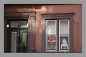
May be you are right about the frame. This image has a drawback - objecs are too close to upper and bottom line(not falling out from composition but close) SO I was tryin to cover it up with a frame to expand the view.
|
| Photo By: Vlad Shtrom
(K:117)
|
|
|
Critique By:
Vlad Shtrom (K:117)
12/23/2004 3:55:13 AM
In what sense? Photoshop filters? No ! just a frame was added. I have the original jpeg as well
|
| Photo By: Vlad Shtrom
(K:117)
|
|
|
Critique By:
Melissa (K:1791)
12/23/2004 2:19:01 AM
This is an interesting image on it's own. The tone and light are very good. The frame, is actually a bit of a distraction in this case (just my opinion). Looking at your work I can see you have a good eye, I especially liked tranquility and the forbidden castle. Keep up the good work, Happy Holidays,
Melissa
|
| Photo By: Vlad Shtrom
(K:117)
|
|