|
|
Critique By:
RC. Dany (K:64104)
2/24/2004 9:25:14 PM
Excellent.
|
| Photo By: william l. borch(jr.)
(K:315)
|
|
|
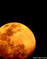
Critique By:
Hanna Segal (K:13469)
2/9/2004 8:36:58 AM
Cool abstract. Lovely shape and color.
|
| Photo By: william l. borch(jr.)
(K:315)
|
|
|
Critique By:
Clifton Jones (K:10688)

1/20/2004 6:50:56 PM
Beautiful colors...very nice shot...........
|
| Photo By: william l. borch(jr.)
(K:315)
|
|
|
Critique By:
Teresa Kleffner (K:168)
12/28/2003 8:55:09 AM
Oh the things we lose when scanning our precious film. I can't tell much due to the inability of my computer to properly display this pretty photo, but I can tell I do like the way the center of the photo comes out and goes off the the upper left corner. It has a beautiful flow.
|
| Photo By: william l. borch(jr.)
(K:315)
|
|
|
Critique By:
Adelino Barreto (K:12661)
12/18/2003 2:32:36 PM
Prety abstract!
Regards.
|
| Photo By: william l. borch(jr.)
(K:315)
|
|
|
Critique By:
Marcos Duarte (K:15402)
12/3/2003 10:19:22 AM
Nice composition.
Marcos
|
| Photo By: william l. borch(jr.)
(K:315)
|
|
|
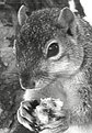
Critique By:
Ray Witter (K:6149)
11/19/2003 3:51:45 PM
William,
Great squirrel,
I can just see him (her?) getting ready to munch on the nut.
Great Work!!
Reguards,
ray w.
|
| Photo By: william l. borch(jr.)
(K:315)
|
|
|
Critique By:
JL E (K:9693)
11/6/2003 9:56:49 AM
excellent photo. I like it so much!
cheers,
Jose
|
| Photo By: william l. borch(jr.)
(K:315)
|
|
|
Critique By:
Dr@gon's Baby (K:1011)
9/12/2003 9:30:57 PM
nice idea
|
| Photo By: william l. borch(jr.)
(K:315)
|
|
|
Critique By:
Carolyn Wiesbrock (K:14051)
9/6/2003 7:10:01 PM
This is different
|
| Photo By: william l. borch(jr.)
(K:315)
|
|
|
Critique By:
Russell Becnel (K:564)
5/14/2003 7:54:06 PM
Great shoot! The colors are bright & vivid. Very well done
|
| Photo By: william l. borch(jr.)
(K:315)
|
|
|
Critique By:
Nick Pernisco (K:625)
5/5/2003 11:34:57 AM
The composition is really good, but the lighting is not even. The light causes dark shadows. A diffuser will really help next time. Also, maybe use a white background... it'll make the food look more apealling. Good start!
|
| Photo By: william l. borch(jr.)
(K:315)
|
|
|
Critique By:
NN (K:26787)
5/3/2003 5:54:37 AM
Lovely!
About the about cropping: I agree with Mike ...
|
| Photo By: william l. borch(jr.)
(K:315)
|
|
|
Critique By:
Mário Sousa (K:16985)
4/18/2003 6:52:04 PM
beautiful kid
|
| Photo By: william l. borch(jr.)
(K:315)
|
|
|
Critique By:
Former Member (K:2712)
2/22/2003 7:15:51 PM
I don't know what works either I just know what I like.And I like this it rates a 8 from me.
|
| Photo By: william l. borch(jr.)
(K:315)
|
|
|
Critique By:
Former Member (K:2712)
2/22/2003 7:06:28 PM
William, I think i would like this alot better if it were a little sharper.
|
| Photo By: william l. borch(jr.)
(K:315)
|
|
|
Critique By:
Oliver Indra (K:448)
2/15/2003 12:17:14 AM
Hi William!
If this is really supposed to be commercial photography you should correct two things: the focus which should be just plain throughout all areas and not start to vanish to the left side and the reflections of the hard flashlight that can be still guessed at the top right area of the pic. It looks more like a computer graphic, one with nice colors chosen but without any "highlights".
Greetings, Oliver
|
| Photo By: william l. borch(jr.)
(K:315)
|
|
|
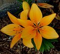
Critique By:
Becky V (K:9699)
1/21/2003 10:51:23 AM
Usually I don't mind a bit of background in a flower shot, but I have to agree with Uncle Frank on this one, only because the browns of the mulch (?) and the orange leaves at the top subtract from the power of the yellow. If you have PS, you could try removing or burning the background, or perhaps blurring it or maybe even smudging it in a circular pattern around the two flowers.
Was this taken with a macro? It's just personal preference, but I'd like to see a closer shot of the inside of the top flower.
The sharpness is great and I love your subject. Yay lillies!
|
| Photo By: william l. borch(jr.)
(K:315)
|
|
|
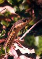
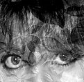
Critique By:
Cemal Ekin (K:2309)
1/18/2003 8:39:59 PM
This photograph does not do much for me. Technically, it needs either sharpening or softening. Now it is caught in between. The digitizing caused softness is there without contributing to the image.
Compositionally, It is weak for my taste. It looks like, well, a head on shot. The tight cropping does not seem to have much purpose and the tones, although probably technically correct, lack impact.
I do not rate photos, so I am offering only my frank comments.
Cemal
|
| Photo By: william l. borch(jr.)
(K:315)
|
|
|
Critique By:
Megan Forbes (K:4617)
1/18/2003 2:11:34 PM
Great timing! The shadow of the snake looks especially good.
|
| Photo By: william l. borch(jr.)
(K:315)
|
|
|
Critique By:
Uncle Frank (K:1642)
1/17/2003 12:42:20 PM
That's a very nice blossom, and you portray it in rich color and with great clarity. But unless you've taken it for documentary purposes, I think the dead leaves just behind the upper part of the flower and other detritus in the frame detract from the image.
|
| Photo By: william l. borch(jr.)
(K:315)
|
|
|
Critique By:
Scott Grewe (K:541)
1/15/2003 12:22:25 PM
Thats neat...ive never seen that before... i live in Florida... great photo.
|
| Photo By: william l. borch(jr.)
(K:315)
|
|
|
Critique By:
Scott Grewe (K:541)
1/15/2003 12:21:36 PM
Thats neat...ive never seen that before... i live in Florida... great photo.
|
| Photo By: william l. borch(jr.)
(K:315)
|
|
|
Critique By:
bruce richardson (K:95)
1/13/2003 6:22:40 AM
I love velvia film , and the colors are good ; but the image does seem a little blurred
|
| Photo By: william l. borch(jr.)
(K:315)
|
|
|
Critique By:
Lisa Howeler (K:3706)
1/12/2003 6:18:12 PM
Nice shot....really. Very cool. Can't say anything about the grain because I can't imagine getting this shot without a little grane. Must have been a large lens...oh yes, I see it was. Very cool indeed
|
| Photo By: william l. borch(jr.)
(K:315)
|
|
|
Critique By:
meprivacynet@meprivacy.net meprivacynet@meprivacy.net (K:3974)
1/7/2003 6:08:57 AM
Usually cameras look like a "mirror-like" objects, passively capturing the moment, but this one looks like a weapon ready to hunt.
I checked your profile and would definitely recommend looking around for a better scanner to improve overall quality of your postings.
Good luck!
|
| Photo By: william l. borch(jr.)
(K:315)
|
|
|
Critique By:
John Charlton (K:5595)
1/6/2003 4:35:34 PM
This looked great in the thumbnails and I have to say I was a little dissapointed when I saw it larger. I'm sure the problem must be the scan, but nothing appears in focus on my screen. I'm also sure that's not what you meant by limited depth of field. Nice colours and background. Any chance of working on this some more. It looks like a winner.
|
| Photo By: william l. borch(jr.)
(K:315)
|
|
|
Critique By:
william l. borch(jr.) (K:315)
1/5/2003 8:31:58 PM
This is a little quarry pond in federal forest michigans U.P Maybe I should have put this in.
|
| Photo By: william l. borch(jr.)
(K:315)
|
|
|
Critique By:
Dawna G. (K:7709)
1/5/2003 9:39:43 AM
hey william, nice to see you!
|
| Photo By: william l. borch(jr.)
(K:315)
|
|
|
Critique By:
william l. borch(jr.) (K:315)
1/5/2003 8:30:41 AM
Thanks keith. Don't really now what I was going for just experimenting really. Got a jungle feel! LOL
|
| Photo By: william l. borch(jr.)
(K:315)
|
|