|
|
Critique By:
Dirk Illing (K:1247)
10/14/2004 7:25:13 PM
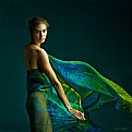
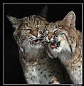
Powerful image, excellent contrast and the texture lends to the shot.
|
| Photo By: Rodrigo Nunez Montecino
(K:509)
|
|
|
Critique By:
Dirk Illing (K:1247)
10/14/2004 7:11:39 PM
Wow, got a big smile on my face. Lovely work.
|
| Photo By: Pat Fruen
(K:12076)
|
|
|
Critique By:
Dirk Illing (K:1247)
10/14/2004 7:08:43 PM
The window light is superb, I think the low camera angle really adds stature to the little girl. This shot has full tonal range - manages to be contrasty and subtle at the same time. This series is really striking.
|
| Photo By: Pat Fruen
(K:12076)
|
|
|
Critique By:
Dirk Illing (K:1247)
10/14/2004 6:56:16 PM
Like these pumpkins! Did you happen to try a few shots from pumpkin height - sort of lining them up?
|
| Photo By: Alison DuFlon
(K:36566)
|
|
|
Critique By:
Dirk Illing (K:1247)
10/14/2004 2:20:12 PM
I first registered in my name with my work address as the contact, then changed my mind and registered my home address, Wyatt is my second name, hee hee.
|
| Photo By: Dirk Illing
(K:1247)
|
|
|
Critique By:
Dirk Illing (K:1247)
10/13/2004 1:33:15 PM
You've achieved an almost painterly effect. I love the 3 distinct layers and how you've caught the sun on the mid ground. Top class.
|
| Photo By: giulio croce
(K:69)
|
|
|
Critique By:
Dirk Illing (K:1247)
10/13/2004 1:10:39 PM
I'm sure everyone else will go on about this, but... wonderful soft lighting, and the subtle pastel shades are amazing. The pose is classic too, well done!
|
| Photo By: Pat Fruen
(K:12076)
|
|
|
Critique By:
Dirk Illing (K:1247)
10/12/2004 8:17:07 PM
Love this dramatic sky, the polariser's really done a good job here. You've framed this well, the gap in the clouds and the building line up nicely.
|
| Photo By: Roberto Carli
(K:13689)
|
|
|
Critique By:
Dirk Illing (K:1247)
10/12/2004 8:07:57 PM
Classic infrared, interesting you can get this effect with a digital. Like your composition!
|
| Photo By: Bartek M
(K:359)
|
|
|
Critique By:
Dirk Illing (K:1247)
10/12/2004 6:29:42 AM
Lovely, the bird really rounds off the shot. You've composed it so well, the whole arch image records, nothing more. Smooth tones on the baloons, excellent exposure!
|
| Photo By: Alison DuFlon
(K:36566)
|
|
|
Critique By:
Dirk Illing (K:1247)
10/12/2004 6:21:50 AM
I like this, a mixture of old and new. Was this handheld - entire image looks a bit shakey, which works for me.
|
| Photo By: Paul Burnett
(K:45)
|
|
|
Critique By:
Dirk Illing (K:1247)
10/11/2004 6:39:36 AM
Wow, a lot going on here, but nothing is competing. Love the grain, looks almost infrared.
|
| Photo By: Aira Manna
(K:11187)
|
|
|
Critique By:
Dirk Illing (K:1247)
10/11/2004 6:37:49 AM
Brilliant - that you've caught the subjects in mid frame works, also that their heads are superimposed against the white wall, cool sidekick dawg too. (like your 'Abouts')
|
| Photo By: Aira Manna
(K:11187)
|
|
|
Critique By:
Dirk Illing (K:1247)
10/11/2004 6:34:59 AM
Brilliant texture frm the Lomo. The idea works really well and the figure in the background really setts off the handprints.
|
| Photo By: Aira Manna
(K:11187)
|
|
|
Critique By:
Dirk Illing (K:1247)
10/11/2004 6:32:40 AM
Yep... Love the graphic feel to this shot, and the crisp contrast. The rings of light are also suscinctly framed.
|
| Photo By: Aira Manna
(K:11187)
|
|
|
Critique By:
Dirk Illing (K:1247)
10/11/2004 5:48:56 AM
Thanks Aria, you're dead right. In the process of moving at the moment, but have the area under the stairs earmarked for the new darkroom! Regards.
|
| Photo By: Dirk Illing
(K:1247)
|
|
|
Critique By:
Dirk Illing (K:1247)
10/9/2004 9:10:33 PM
Tippy's a legend! Great effect, lovely colours.
|
| Photo By: Alison DuFlon
(K:36566)
|
|
|
Critique By:
Dirk Illing (K:1247)
10/9/2004 8:17:06 PM
The off-kilter horizon really adds to the dynamism of the shot, you're really captured the essence of the day, can almost smell it. Well done!
|
| Photo By: Feride Dulgeroglu
(K:58)
|
|
|
Critique By:
Dirk Illing (K:1247)
10/9/2004 8:14:29 PM
This would go well blown up A1 size in a house by the sea.
|
| Photo By: James Taylor
(K:106)
|
|
|
Critique By:
Dirk Illing (K:1247)
10/7/2004 7:52:36 PM
Such rich colours, lovely light and sky. Nice one!
|
| Photo By: Aldo Costantini
(K:659)
|
|
|
Critique By:
Dirk Illing (K:1247)
10/7/2004 7:07:35 PM
The foreground really makes this shot. I like the cool colours.
|
| Photo By: Teunis Haveman
(K:37426)
|
|
|
Critique By:
Dirk Illing (K:1247)
10/7/2004 7:05:27 PM
Lovely shot, really special mix of colours. Schaaphok - sheep corner?
|
| Photo By: Teunis Haveman
(K:37426)
|
|
|
Critique By:
Dirk Illing (K:1247)
10/6/2004 5:19:30 PM
Beautiful. The foreground really makes this shot, adding an extra sense of depth, I like the way the grass in the middle extends into the curve of the water. Must have been a real still morning.
|
Photo By: Dave Stacey
(K:150877)

|
|
|
Critique By:
Dirk Illing (K:1247)
10/5/2004 9:09:44 PM
Hight praise coming from you Giuliano! Love your work and the Mr M series, most interesting stuff I've seen for some time.
|
| Photo By: Dirk Illing
(K:1247)
|
|
|
Critique By:
Dirk Illing (K:1247)
10/5/2004 9:08:13 PM
Love this semi-silhoette, and the blue space around her, really conveys many emotions. Just seen your comments on it '...mind flutters...' this conveys this perfectly.
|
| Photo By: Alison DuFlon
(K:36566)
|
|
|
Critique By:
Dirk Illing (K:1247)
10/5/2004 8:38:57 PM
Brilliant, made me smile! I love the high key tones of the upper image contrasting with the lower half. Lovely printing.
|
Photo By: Giuliano Guarnieri
(K:36622)

|
|
|
Critique By:
Dirk Illing (K:1247)
10/5/2004 8:33:25 PM
Really like the various elements woven through this image. The Mr M sequence is brilliant, am gonna take a closer look!
|
Photo By: Giuliano Guarnieri
(K:36622)

|
|
|
Critique By:
Dirk Illing (K:1247)
10/5/2004 7:50:06 PM
Stunning image, that blue colour is amazing. Lovely shapes.
|
| Photo By: Brian Bouwer
(K:81)
|
|
|
Critique By:
Dirk Illing (K:1247)
10/5/2004 7:27:53 AM
Great sense of movement and colour, well done! I also like the composition.
|
| Photo By: Brian Bouwer
(K:81)
|
|
|
Critique By:
Dirk Illing (K:1247)
10/5/2004 7:22:50 AM
Great point of view, getting down to the dog's level - adds foreground interest and loads of sky.
|
| Photo By: Alison DuFlon
(K:36566)
|
|


