|
|
Critique By:
Dario Stefani (K:4938)
11/15/2006 9:20:48 PM
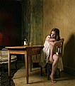
Really abandoned atmosphere..well done!
dario
|
| Photo By: Matt Lefank
(K:923)
|
|
|
Critique By:
Dario Stefani (K:4938)
11/15/2006 9:19:05 PM
Great image..i like the grain!
dario
|
| Photo By: Matt Lefank
(K:923)
|
|
|
Critique By:
Paul Lara (K:88111)

11/12/2006 6:10:24 PM
What a fiery beauty, Matthew!
Orange you glad you had your camera THEN??
|
| Photo By: Matt Lefank
(K:923)
|
|
|
Critique By:
Paul Lara (K:88111)

11/12/2006 6:09:19 PM
Sorry. My link fell off:
http://bermangraphics.com/coolpix/lighting_diagram.htm
|
| Photo By: Matt Lefank
(K:923)
|
|
|
Critique By:
Paul Lara (K:88111)

11/12/2006 6:08:27 PM
Well, this shot just goes to show how much you have learned in a year. The principal problem I see with this shot is the use of on-board flash. While sufficiently illuminating your subject, any on-board flash is so close to the lens that it flattens and minimizes features. It's best to work with 1, 2 or 3-point lighting that is 30 to 45 degrees from the subjects view of the lens.
HERE is a good diagram with explanation.
I believe lighting can make or break any portrait, and is what separate a 'snapshot' from a portrait.
|
| Photo By: Matt Lefank
(K:923)
|
|
|
Critique By:
Paul Lara (K:88111)

11/12/2006 6:02:48 PM
Her eyes are 'dead'. Without any catch-light or sparkle, I feel portraits lose a lot of dynamics.
|
| Photo By: Matt Lefank
(K:923)
|
|
|
Critique By:
Roberto Arcari Farinetti (K:209486)

11/11/2006 4:58:30 PM
a really dramatic DOf, created a nice focus-effect..
well done
roby
|
| Photo By: Matt Lefank
(K:923)
|
|
|
Critique By:
Alicia Popp (K:87532)
5/30/2006 5:12:12 AM
qué texturas y gran iluminación!! Una muy interesante composición!!!
|
| Photo By: Matt Lefank
(K:923)
|
|
|
Critique By:
Gustavo Scheverin (K:164501)

5/30/2006 1:41:04 AM
Simpática captura.
Felicitaciones!
|
| Photo By: Matt Lefank
(K:923)
|
|
|
Critique By:
Gavino Tavera (K:424)
5/26/2006 2:01:10 PM
My compliments. Very well balanced shot and great idea. Nice portfolio indeed.
|
| Photo By: Matt Lefank
(K:923)
|
|
|
Critique By:
Nicola Barbieri (K:18000)
5/2/2006 8:12:43 PM
Very nice shot.. Best regards! Ciao, Nicola
|
| Photo By: Matt Lefank
(K:923)
|
|
|
Critique By:
metoni . (K:24727)
5/2/2006 6:45:27 PM
great colors.!!!
|
| Photo By: Matt Lefank
(K:923)
|
|
|
Critique By:
Klaas Baas (K:15111)

4/26/2006 3:26:20 PM
And you? It's always the same, my wife hate the pictures where she's at her best, very photogenic, but she wants me to delete almost every single one of them.
I like this portrait, the daffodils and the tree, but especialy your girlfriend, great pose and a lovely smile. You can tell her that.
Best regards,
Klaas
|
| Photo By: Matt Lefank
(K:923)
|
|
|
Critique By:
Jimmy Perez (K:1694)
4/26/2006 3:13:40 PM
very pleasant shot good dof. great job matthew.
jimmy
|
| Photo By: Matt Lefank
(K:923)
|
|
|
Critique By:
Luis Limchiu (K:3168)
4/26/2006 3:10:28 PM
Pretty flowers, pretty girl and a pretty portrait. Well done Matthew
|
| Photo By: Matt Lefank
(K:923)
|
|
|
Critique By:
Karina Brys (K:16541)
4/17/2006 5:17:28 PM
Interesting angle, showing us all these wheels. I would have included the head of the man in front. Otherwise a nice documentary photo!
|
| Photo By: Matt Lefank
(K:923)
|
|
|
Critique By:
p e t a . (K:18700)
4/3/2006 11:06:44 PM
great matthew, love your composition
|
| Photo By: Matt Lefank
(K:923)
|
|
|
Critique By:
brian underdown (K:-960)
4/3/2006 9:35:11 PM
not sure about cute but i can see what u were looking at.good find and i guess they were more spaced out than neil armstrong ever was.
brian
|
| Photo By: Matt Lefank
(K:923)
|
|
|
Critique By:
- - (K:1222)
4/3/2006 9:22:39 PM
super lovely and cute
very good crop
barbara
|
| Photo By: Matt Lefank
(K:923)
|
|
|
Critique By:
Steve Aronoff (K:18393)
4/2/2006 2:20:36 AM
A beautiful intimate portrait of a rooster, Matthew. The stark red and white play wonderfully off of each other. And the grey background helps it all pop out. Well done!
Steve
|
| Photo By: Matt Lefank
(K:923)
|
|
|
Critique By:
A Smith (K:851)
4/1/2006 3:18:12 AM
nice shot. good colour 
|
| Photo By: Matt Lefank
(K:923)
|
|
|
Critique By:
Kamran (K:3526)
3/15/2006 7:35:50 PM
Can u hear me now ........?
i like this pic great choice of B & W keep up the good work
kamran
|
| Photo By: Matt Lefank
(K:923)
|
|
|
Critique By:
Doyle D. Chastain (K:101119)

3/9/2006 8:41:19 PM
Not bad Matthew . . . Suggestions?
1) Maybe add a bit of backlighting (low).
2) Set the bottle up a bit, not so laid back.
Otherwise . . . Nice image!
- Regards,
Doyle I
|
| Photo By: Matt Lefank
(K:923)
|
|
|
Critique By:
Ms. Mel Brackstone (K:5285)
3/2/2006 6:23:13 AM
I'd say you've done well. As long as you keep in mind that the brightest spots will attract the viewers eyes (in general) the man's ring is a little distracting, as well as the over-bright white of the left eye. Perhaps a reflector on his left could have softened the shadow and lowered the contrast between his eyes and skin.....I'm a newbie as well, so thats only my uninformed opinion. 
|
| Photo By: Matt Lefank
(K:923)
|
|
|
Critique By:
Jonathan Karwacki (K:1105)
3/1/2006 8:19:26 PM
I like the compostion, the kleenex on the bed makes me think she has been crying, it gives a sad tone to the photo. the woman in the background ads to that feeling, both women seem lonely. the photo does seem a little flat, a bit more contrast would help
|
| Photo By: Matt Lefank
(K:923)
|
|
|
Critique By:
Romy Fabian Garmaz (K:17105)
2/22/2006 5:32:46 PM
Mat
Excellent job
Romy
|
| Photo By: Matt Lefank
(K:923)
|
|
|
Critique By:
Kambiz K (K:37420)

2/22/2006 5:11:21 PM
it is similar to those sci fi movies. i like that smoky color
|
| Photo By: Matt Lefank
(K:923)
|
|
|
Critique By:
Gavino Tavera (K:424)
2/20/2006 12:15:46 PM
Impressive. Excellent prospect. Everything is in the right place (the clouds, the old pole on the right) and colours are superb.
|
| Photo By: Matt Lefank
(K:923)
|
|
|
Critique By:
z z (K:7231)
2/14/2006 8:01:42 PM
I love the natural lighting. It adds a bit of mystery to the darkened areas. The only thing that is a bit distracting is the shape of the catch light on the left side eye. Its bright white pops out of the darkened areas - maybe a little burning to take the brightness down...course that is MHO. Well done regardless.
|
| Photo By: Matt Lefank
(K:923)
|
|
|
Critique By:
Rashed Abdulla (K:163889)

2/14/2006 6:21:31 PM
wonderful portrait and with very effective lighting and contrast , all of the best my friend .
|
| Photo By: Matt Lefank
(K:923)
|
|


