|
|
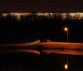
Critique By:
Kurt Zoglmann (K:1373)
12/1/2004 1:42:04 AM
I like the composition and the color tone to the image.
How often is it misty/foggy in Sweden you sure have a lot of foggy pictures??
Here in the midwest USA it gets foggy maybe 2-3 times a year.
|
| Photo By: Patrick Jacobson
(K:29151)
|
|
|
Critique By:
Kurt Zoglmann (K:1373)
12/1/2004 1:39:18 AM
I like the colors and tones in the image. It is peaceful and charming and the exposure is dead on. Out of curiosity, what is the light source? My guess is that it came from a weilder.
|
| Photo By: Carlos Ferreira
(K:0)
|
|
|
Critique By:
Kurt Zoglmann (K:1373)
11/29/2004 2:22:14 PM
I love the strong form, pattern, and lines in this image. The crop and conversion to B&W is excellent. The fence definitely draws your eyes do the tunnel's opening. Excellent capture.
|
| Photo By: Joshua Rainey
(K:5069)
|
|
|
Critique By:
Kurt Zoglmann (K:1373)
11/29/2004 2:19:09 PM
I find the overall composition interesting; I like the trio of poles coming together and adorned by a bird. I'm not entirely for sure, but the image appears to be a little "muddled". The poles in the foreground and the buildings in the background seem to be lacking some detail and sharpness. Maybe the camera focused about 10-15 feet behind the poles? Part of the water seems defined and clear.
|
Photo By: Joe Ciccone
(K:3684)

|
|
|
Critique By:
Kurt Zoglmann (K:1373)
11/29/2004 2:12:10 PM
This is simply short of amazing. Usually the largest possible DOF is preferable when taking macro shots. The tiny DOF is spot on for this composition. The color and saturation could not have been better.
|
| Photo By: Mary Sue Hayward
(K:17558)
|
|
|
Critique By:
Kurt Zoglmann (K:1373)
11/29/2004 3:17:52 AM
I have no idea what they are protesting against the Georgian goverment, but the image captures the marches power and expression. The people are displaying strong harsh anger.
|
| Photo By: Lasha Chkhikvishvili
(K:1328)
|
|
|
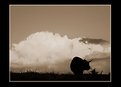
Critique By:
Kurt Zoglmann (K:1373)
11/29/2004 2:22:24 AM
Wow! This landscape is creepy and cool. The cloud cover contributes a feeling of entrapment by creating an artificial top. The reds and calm water add to the overall mood.
|
| Photo By: Tom Ross
(K:6453)
|
|
|
Critique By:
Kurt Zoglmann (K:1373)
11/29/2004 2:07:53 AM
Toning the image with green in the midtones adds a degree of character. It "feels" unique. Your post processing is dead on for this image. Good job!
|
| Photo By: Pat McMullen
(K:3)
|
|
|
Critique By:
Kurt Zoglmann (K:1373)
11/29/2004 2:05:15 AM
Excellent tones and contrast in the sky! This image is pristine! I love the composition and subject matter.
|
| Photo By: Servé Huijben
(K:124)
|
|
|
Critique By:
Kurt Zoglmann (K:1373)
11/29/2004 2:00:06 AM
This definitely virges on the side of abstract. The grain is cool, but I'm not for sure I like the horizontal and vertical lines creating "tiles" in the image.
|
| Photo By: Samuel Downs
(K:7290)
|
|
|
Critique By:
Kurt Zoglmann (K:1373)
11/29/2004 1:57:28 AM
The border/cropping appears fine to me. I think the image could have been a little stronger with either more background blurring or having a larger DOF with the background and foreground in focus. The background seems to be on the "fence".
Overall this is a good photo and from the sounds of it, you were in mid flight when you took this photo. Good job!
|
| Photo By: John Beavin
(K:4477)
|
|
|
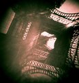
Critique By:
Kurt Zoglmann (K:1373)
11/29/2004 1:48:38 AM
For a homemade camera this is pretty cool. It does show a lot of light fall off towards the corners and edge of the frame. However, it does seems to add character to the image.
|
| Photo By: Paul Egan
(K:0)
|
|
|
Critique By:
Kurt Zoglmann (K:1373)
11/29/2004 1:46:50 AM
Good facial expression and skin tones. I've seen that look on other kids faces many a time. I'm glad you captured it well.
|
| Photo By: Simon Jarvis
(K:489)
|
|
|
Critique By:
Kurt Zoglmann (K:1373)
11/29/2004 1:42:25 AM
The tree seems to have a wispy and magical character. Would you mind posting a small full resolution crop of a section of the tree towards the top of the frame? Thanks!
|
| Photo By: James Bambery
(K:13421)
|
|
|
Critique By:
Kurt Zoglmann (K:1373)
11/29/2004 1:35:49 AM
I like the perspective and tones of the photo. The only thing I don't care for is the texture. It seems a little too chiche, but that's just my opinion.
|
| Photo By: John Juhl
(K:80)
|
|
|
Critique By:
Kurt Zoglmann (K:1373)
11/29/2004 1:31:34 AM
Overall I like the composition and mood of the landscape. It does seem a little "muddy". The snow seems a bit dark (1 f-stop?) and not enough contrast. I have attached an edited version. What do you think?
|
| Photo By: Ana Martins
(K:5643)
|
|
|
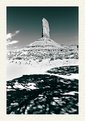
Critique By:
Kurt Zoglmann (K:1373)
11/29/2004 1:14:32 AM
I agree that this is a moody landscape. The sky has the appearance of a storybook sunset. It appears more like a painting than a photo. The signal to noise ratio appears to be a little low in the sky. I'm sure it has to do with cranking up the contrast. I might try to smooth out the noise a little and see if that improves the tones. Overall, I like the image.
|
| Photo By: Kessia & Morgan UVA
(K:7265)
|
|
|
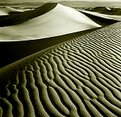
Critique By:
Kurt Zoglmann (K:1373)
11/28/2004 11:01:42 PM
Nice tones, contrast, and lines. This reminds me a lot of a picture that Ansel Adams took. Shooting in the desert is difficult--heat, sand, and extreme contrast. Excellent job in capturing the every moving desert.
|
| Photo By: Dr. Thomas Krebs
(K:1376)
|
|
|
Critique By:
Kurt Zoglmann (K:1373)
11/12/2004 3:30:49 AM
Wow! You choose great subject matter. I love the tones, contrast, and DOF. I have no idea what the young woman in this picture is doing, but it looks fascinating. The two people in the back ground are also interesting.
|
| Photo By: ignacio ayestarán
(K:372)
|
|
|
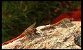
Critique By:
Kurt Zoglmann (K:1373)
11/12/2004 3:25:13 AM
You caught two dragon flies at the same time? That is amazing. I have never been able to get them to stay still or let me near them.
|
| Photo By: Maggie Rodriguez
(K:215)
|
|
|
Critique By:
Kurt Zoglmann (K:1373)
11/12/2004 3:23:43 AM
I like the composition. The use of white space brings attention to the suttle hues and forms.
|
| Photo By: Stace Walker
(K:4175)
|
|
|
Critique By:
Kurt Zoglmann (K:1373)
11/12/2004 2:59:27 AM
This is abstract, but good. It almost looks like something rendered instead of captured by a camera.
Out of curiosity, would you mind posting what the original image looked like?
|
| Photo By: Luís Lobo Henriques
(K:9002)
|
|
|
Critique By:
Kurt Zoglmann (K:1373)
11/12/2004 1:45:07 AM
This is not the typical garden variety flower. It makes a good subject matter. The choice of soft focus isn't overbearing and adds to the idea that the flower is more of imagination than reality. There is enough detail to know that this is real and something that exists. The extremely shallow DOF is a plus in this image. It focus your attention on the streams coming from the flower.
|
| Photo By: Debby Biri
(K:4775)
|
|
|
Critique By:
Kurt Zoglmann (K:1373)
11/12/2004 1:40:58 AM
This is a cute sweet capture of a baby bundled up and protected from the cold. The aspect ratio and cropping place emphasis on the face of the baby. I like how the eyes seem to peer out from under its coat. B&W is a good choice for this photo. It adds to the sense of it being cold outside.
|
| Photo By: i 4 it
(K:58)
|
|
|
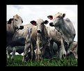
Critique By:
Kurt Zoglmann (K:1373)
11/12/2004 1:19:28 AM
I like the angle of this composition. The lower angles places meaning and adds significance to their world of pasture grazing. Cattle are often overlooked, but this image begs for us to take a second look.
I love this breed of cattle. The texture and tones of their hide are more photogenic than a lot of the cattle here in the midwest.
|
| Photo By: Marcio Janousek
(K:32538)
|
|
|
Critique By:
Kurt Zoglmann (K:1373)
11/12/2004 1:13:54 AM
Out of curiosity, can you fill us in on the subject matter and the over all effect you were going for in this image? It seems pretty abstract.
|
| Photo By: Virginia Scout
(K:0)
|
|
|
Critique By:
Kurt Zoglmann (K:1373)
11/12/2004 1:10:24 AM
I agree with Mary. Snow can be very difficult to capture its detail and texture. The lighting and exposure are excellent. The blue tint is nice, but is it natural?
|
| Photo By: Johanna Kaikkonen
(K:151)
|
|
|
Critique By:
Kurt Zoglmann (K:1373)
11/12/2004 1:00:10 AM
Excellent composition and post processing. I love how the water looks like liquid mercury and how the water tension jumps out at you.
|
| Photo By: Reidar Olsen
(K:144)
|
|
|
Critique By:
Kurt Zoglmann (K:1373)
11/11/2004 4:33:57 PM
I got your point. You dislike the subject matter for anything more than an add. I'm just not for sure how or why this is constructive critisim.
I choose this subject matter because it lent itself to high contrast and metal like highlights. I thought it would work exceptionally well as a B&W image and it does. This was one of my first attempts at converting a color image to B&W by working with different channels in PS. This was never meant to be a work of art, but as an experiment and a recreation of what one might find in a magazine advertisement.
I posted it on usefilm because I thought it looked "cool". Now that is entirely subjective, but at the end of the day I'm not entirely concerned if other people don't also think so too.
If you have creative suggestions on how to better photograph everyday symbols or have good examples, I'm always open to ideas. Otherwise, I'm not going to respond further about the merits of having photographed a Honda symbol. A debate would not be fruitful or worth our time.
|
| Photo By: Kurt Zoglmann
(K:1373)
|
|
|
Critique By:
Kurt Zoglmann (K:1373)
11/11/2004 2:19:50 PM
This is absolutely beautiful. The canyon walls are well lit and have good contrast. The color is just enough saturated without being too over the top. There are fairly strong lines and shapes that help the overall composition. And there is always something about slow shutter speeds and shallow water that give a sense of timelessness. Excellent photograph.
|
| Photo By: Patrick Di Fruscia
(K:486)
|
|