|
|
Critique By:
Alejandro (K:180)
3/2/2004 2:38:32 AM
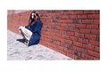
Your sister IS a little too near the building, I agree. However, I like that she's out of focus, and I like the overcast, blown-out sky. This is a bold photograph. The noisiness of your sister's shirt is poetically mirrored in the noisiness of the foliage--such a prominent visual rhyme can be cloying, but in this case I think it resists overstatement (just barely). Directly between these two living things is a building made up of clinical shapes--windows, roof, clock, the edifice itself. (Much can be read into the eclipsing of the building by a girl and a tree!) The real triumph is that you managed to capture an energy in your sister, an eagerness. The parted lips, fierce gaze, ready hands--your angle complements these elements very nicely.
|
| Photo By: Greg Pauline
(K:27)
|
|
|
Critique By:
Joksa Juoperi (K:13473)
8/27/2003 3:29:51 AM
Nice capture with good perspective, lighting and colours.
Could be a little bit bigger size.
Regards, Joksa.
|
| Photo By: Greg Pauline
(K:27)
|
|
|
Critique By:
Mário Sousa (K:16985)
8/7/2003 5:52:56 AM
excellent
|
| Photo By: Greg Pauline
(K:27)
|
|
|
Critique By:
Mário Sousa (K:16985)
8/5/2003 8:00:59 AM
excellent photo
|
| Photo By: Greg Pauline
(K:27)
|
|
|
Critique By:
Surajit Mukerji (K:3889)
4/13/2003 11:16:21 AM
Nice night effect
|
| Photo By: Greg Pauline
(K:27)
|
|
|
Critique By:
Surajit Mukerji (K:3889)
4/13/2003 11:12:51 AM
Unsharp?
|
| Photo By: Greg Pauline
(K:27)
|
|
|
Critique By:
heather martino (K:3648)
1/26/2003 7:55:32 AM
whatever happened to this guy - he's a great candidate for the whole 'commenting on a portfolio' idea that someone suggested.
H
|
| Photo By: Greg Pauline
(K:27)
|
|
|
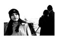
Critique By:
Jake Sieg (K:673)
6/16/2002 12:20:32 AM
i think this photo sets some type of mood. i cant yet put my finger on what kind, but im thinking more of a 'yep, ive seen this before' becasue the couple behind her is staring out at the sights, and she just seems like she doesnt care, but yes, a fill flash might be a bit better
|
| Photo By: Greg Pauline
(K:27)
|
|
|
Critique By:
Terrence Kent (K:7023)
5/23/2002 6:41:30 PM
This is a snapshot. Not in the offensive sense i suppose, but all the same this doesn't strike me as any kind of deep message from you to me. I see two nondescript faces seperated by a wedge of brick, maybe this means something to you but i dont see anything going on here.
|
| Photo By: Greg Pauline
(K:27)
|
|
|
Critique By:
Greg Pauline (K:27)
5/23/2002 6:36:49 AM
Whats a snapshot?
|
| Photo By: Greg Pauline
(K:27)
|
|
|
Critique By:
Terrence Kent (K:7023)
5/19/2002 6:14:14 PM
Looks like a snapshot to me, the smoking issue beyond that isn't very important
|
| Photo By: Greg Pauline
(K:27)
|
|
|
Critique By:
Tony Blei (K:575)
5/19/2002 5:07:54 PM
Whaddayall talkin' about?
Smokin' really is cool. As a matter of fact, takin' up smoking is my New Year's Resolution (I've already bought the lighter and am lookin' for a good deal on an ash tray). As soon as I figure out the whole menthol vs. regular; shorts vs. 100's thing, I'm headin' down to the nearest convenience store to buy a carton (there are just so many decisions until then).
To say that you don't like the picture because the kids are smoking is about as shallow as saying you don't like a picture because a model is ugly.
I suppose you could always pick a prettier or more handsome model. I guess you could also do a portrait of someone who doesn't smoke. But the truth remains that the world is full of less than pretty people and teens who smoke.
Maybe we should all turn our eyes away from "Tomako in her bath" by W. Eugene Smith. That was the image of a mother giving her daughter a bath in Minamata, Japan. Not only did the image contain full-frontal nudity of a pre-teen girl but the girl was deformed. I believe Smith won the Pulitzer Prize for his work and because of increased pressure, the factories in the area stopped polluting Minamata Bay (which was the cause of the birth defects). Sometimes it is important to show those things we don't like or don't want to see!
Teen smoking may be one of those things.
Now, to actually comment on the image: I really don't see this as a portrait but possibly an excerpt from a photojournalism picture story on teen smoking. My idea of a portrait is where the photographer obviously poses the models to accent a feature or trait. Now that I've said that I would like to add there are times when that GUIDLINE needs to be thrown out the window because the photographer has captureed someone who is doing something (to illustrate your point) on their own and spontaneously.
The other thing that bothers me in this image is the girls are framing the picture. Girl No. 1 on the right is so close to the edge of the picture that my eye has to look around for her (because my eye goes to the big empty area in the center of the picture first). Girl No. 2 is almost hidden because her hair is blocking her eye and she is on the far left side of the picture. She is the one that I see first. When I first look at the picture, my eye goes to the center and finds the brightest object there (the back of her hand), it travels up and sees the cigarettes and her face and then has to jump across to the other girl.
Where possible, as photographers, we need to make viewing the images we create as easy for the viewer as possible. -- Tony
|
| Photo By: Greg Pauline
(K:27)
|
|
|
Critique By:
Greg Pauline (K:27)
5/19/2002 3:51:08 PM
Jake,
smoking is bad and this picture doesn't promote it in any way. It is a picture of an event. They smoked, I took the picture.
|
| Photo By: Greg Pauline
(K:27)
|
|
|
Critique By:
Jake Sieg (K:673)
5/19/2002 8:53:05 AM
ah yes, smoking, its so cool. cigarettes are prolly the coolest thing in this world...sorry, i dont really like this because of the fact young kids are smoking
|
| Photo By: Greg Pauline
(K:27)
|
|
|
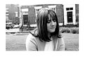
Critique By:
Jake Sieg (K:673)
3/29/2002 11:13:56 AM
i really like this, but i really would like to see more of her face. i also keep wondering what this would look like if maybe you used a sepia filter, or you could change it in PS too.
|
| Photo By: Greg Pauline
(K:27)
|
|
|
Critique By:
E A (K:727)
3/15/2002 2:07:46 PM
Great crop, really keeps the focus where it should be. I like the way you composed her further to the facing-side of the frame, something that usually doens't work well but does so here quite nicely.
|
| Photo By: Greg Pauline
(K:27)
|
|
|
Critique By:
Daniel L Quigley-Skillin (K:1383)
3/3/2002 3:27:38 PM
This came up in the random images.
Heather's such a pretty young lady, and the tones of her skin and hair are soft and wonderful. I find the background distracting though. Getting her eyes may have reduced the distraction a bit.
|
| Photo By: Greg Pauline
(K:27)
|
|
|
Critique By:
Samuel Downs (K:7290)
2/24/2002 9:11:26 PM
Greg, nice idea on this one. I like the shot and the framing.
|
| Photo By: Greg Pauline
(K:27)
|
|
|
Critique By:
Carl Milloshewski (K:74)
11/8/2001 12:53:27 AM
I think you did a great job capturing feelings. Eerie, stange, lonely, afraid all come to mind when I see this picture.
Good Job.
|
| Photo By: Greg Pauline
(K:27)
|
|
|
Critique By:
Carl Milloshewski (K:74)
11/8/2001 12:53:06 AM
I think you did a great job capturing feelings. Eerie, stange, lonely, afraid all come to mind when I see this picture.
Good Job.
|
| Photo By: Greg Pauline
(K:27)
|
|
|
Critique By:
Troy Phillips (K:420)
10/20/2001 10:40:34 AM
Greg; Gary's comments are more right on than mine will be here. I only have to comment on the fact that I think this is a neat effect with her and her shadow depected so well together. If you could have gotten closer to her maybe so that I could see her face clearly along with the different pose and shadow effect. I also think that cropping would make this a much stronger picture. Oh; something else just came to me, perhaps a vertical shot would have worked better than horizontal one? Either way this is still a unique effect. I would love to see you work more with this idea.
|
| Photo By: Greg Pauline
(K:27)
|
|
|
Critique By:
Debbie Groff (K:9569)
10/8/2001 4:35:13 AM
Hi Gregg,,,,Thought someone had grabbed you to wake you up and get you off of the scanner
|
| Photo By: Greg Pauline
(K:27)
|
|
|
Critique By:
Debbie Groff (K:9569)
10/6/2001 5:13:00 AM
Scanner pictures are cool.....Looks like you decided to take a nap after all the hard work of setting it up?
|
| Photo By: Greg Pauline
(K:27)
|
|
|
Critique By:
Chris Whaley (K:3847)
10/5/2001 7:01:35 PM
3 cheers for scanograms!...cool one Greg.
|
| Photo By: Greg Pauline
(K:27)
|
|
|
Critique By:
Deleted User (K:6775)
10/5/2001 5:51:01 PM
I like the expressions you have captured on your friends faces Greg. Only thing wrong with this one is Kate's face needs some fill light.
Do you have one of those little fold up reflectors. If this was a setup shot you could have got Shaun to hold it up out of the view of the camera and bounce that light that is lighting up his face back into Kate's face and get rid of those dark circles under her eyes and lighten up her face.
I have mentioned using fill-flash in some of your previous pics but I dont think flash would work here as it it burn out Shuans face...a small reflector would do the job for you though....*smile*....Maggie
|
| Photo By: Greg Pauline
(K:27)
|
|
|
Critique By:
Deleted User (K:6775)
10/5/2001 5:41:44 PM
Hey Greg...havent commented on one of your pics for awhile. Great composition! I'm with Dave...wish you hadnt pressed your face against the scanner..but none the less its an interesting idea and composed very well....*smile*...Maggie
|
| Photo By: Greg Pauline
(K:27)
|
|
|
Critique By:
Joellen Wilcox (K:102)
10/5/2001 5:35:04 PM
Interesting and creepy -- in a good way.
|
| Photo By: Greg Pauline
(K:27)
|
|
|
Critique By:
Deleted User (K:2231)
10/5/2001 5:08:00 PM
seems like a well thought out composition... would have been better had you not pushed your face against the glass.
|
| Photo By: Greg Pauline
(K:27)
|
|
|
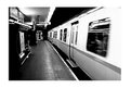
Critique By:
David Meiland (K:1820)
9/24/2001 12:29:54 PM
I think the above comments show that sometimes, when the commentators are your fellow photographers, we want to know what the subject is so we can tell you if you took a good picture of the subject. Maybe the most appropriate thing is to simply comment on whether or not we have a reaction the the image, and if so, what it is. That said, I think there's some promise in this image, a possibility that if you shot a roll or two of these that you'd get one with some really compelling features. This doesn't have any for me, and so my feeling is... what am I supposed to feel? I need some color, texture, shape, line... something strong to react to. You could work this area--it's abstract and you will need to work hard to get something a lot of people will feel positive (or negative) about. Keep trying. You should probably include more of an explanation in your posts--shutter speed, lens, etc. Just my $.02.
|
| Photo By: Greg Pauline
(K:27)
|
|
|
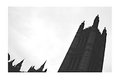
Critique By:
David Meiland (K:1820)
9/23/2001 3:00:59 PM
Excellent idea. I like the lean and I like the tops of the farthest towers peeking up. I would like more detail in the face of the building--it's pretty dark. This would be one to work on at different times of the day.
|
| Photo By: Greg Pauline
(K:27)
|
|