|
|
Critique By:
Ian Crean (K:14866)
9/30/2005 10:24:43 PM
High key, low contrast, difficult trick. Really lovely shot, simplicity in set up and subtle tones, and a hint of melancholy.
|
| Photo By: Carlheinz Bayer
(K:14220)
|
|
|
Critique By:
Ian Crean (K:14866)
9/28/2005 8:03:29 AM
Terrific Sammy, inspirational work and such modesty in your words. A great explanation worded so that anyone can understand, you make it seem so simple! If only ....
About time you hit home page, be no keeping you off it now I reckon.
Cheers, Ian
|
| Photo By: sammy -
(K:4108)
|
|
|
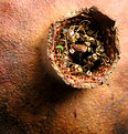
Critique By:
Ian Crean (K:14866)
9/26/2005 9:16:02 PM
Interesting organic macro, looks like a pomegrante. Strange how disturbing the vivid green element is against the earthy tones and textures.
|
| Photo By: Mirza Durakovic
(K:789)
|
|
|
Critique By:
Ian Crean (K:14866)
9/26/2005 8:41:52 PM
The long lends really accentuates the steep mountain side looming over the church which is nicely picked out from its surroundings. The chuch tower makes a noble effort to mimic the mountain.
|
| Photo By: Robert Kalb
(K:13)
|
|
|
Critique By:
Ian Crean (K:14866)
9/26/2005 8:37:45 PM
I assume this is a decorative ceramic in a cafe, nice simple job by the original designer and creator of the tile and makes for a nice photo, enchanced by your presentation.
|
| Photo By: Jánosi Bálint
(K:2818)
|
|
|
Critique By:
Ian Crean (K:14866)
9/26/2005 11:16:05 AM
I like how the exhaled smokey breath follows the line of the cigarette. Painful death in progress. Still, it's an adult product for adults with choices, isn't it? Yeah, right.
|
| Photo By: poorbaby poor
(K:159)
|
|
|
Critique By:
Ian Crean (K:14866)
9/26/2005 11:11:13 AM
The transitional light accentuates an impression that the potter turns the dull earthy clay into something bright and useful. It's like the clay is given a new life by the potter's hands and you can almost expect the new pots to be throbbing with the promise of exciting new life. In fact it might turn out to be equally mundane and even shattered. Still, there's always hope and that's what your picture breathes.
|
| Photo By: abhra aich
(K:8830)
|
|
|
Critique By:
Ian Crean (K:14866)
9/20/2005 8:56:21 PM
One of my favourite places, a beautiful rugged spot, easy enough to walk and spectacular views.
Great conditions here with the steely blue sky and light picking our colour in the rocks. For altogether different conditions see http://www.usefilm.com/image/567201.html
|
| Photo By: Mark Evans
(K:17428)
|
|
|
Critique By:
Ian Crean (K:14866)
9/17/2005 7:21:37 AM
The thumb resembles one of those classic American prairie images but the full picture reveals something more unique. The cloud forms resemble dunes in the sky,the rainbow hints at something tantalising behind the mound and connects the different parts of the frame. It may be minimalist but the whole image is full of interest and the result transports the viewer to the place and time. Very special, Carmem
|
| Photo By: Carmem A. Busko
(K:48785)
|
|
|
Critique By:
Ian Crean (K:14866)
9/15/2005 10:26:31 PM
I'm sorry to see so few views Jenni, it's a nice bold picture, the intrigue and determination to get out there is very strong in her eyes.
|
| Photo By: Jennifer Lord-Palmer
(K:2596)
|
|
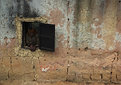
|
Critique By:
Ian Crean (K:14866)
9/14/2005 12:31:55 PM
I like the photo a lot, it comes up a little dark but could be easily edited to bring up some brightness without losing the rich tones and textures of the wall. The face at the window is a nice surprise on opening from the thumbnail.
|
| Photo By: Robert Waddingham
(K:3389)
|
|
|
Critique By:
Ian Crean (K:14866)
9/14/2005 12:29:29 PM
A double headed monster Andrew? Not with those smiles, and missing teeth do make for cutes shots. Very infectuous and I like the tight crop. I find the settings quite interesting here, such a fast shutter speed for the light and the digital ISO800 does resemble a fast film here.
|
| Photo By: Andrew Bauer
(K:381)
|
|
|
Critique By:
Ian Crean (K:14866)
9/14/2005 12:21:03 PM
Beautiful image and edit, the catching the sun against the darkened sea is eyecatching. There are a lot of jpg artefacts in the sand section which suggest overworking in lossy jpg format, if the original file is safe this is a wallhanger.
|
| Photo By: Nandor Lang
(K:1257)
|
|
|
Critique By:
Ian Crean (K:14866)
9/7/2005 11:11:24 PM
Yes, always aim for the top corner for a successful shot Waldemar! Creative.
|
| Photo By: waldemar ebner filho
(K:5242)
|
|
|
Critique By:
Ian Crean (K:14866)
9/7/2005 11:07:13 PM
Brings back memories of walking here before work in the morning, I like the misty mood, and how the floodlights are still catching part of the mosque.
|
| Photo By: murat ayral
(K:2571)
|
|
|
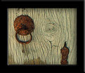
Critique By:
Ian Crean (K:14866)
9/5/2005 4:34:30 PM
Great detail piece, the knot in the wood is combines so well with the rusty knocker. The piece demands to be sharper though and posted bigger to enjoy the detail.
|
| Photo By: Nevhan Varol Yüce
(K:6)
|
|
|
Critique By:
Ian Crean (K:14866)
9/3/2005 5:15:15 AM
I'm not sure that I like the canvas effect but I do like the scene and the way you have composed it with the large foreground wheel anchoring on corner and an exit at the opposite. Looks hot, dry and abandoned.
|
| Photo By: Kostas Tzanetos
(K:22012)
|
|
|
Critique By:
Ian Crean (K:14866)
9/2/2005 4:28:55 PM
The landscape reflects the smooth ruggedness of a Guinness or west country Irish accent.
|
| Photo By: Yigal Shalhevet
(K:1286)
|
|
|
Critique By:
Ian Crean (K:14866)
9/1/2005 4:56:36 PM
Looks like great stock material Ameed, simple and spacious, almost no features other than the white house and the bands of colour.
|
| Photo By: Ameed El-Ghoul
(K:42215)
|
|
|
Critique By:
Ian Crean (K:14866)
9/1/2005 4:50:22 PM
Last one out turn the lights off.
Great widescreen image Vadim and the one car is perfectly placed, great reflection of the headlights too.
|
| Photo By: Vadim Melamedov
(K:1466)
|
|
|
Critique By:
Ian Crean (K:14866)
9/1/2005 4:47:30 PM
Really smart observation Jose, the smoke is intriguing as to its source and seems to become a natural part of the landscape, in harmony rather than conflicting with the plant. Adds up to a good graphic image with a challenge to the viewer.
|
| Photo By: jose markes
(K:157)
|
|
|
Critique By:
Ian Crean (K:14866)
8/27/2005 4:39:34 PM
This is my pick of the three Rina, just enough colour, the rock looks like some organism draining the pool. It is a beautiful piece of beach detail, great observation.
|
| Photo By: Caterina Berimballi
(K:27299)
|
|
|
Critique By:
Ian Crean (K:14866)
8/20/2005 12:02:04 AM
Really lush and makes for a good reflected nature abstract, espcecially strong if you crop away the bottom to remove the light corner which although it gives a reference to the sky, distracts. The real action is in tones and transition of dark to light laterally across the frame.
|
| Photo By: Bill Henry
(K:192)
|
|
|
Critique By:
Ian Crean (K:14866)
8/19/2005 11:38:39 PM
There's something hypnotic and demonic about this, your eyes just hold the viewers eyes fixedly, a challenge to look away. Different, and SO different to your recent office portraits. Have a great trip to India, and do try to keep the curry out of your beard, it stains something rotten. Now that would be scary, flourescent yellow streaks! Ian
|
| Photo By: Angelo Villaschi
(K:49617)
|
|
|
Critique By:
Ian Crean (K:14866)
8/19/2005 1:18:54 PM
Whilst we inevitably mourn, the end of a long lfe well lived is a cause for celebration and your shot pulls off something incredible, something I've never quite seen before, something comforting and accepting, and your words perfectly capture what comes off the screen but even without words your sensitivity and intimacy and as photographer and a welcome loved one radiate over the scene. I think that could be the magic part, the photographer is emotionally involved, and your daughter is getting incalculably valuable lessons in love and respect. I admire this piece of work. Ian
|
| Photo By: Jennifer Lord-Palmer
(K:2596)
|
|
|
Critique By:
Ian Crean (K:14866)
8/19/2005 12:04:20 PM
Superbly done Emre, not just a caught reflection but a well planned out spacial composition, and of course wonderful gritty true B&W tones and grain. Really makes me hope we never see the absolute death of film, there will always be a artistic place for it. Ian
|
| Photo By: emre devseren
(K:66)
|
|
|
Critique By:
Ian Crean (K:14866)
8/19/2005 11:40:26 AM
I like the bits of remaining tree bark giving a hint at how this would have looked before it decayed.
|
| Photo By: Neil Niamh White
(K:9165)
|
|
|
Critique By:
Ian Crean (K:14866)
8/19/2005 11:29:51 AM
I like this find, like siblings or partners, one male, one female. The pallete behind the subject is so perfect in colour, the editing glow (I imagine) also works artistically well. Excellent Marco.
|
| Photo By: Marco Cassé
(K:165)
|
|
|
Critique By:
Ian Crean (K:14866)
8/19/2005 7:50:07 AM
Goodness, already? Fine capture, love the half light and the vivid red, and those boppers.
|
| Photo By: Jennifer Lord-Palmer
(K:2596)
|
|
|
Critique By:
Ian Crean (K:14866)
8/17/2005 11:47:35 PM
Terrific John, minimalist in colour and subject matter yet full of life ad movement. The birds make a random pattern in the frame which could hardly be better if you had cut and pasted them all yourself! Makes a great abstract and also a graphic study of the storks in flight.
|
Photo By: AJ Miller
(K:49168)

|
|