|
|
Critique By:
John E Robertson (K:1752)
6/25/2004 11:36:30 PM
spooky but REALLY effective.like it!
|
| Photo By: Troy Stanton
(K:67)
|
|
|
Critique By:
Ana Vianna (K:15270)
3/9/2004 1:43:02 PM
Good lines and good idea too! ..but you should to adjust the image with some contrast and sharpness! My regards, my friend!
|
| Photo By: Troy Stanton
(K:67)
|
|
|
Critique By:
Ferran Lacruz (K:5466)
12/26/2003 12:08:22 AM
Beautiful photo, excellent prespective.
Saludos Ferran
|
| Photo By: Troy Stanton
(K:67)
|
|
|
Critique By:
this is not me (K:460)
12/22/2003 8:21:22 PM
Just shooting some ideas your way.
|
| Photo By: Troy Stanton
(K:67)
|
|
|
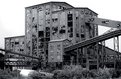
Critique By:
Troy Stanton (K:67)
12/22/2003 7:41:55 PM
The general concensus has been that this shot is too buisy. I'm inclined to agree And no Nikko I'm not at all offended. Infact I like the abstract quality your crop has added to this shot. I went for something similar on the inside but couldn't overcome the light issues, (too dark).
|
| Photo By: Troy Stanton
(K:67)
|
|
|
Critique By:
this is not me (K:460)
12/22/2003 12:15:49 AM
I just read your caption about this image...To be frank, this is an amazing shot(keeping the title in mind). The fact that the image is in B&W takes all the distractions away and helps strengthen your emotions and statement through the main jubject which it would be the window with the reflection. One small thing though...There is a small distraction at the lower left corner...if you could crop it or touch it up in PS would make this photo a perfection.
Regards,
nikko
|
| Photo By: Troy Stanton
(K:67)
|
|
|
Critique By:
this is not me (K:460)
12/21/2003 11:55:01 PM
Hey troy...this is a just a sugestion...I hope you're not offended by me playing around with you photo...All i did was a crop and adjusted the curves in photoshop.
With all respect
nikko
|
| Photo By: Troy Stanton
(K:67)
|
|
|
Critique By:
Sandro Monti (K:1278)
12/21/2003 3:09:29 PM
Nice, but I think there might be too much in there.
It's a very nice use of lines, but there's just too
much, well, to me. But still, a cool lighting and I love
how you place everything, there was just too much
things there.
Nice job!!!
|
| Photo By: Troy Stanton
(K:67)
|
|
|
Critique By:
Troy Stanton (K:67)
12/21/2003 5:44:18 AM
Yes this was the same location. I think of them all, this has become my favorite. You're right about the color. I shifted it to blue a little.
|
| Photo By: Troy Stanton
(K:67)
|
|
|
Critique By:
Troy Stanton (K:67)
12/21/2003 5:28:31 AM
I did shoot some stuff inside but I didn't have my tripod with me and it was so dark I couldn't get any good handholdable shutter speeds. I even tried pushing the film a stop but the results weren't up to snuff. Too bad too. I couild have shot there all day, eyecandy galore.
|
| Photo By: Troy Stanton
(K:67)
|
|
|
Critique By:
this is not me (K:460)
12/20/2003 10:15:05 PM
Troy...i like this one better than the other one. was it the same location? I like it a lot...I don't seeing this in a true b&w
|
| Photo By: Troy Stanton
(K:67)
|
|
|
Critique By:
this is not me (K:460)
12/20/2003 10:11:49 PM
Hey Troy...good work buddy. I bet this was a a ton of fun to shoot at. did you get to break in and shoot stuff inside?
|
| Photo By: Troy Stanton
(K:67)
|
|
|
Critique By:
Troy Stanton (K:67)
12/20/2003 7:14:07 AM
Actually I did use a tripod. I 'm curious as to what specificaly you find wrong with it. Can't grow if I don't know.
|
| Photo By: Troy Stanton
(K:67)
|
|
|
Critique By:
John Beavin (K:4477)
12/20/2003 1:32:29 AM
Sorry, I cannot rate this very high, You did"nt use a tripod did you? Never mind, you have a good camera and I am sure you will improve with practice.
|
| Photo By: Troy Stanton
(K:67)
|
|
|
Critique By:
Sandro Monti (K:1278)
12/15/2003 8:18:59 PM
Nice contrast between the the broken and the
unbroken windows. I think that this what makes
the shot. Nice use of lines too.
Good shot!
|
| Photo By: Troy Stanton
(K:67)
|
|
|
Critique By:
Robert Walls (K:1728)
12/15/2003 7:12:45 PM
An interesting collection of shapes Troy.
A reminder of another time.
|
| Photo By: Troy Stanton
(K:67)
|
|
|
Critique By:
B:)liana (K:30945)
12/15/2003 4:05:49 AM
Good capture of forms and shapes. but too heavy composition for me ;-)
|
| Photo By: Troy Stanton
(K:67)
|
|
|
Critique By:
peta jones (K:12615)
12/14/2003 6:44:49 PM
Lovely photo Troy, I love the soft effect you have used, I bet the bride was thrilled with this one. Sweet interaction.
|
| Photo By: Troy Stanton
(K:67)
|
|
|
Critique By:
Rodrigo D (K:1577)
12/14/2003 6:35:46 PM
Brassaï had once has the same idea of take a photo of broken windows to illustrate a surrealist poetry book... anyway, broken windows always drive me to sad!
you both took a great photo as Brassaï did and drive to emotions... thank you for post it!
|
| Photo By: Troy Stanton
(K:67)
|
|
|
Critique By:
Johnpaul Soto (K:675)
12/14/2003 4:09:23 PM
Very good, I like the angle in which you captured the subject. Congrats.
|
| Photo By: Troy Stanton
(K:67)
|
|
|
Critique By:
Lissa Hatcher (K:3006)
12/14/2003 3:06:34 PM
Nice work could use some more contrast and less depth of field .... really great composition... did you notice the tone was a bit bule ?
|
| Photo By: Troy Stanton
(K:67)
|
|
|
Critique By:
Lissa Hatcher (K:3006)
12/14/2003 3:05:14 PM
The sky is a little bright , but other than that nice composition.
|
| Photo By: Troy Stanton
(K:67)
|
|
|
Critique By:
J.T. Lovell (K:149)
12/14/2003 3:04:16 PM
Nice melancholy feeling.
|
| Photo By: Troy Stanton
(K:67)
|
|
|
Critique By:
Lissa Hatcher (K:3006)
12/14/2003 3:04:07 PM
I like it ... would make a great series...
|
| Photo By: Troy Stanton
(K:67)
|
|
|
Critique By:
Teunis Haveman (K:37426)
12/14/2003 2:57:34 PM
Troy, great work
|
| Photo By: Troy Stanton
(K:67)
|
|
|
Critique By:
Betsy Hern (K:12872)
12/12/2003 9:14:33 PM
Of all the photos in your portfolio this one caught my eye. I am a graphic artist too (at least they pay me to pretend I am one) and this one presents itself as the most "graphic" of all your images. The longer I work in this biz the more I'm drawn to simple, monochromatic, uncluttered images. We are constantly bombarded with fast, flashy, vivid, loud, in-your-face... This pic is so soothing, so soft, so simple. I am also a little jealous, I've been trying to get a good fog pic for many a year. I live near Lake Michigan and am too lazy to venture down in the wee hours of the morn to capture fog, so I will simply enjoy this image. Nicely captured.
|
| Photo By: Troy Stanton
(K:67)
|
|
|
Critique By:
Isaac Shaw (K:2563)
12/12/2003 6:41:51 PM
Troy,
I really like the model and pose. Perhaps waiting another 30-45 mins would have offered a better light for this but the composition and appeal of this is very nice! I'm only an amateur but I know what I like when I see it (getting it down on film is my challenge, :-)).
Congrats,
Isaac
|
| Photo By: Troy Stanton
(K:67)
|
|
|
Critique By:
Isaac Shaw (K:2563)
12/12/2003 6:38:11 PM
Very nice work Troy. You definitely got the moment here!
Congrats!
Isaac
|
| Photo By: Troy Stanton
(K:67)
|
|
|
Critique By:
Marco Ferlito (K:412)
12/12/2003 6:09:46 AM
Very nice.
Welcome
Marco
|
| Photo By: Troy Stanton
(K:67)
|
|
|
Critique By:
Lissa Hatcher (K:3006)
12/12/2003 5:14:39 AM
on the front page YEA ... I feel this shot should have been a vertical instead of a horizonal .... you did a great job witht eh back light though .... keep wprking on it .
|
| Photo By: Troy Stanton
(K:67)
|
|