|
|
Critique By:
Che C (K:763)
3/19/2004 2:46:37 AM
Great picture. I feel that the well focused petal to the left is fighting for a bit too much attention. Could look nicer in a tighter/square format perhaps?
|
| Photo By: Dan Lightner
(K:12684)
|
|
|
Critique By:
Che C (K:763)
3/19/2004 2:37:09 AM
Love your model series - very James Bond-like picture. I think this one would look nicer if you crop above Fleur's skirt or the knee-length boot.
P.S. I see that you have a new digital camera!
|
| Photo By: Antonella Nistri
(K:21867)
|
|
|
Critique By:
Che C (K:763)
3/17/2004 12:56:02 AM
I like the blurry people in this picture. Great choice of slow shutter speed to capture the movements. I think that you could also use a tripod/monopod and render the background(especially the roof) sharp.
|
| Photo By: Danish Abadi
(K:1468)
|
|
|
Critique By:
Che C (K:763)
3/17/2004 12:53:04 AM
A very nice picture. Good composition: I like the grainy effects but feel that the picture could have been a bit sharper.
|
| Photo By: Saurav Dutta
(K:64)
|
|
|
Critique By:
Che C (K:763)
3/17/2004 12:44:44 AM
This picture is awesome! I would prefer the surfer placed to the lower left on the picture but this is still awesome! 
|
| Photo By: Giuseppe Repetto
(K:177)
|
|
|
Critique By:
Che C (K:763)
3/17/2004 12:41:45 AM
Excellent composition. Lovely country. This would look good in colour too, I think.
|
| Photo By: Antonella Nistri
(K:21867)
|
|
|
Critique By:
Che C (K:763)
3/14/2004 9:07:29 PM
An excellent shot. Great DOF and I love it.
|
| Photo By: Juergen Kollmorgen
(K:6)
|
|
|
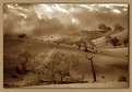
Critique By:
Che C (K:763)
3/14/2004 4:16:24 PM
A great shot. I like lonely-looking pictures and this is one of them. Might also worth a shot at a lower angle, max DOF, square format.
|
Photo By: Roberto Arcari Farinetti
(K:209486)

|
|
|
Critique By:
Che C (K:763)
3/14/2004 4:11:28 PM
Another classic portrait. The scene is contrasty but nothing is out of place. Great use of selective DOF.
|
| Photo By: Antonella Nistri
(K:21867)
|
|
|
Critique By:
Che C (K:763)
3/10/2004 2:12:00 AM
I love your model(s) series. I would prefer a tighter crop (face + shoulders) or a full frame. A classic pose.
|
| Photo By: Antonella Nistri
(K:21867)
|
|
|
Critique By:
Che C (K:763)
3/8/2004 7:57:03 PM
I like this a lot. The sun placement is too close to the corner, I think but this is a nice picture all the same.
|
| Photo By: J Y
(K:265)
|
|
|
Critique By:
Che C (K:763)
3/7/2004 11:47:07 PM
A super shot. Looks like one of those nike images. Now all it needs is a nike swoosh across the chest!
|
| Photo By: Andrew Caldwell
(K:18307)
|
|
|
Critique By:
Che C (K:763)
3/7/2004 11:41:54 PM
A nice picture to look at. Great composition and lighting. I like the dreamy look of the picture. Congratulations for being on the front page and photographer of the day.
|
| Photo By: Rebecca Raybon
(K:26654)
|
|
|
Critique By:
Che C (K:763)
3/7/2004 8:51:28 PM
Good colour and composition. The lighting is a bit harsh but works in this picture showing the contours on the wall.
|
| Photo By: laura diaz
(K:863)
|
|
|
Critique By:
Che C (K:763)
3/7/2004 8:40:16 PM
A very lovely picture. Works well compositionally. Could bring it to the next level emotionally with a super grainy B&W shot.
|
| Photo By: Glenn R. McGloughlin
(K:3716)
|
|
|
Critique By:
Che C (K:763)
3/7/2004 5:30:12 PM
A great shot. Good composition and lighting but what's up with the tree branches towards the right of the picture?
|
| Photo By: Amy B
(K:619)
|
|
|
Critique By:
Che C (K:763)
3/7/2004 5:25:44 PM
I like this version more than the other. Good contrasty picture. Could use a little clone tool in PS to remove the lamp post on the boy's head but a nice picture all the same.
|
| Photo By: lowell whipple girbes
(K:13151)
|
|
|
Critique By:
Che C (K:763)
3/7/2004 5:23:16 PM
A nice b&w image - the main line leading into the picture hold my attention. Good place for low light/long exposure shots.
|
| Photo By: gregory J. mclemore
(K:1810)
|
|
|
Critique By:
Che C (K:763)
3/7/2004 5:19:44 PM
Great tones and depth of picture. A very attractive image.
|
| Photo By: Hans Petter Nenseth
(K:284)
|
|
|
Critique By:
Che C (K:763)
3/3/2004 1:28:25 PM
This is the kind of compostion that you'll find in chinese paintings - very harmonious and not too cluttered. Good use of large f-stop for blurry background. Congrats.
|
| Photo By: Antonella Nistri
(K:21867)
|
|
|
Critique By:
Che C (K:763)
2/26/2004 12:45:46 AM
A very nice peaceful image. Good framing with overhead branches and rocks on the foreground. Lots of potential photos on this nudey beach
|
| Photo By: Melissa Schalke
(K:2070)
|
|
|
Critique By:
Che C (K:763)
2/26/2004 12:33:10 AM
Wow. Nice macro shot. Wonderful details on the flower. And excellent camera gear too!
|
| Photo By: Jorg Reif
(K:16020)
|
|
|
Critique By:
Che C (K:763)
2/26/2004 12:31:02 AM
An excellent picture. Very eye-catching. Good work.
|
| Photo By: Danish Abadi
(K:1468)
|
|
|
Critique By:
Che C (K:763)
2/25/2004 1:16:04 AM
A very very very nice image. Good smooth skin tones. Sexy eyes. And great composition.
|
| Photo By: AGUS DWIANTO
(K:-14)
|
|
|
Critique By:
Che C (K:763)
2/25/2004 1:00:45 AM
This is a change from your usual portrait shots(involving lovely ladies!) but I like this shot a lot. Good composure and placement of the farmer's hands. The age lines gives the man a bit of character. A very elegant picture.
|
| Photo By: Antonella Nistri
(K:21867)
|
|
|
Critique By:
Che C (K:763)
2/24/2004 9:25:55 PM
I like blurry water shots, in particularly ones like this. A well balanced picture - composition, exposure & lighting.
|
| Photo By: Jimmie Clark
(K:312)
|
|
|
Critique By:
Che C (K:763)
2/24/2004 6:04:12 PM
Good composition. THis is one image that you can play with in Photoshop and end up with all sorts of interesting images.
|
| Photo By: emrah soylemez
(K:577)
|
|
|
Critique By:
Che C (K:763)
2/24/2004 5:42:30 PM
This is a great picture. Viewed 100X but I'm not sure why you didn't get many comments on this. I'm a big fan of the vertical format landscapes and this one is well done. Great long shadows bringing out the contours of the land. Perhaps a little bit of cropping at the top right hand corner would make this picture more beautiful.
|
| Photo By: Tony Smallman
(K:23858)
|
|
|
Critique By:
Che C (K:763)
2/24/2004 12:23:14 PM
A good play with light and shadows. The diagonal lines give some dynamics to the picture.
|
| Photo By: Gábor Koscsó
(K:-229)
|
|
|
Critique By:
Che C (K:763)
2/24/2004 12:20:32 PM
A very nice and simple composition.
|
| Photo By: John Reed
(K:6994)
|
|