|
|
Critique By:
Paul Sanders (K:744)
10/30/2006 3:56:33 AM
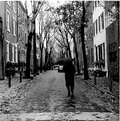
Excellent model and nice angle. The best constructive criticism I would have would be to avoid too much reflection in subject's glasses and avoid distracting backgrounds (like the figure in the top left corner). Good job.
|
| Photo By: Marina La Scala
(K:1545)
|
|
|
Critique By:
Paul Sanders (K:744)
10/23/2006 5:30:43 AM
It definitely has something to do with the photo being digitized and scanned. I'm not too competent and patient with scans, etc. It actually discouraged me from posting or making a webpage for such a long time. The prints I made myself especially the 16 x 16 are so much better. Shame.
|
| Photo By: John William
(K:775)
|
|
|
Critique By:
Paul Sanders (K:744)
10/23/2006 4:00:41 AM
Nice capture! Always loved these kinds of photos. There are many criteria for what constitutes a good photo. Sometimes a photo can evoke an emotional response. This photo does that. I think I'll go hop on a swing now...The only critique I have is maybe the photo should be a tad darker or have more contrast? Nice.
|
| Photo By: John William
(K:775)
|
|
|
Critique By:
Paul Sanders (K:744)
9/14/2005 3:32:17 PM
Very nice capture
|
| Photo By: Hai Thanh
(K:1396)
|
|
|
Critique By:
Paul Sanders (K:744)
9/6/2005 9:13:27 PM
Cool image. It looks like a toy city.
|
| Photo By: Martin Rosa
(K:-106)
|
|
|
Critique By:
Paul Sanders (K:744)
9/5/2005 8:27:49 PM
Mirko,
An excellent use of the Holga. This photo has tons of mood. I couldn't tell if I liked how the angel was positioned but I decided I liked it. For some reason having the angel faceless has more of an impact. Congrats. Paul
|
| Photo By: Mirko Nardecchia
(K:486)
|
|
|
Critique By:
Paul Sanders (K:744)
9/5/2005 8:22:58 PM
Claude,
Excellent style in this photo and excellent style in the woman. I normally don't like fashion/portrait stuff but I love this photo. It is very original plus it has an excellent retro feel to it which I'm a sucker for. Congratulations. Paul
|
| Photo By: Claude Tenot
(K:9960)
|
|
|
Critique By:
Paul Sanders (K:744)
9/5/2005 5:25:45 PM
Mark,
Great set of photos! There are many things that qualify for a good photo. A lot of my favorite photos are those that immediately hit an emotional response in myself and this is one of those photos. Paul
|
| Photo By: Mark Hamilton
(K:8387)
|
|
|
Critique By:
Paul Sanders (K:744)
9/5/2005 1:38:54 PM
Excellent
|
| Photo By: Mirko Nardecchia
(K:486)
|
|
|
Critique By:
Paul Sanders (K:744)
8/26/2005 1:01:15 PM
Very nice.
|
| Photo By: Sebastian Jelinski
(K:179)
|
|
|
Critique By:
Paul Sanders (K:744)
8/19/2005 10:35:54 PM
Arthur,
I'm glad I clicked on this image. A great silhouette and sharp image. You managed to have good composition and also make the ride somewhat ominous looking. Congrats.
|
| Photo By: Arthur Fleischmann
(K:16)
|
|
|
Critique By:
Paul Sanders (K:744)
8/19/2005 7:15:54 PM
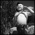
An adorable image and great capture. The toning is excellent as well.
|
| Photo By: ol an
(K:-248)
|
|
|
Critique By:
Paul Sanders (K:744)
8/19/2005 7:08:28 PM
very nice exposure
|
| Photo By: Piotr Niewierowicz
(K:2401)
|
|
|
Critique By:
Paul Sanders (K:744)
8/19/2005 7:01:49 PM
Excellent. Nice exposure.
|
| Photo By: Pieter Tieghem
(K:66)
|
|
|
Critique By:
Paul Sanders (K:744)
8/19/2005 5:16:27 PM
I really like this picture and I love what you are trying to capture with your photos. Documentary photography is my favorite. This photo is really busy with a lot going on which means you can probably look at it repeatedly and find new, interesting things each time.
|
| Photo By: Hanggan Situmorang
(K:24833)
|
|
|
Critique By:
Paul Sanders (K:744)
8/19/2005 12:35:32 PM
Hanggan, this is an impressive photo. You captured the sky very well. However, I think the sky is distracting. Is the subject of this photo the villagers or the sky? I think if you would have come in closer to the villagers then the picture would have even been better. Indonesia, the land and the people look beautiful.
|
| Photo By: Hanggan Situmorang
(K:24833)
|
|
|
Critique By:
Paul Sanders (K:744)
8/17/2005 5:10:13 AM
nice image. I like the composition and the whole mood of the image.
|
| Photo By: daniel grant
(K:155)
|
|
|
Critique By:
Paul Sanders (K:744)
8/15/2005 1:16:49 AM
Moises,
I'm so jealous. Extremely well executed shot with gorgeous tones, mood, and light. Keep up the good work!
|
| Photo By: Moises Levy
(K:782)
|
|
|
Critique By:
Paul Sanders (K:744)
8/6/2005 4:26:26 AM
Joern,
Wonderful picture! Congratulations.
|
| Photo By: Joern Stubbe
(K:65)
|
|
|
Critique By:
Paul Sanders (K:744)
8/2/2005 12:17:40 PM
Moises,
I love the tones and I love the highlights on the rocks. I also like how the long exposure caused the chair to "glow." Nice pic.
|
| Photo By: Moises Levy
(K:782)
|
|
|
Critique By:
Paul Sanders (K:744)
7/31/2005 2:34:41 PM
Chris, wow this is excellent. I laughed out loud when I read the title and then saw the picture. Nice sharp image and nice tones. It seems like the day was bright and sunny so you did well with the exposure. The cloud above the sheep made the image so much better as well. Congrats and eat fry bread!
|
| Photo By: Chris Blaszczyk
(K:610)
|
|
|
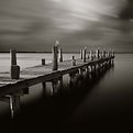
Critique By:
Paul Sanders (K:744)
7/31/2005 4:10:08 AM
Mark,
I really love this image. I really love the moodiness of this picture and I especially love the sky, how it is bright in the center and very dark in the corners. The only thing I'm not sure of is the pole. I might think this would look better without the light. I can't tell if it's distracting or not. Perhaps you can continue to experiment with the same type of image but with a simpler pole or telephone pole. Just an idea. Congratulations on the success with the toy camera. I really do love this image.
|
| Photo By: Mark Hamilton
(K:8387)
|
|
|
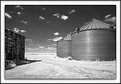
Critique By:
Paul Sanders (K:744)
7/28/2005 5:50:24 PM
Don,
It's funny how every time there is a critique only post no one ever does that. Anyway, I think the composition is nice and the fact that you can see all the detail inside the corn crib is great. If this was my shot the crib would probably be really dark and contrasty (bad). The only critique I have is probably the fact that another time of day would have probably been better or even a more overcast day would have turned out better. It seemed the day was really bright or maybe it is the IR effect. Also, possibly not using IR would have been a better choice because the grass just looks really burnt and too bright. Just some things to think about. I'm no expert myself.
|
| Photo By: Don Loseke
(K:32503)
|
|
|
Critique By:
Paul Sanders (K:744)
7/28/2005 11:59:55 AM
Dubravko,
Very nice photo. I've never heard of the Robot Star 25. It sounds like it might be a large format camera. This photo has a classic, almost vintage large, medium format look reminiscent of Doisneau, etc. The pedestrian makes the picture a whole lot better making the photo much more interesting. Congrats.
|
| Photo By: Dubravko Grakalic
(K:25235)
|
|
|
Critique By:
Paul Sanders (K:744)
7/28/2005 3:21:54 AM
Jeff, this is an excellent, creative photograph. You get bonus points for the excellent toning and creative processes and also for doing it the old fashioned way and not thru photoshop. Congrats!
|
| Photo By: Jeff Michalek
(K:139)
|
|
|
Critique By:
Paul Sanders (K:744)
1/5/2005 4:26:48 PM
Rebecca,
Thanks for the comment. I really like silhouettes. Usually the sun is blocked out but in this instance I thought what would it look like if it was only partially blocked out? Anyway, I thought in this case to be a good idea. I liked your comments about photography in your bio. Photography only increases my enjoyment of life because it forces you to realize either the beauty in everyday things or at least the artistic value in them. That is an interesting perspective. I never thought of it that way before. Thanks.
|
| Photo By: Paul Sanders
(K:744)
|
|
|
Critique By:
Paul Sanders (K:744)
12/6/2004 3:16:51 PM
Carlos, Thanks so much for your comments. You have convinced me that I should enlarge this photograph. I used to be mostly against large prints (16 inches or larger)but I was recently convinced to make some large prints and I love it! In fact I recently did one of "Chinatown Rollerblader" which you suggested and I think it looks so much better. The tones are better and you can see much more detail. Thanks again.
|
| Photo By: Paul Sanders
(K:744)
|
|
|
Critique By:
Paul Sanders (K:744)
11/3/2004 4:47:53 PM
Great capture. I'm happy to see a Rollei image. Nice clear, sharp image and interesting angle.
|
| Photo By: Piotr Niewierowicz
(K:2401)
|
|
|
Critique By:
Paul Sanders (K:744)
9/3/2004 2:26:54 PM
Exellent drama in this picture. The silhoulette is great and I like how the "drama" in the clouds and sky are kind of split into two main areas. Also, the bright sun at the one branch is a nice touch. The grain seems to suit the picture as well. Nice concept. Nice to see you're not afraid of grain like I am.
|
| Photo By: Murat Harmanlikli
(K:7846)
|
|
|
Critique By:
Paul Sanders (K:744)
8/26/2004 2:26:11 PM
Jose, I totally agree with you about the contrast. Unfortunately, as is common the original print is much sharper and contrasty and I had no way of adjusting the contrast on the scan. Thanks for commenting. There is something about the composition I don't quite like for some reason. I think maybe a panoramic view would be better?
|
| Photo By: Paul Sanders
(K:744)
|
|