|
|
Critique By:
Andre Balijon (K:66)
10/11/2005 1:50:46 PM
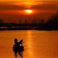
Beautifull colors, lines and shadow!
|
| Photo By: Ina Nicolae
(K:44481)
|
|
|
Critique By:
Andre Balijon (K:66)
10/6/2005 8:37:34 PM
Beautifull colours, nice combination of photographs
|
| Photo By: Mitchell Miller
(K:3009)
|
|
|
Critique By:
Andre Balijon (K:66)
3/1/2005 6:45:05 PM
Very nice photograph and subject. I do like stairs and doors.
|
| Photo By: Naomi Weidner
(K:6636)
|
|
|
Critique By:
Andre Balijon (K:66)
2/27/2005 12:46:11 PM
Beautiful!!!
|
| Photo By: José Azevedo
(K:9845)
|
|
|
Critique By:
Andre Balijon (K:66)
2/24/2005 8:01:53 PM
Hello Erwin, maybe your picture looks stronger with a little more punch.
|
| Photo By: Erwin Spronck
(K:10)
|
|
|
Critique By:
Andre Balijon (K:66)
2/24/2005 7:47:40 PM
You are creating a beautiful serie of blue. I like this one most. It is all about the color and light, no distractions here. If the quality is good enough it would be a beauty on a big size print.
|
| Photo By: David Bourke
(K:2239)
|
|
|
Critique By:
Andre Balijon (K:66)
2/24/2005 7:38:45 PM
Beautiful nearly monochrome blue. But I can't see what those dark blue (and red) things are.
|
| Photo By: David Bourke
(K:2239)
|
|
|
Critique By:
Andre Balijon (K:66)
2/24/2005 6:51:50 PM
I like the photo and the idea. Did you experiment with other compositions? (more to the left/right horzontal?)
|
| Photo By: José Azevedo
(K:9845)
|
|
|
Critique By:
Andre Balijon (K:66)
2/24/2005 6:37:37 PM
Apparently it took a lot of effort to make this picture, but indeed: why?
|
| Photo By: EUGENIO SINATRA
(K:1948)
|
|
|
Critique By:
Andre Balijon (K:66)
2/24/2005 1:59:45 PM
Makes you wish it was spring already. It's still freezing in Holland.
|
| Photo By: l j
(K:349)
|
|
|
Critique By:
Andre Balijon (K:66)
2/24/2005 1:55:51 PM
Very original view(point)! It makes a familiar thing look very special...
|
| Photo By: Robert Lloyd
(K:9943)
|
|
|
Critique By:
Andre Balijon (K:66)
2/17/2005 7:38:23 PM
Beautiful! Perfect, except for the dark round spot in the left upper corner. Maybe dust on the sensor? (Could easily be removed with photoshop) 7/7
|
Photo By: KEVIN TEMPLE
(K:8657)

|
|
|
Critique By:
Andre Balijon (K:66)
2/17/2005 7:26:11 PM
Very nice picture. It trembles in my eyes and has a nice resting point at the "angel". Did you use a special photoshop trick or is this the effect of f/2 ?
|
| Photo By: ann!e
(K:2441)
|
|
|
Critique By:
Andre Balijon (K:66)
2/17/2005 7:18:30 PM
Beautiful briljant colors. The movement makes it look like an abstract painting. Very inspiring!
|
| Photo By: lowell whipple girbes
(K:13151)
|
|
|
Critique By:
Andre Balijon (K:66)
2/17/2005 7:10:26 PM
Nice striking portraits. How did you do it? It looks like people looking through a door spy-hole.
|
| Photo By: aviva s.
(K:346)
|
|
|
Critique By:
Andre Balijon (K:66)
2/16/2005 9:19:17 PM
It's just a matter of taste. I hope you are not offended. It was just a suggestion. I think that it doesn't matter how the colors looked in reality, the viewer only sees the photo and has no rememberance of that morning. I mirrorred your photograph because I read from left to right. For me it feels naturally to let the bird fly in that direction. I played a little bit with your photograph because I liked your photo ...
|
| Photo By: Giovanni Guerrieri
(K:1169)
|
|
|
Critique By:
Andre Balijon (K:66)
2/16/2005 5:50:25 PM
Hi, nice picture, but i.m.h.o. it needs a bit tweeking to get stronger colors... But maybe you think otherwise.
|
| Photo By: Giovanni Guerrieri
(K:1169)
|
|
|
Critique By:
Andre Balijon (K:66)
2/16/2005 5:27:17 PM
I like this photo a lot. Nice color and light/dark balance. Beautiful lonesome-evening mood. Maybe the red lamp draws a little bit too much attention, but it also helps the picture.
Beautiful!
|
| Photo By: kokupsy_un morita
(K:2651)
|
|
|
Critique By:
Andre Balijon (K:66)
2/16/2005 4:58:02 PM
A really nice picture!
But maybe the building in the middle looks a bit leaning to the left?
Very sharp for 1 sec without tripod!
|
| Photo By: Patrick Elsass
(K:552)
|
|


