|
|
Critique By:
Mark Peterson (K:3452)
11/13/2003 11:01:30 PM
The ducklings distracted me alittle. I think the reflection is a nice enough photo without the ducks.
|
| Photo By: David Morris
(K:1404)
|
|
|
Critique By:
Fabio Keiner (K:81109)
10/8/2003 2:19:32 AM
excellent graphical efect for your reworking
and impeccable as a macro
(not so sure, what you mean with 'cliche'-images, as this one certainly is also a cliche: that's photography, like it or not

|
| Photo By: David Morris
(K:1404)
|
|
|
Critique By:
melik iscan (K:907)
10/7/2003 9:38:44 PM
nice shot ,best regards
|
| Photo By: David Morris
(K:1404)
|
|
|
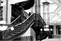
Critique By:
Paul's Photos (K:35235)
9/20/2003 10:34:50 PM
Very interesting photo.. love the architecture.. seems a little overexposed.. like the b&w...
|
| Photo By: David Morris
(K:1404)
|
|
|
Critique By:
Jose Ignacio (Nacho) Garcia Barcia (K:96391)
9/19/2003 9:12:14 PM
beautiful.I agree with Luke.
|
| Photo By: David Morris
(K:1404)
|
|
|
Critique By:
Jose Ignacio (Nacho) Garcia Barcia (K:96391)
9/9/2003 10:24:13 PM
great detail.nice composition.
|
| Photo By: David Morris
(K:1404)
|
|
|
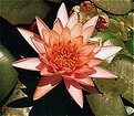
Critique By:
Joksa Juoperi (K:13473)
9/7/2003 1:22:34 AM
Great and beautiful flower shot with nice details and colours.
Regards, Joksa.
|
| Photo By: David Morris
(K:1404)
|
|
|
Critique By:
John Nelson (K:161)
9/7/2003 1:19:53 AM
It is still a nice shot
|
| Photo By: David Morris
(K:1404)
|
|
|
Critique By:
John Hatziemmanouil (K:40580)
9/7/2003 12:40:26 AM
Nice flower. Good presentation David.
|
| Photo By: David Morris
(K:1404)
|
|
|
Critique By:
Jeff Moss (K:552)
9/6/2003 10:26:02 PM
Beautiful flower. The lighting seems a bit harsh though.
|
| Photo By: David Morris
(K:1404)
|
|
|
Critique By:
Toni Martin (K:5092)
8/24/2003 10:49:37 PM
David, I like this. But I think it could be much better in a square format. Without the color to make that extra space important, the negative space above can become more dynamic if tightened up. Just try it.
|
| Photo By: David Morris
(K:1404)
|
|
|
Critique By:
ryan winton (K:3027)
8/24/2003 7:06:24 PM
nice shot, there are little bits of white flecks on the image, very distracting,
also the crop is a little off kilter,
great lighting!!! actually, awsome lighting
|
| Photo By: David Morris
(K:1404)
|
|
|
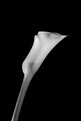
Critique By:
Luke Luther (K:14693)
8/23/2003 9:44:41 PM
nice simple composition. i think it could be sharper. the edges look a tiny bit blurred. perhaps using a tripod and increasing your DOF. don't get me wrong as i really like what you have done here. it is clean and succint in terms of expressing an idea about the beuaty of this flower.
|
| Photo By: David Morris
(K:1404)
|
|
|
Critique By:
ryan winton (K:3027)
8/23/2003 8:34:27 PM
very slick
|
| Photo By: David Morris
(K:1404)
|
|
|
Critique By:
CJ Kitts (K:1607)
8/15/2003 6:00:06 AM
Very interesting photo. The reflection is striking!
|
| Photo By: David Morris
(K:1404)
|
|
|
Critique By:
Jim F (K:8859)

8/14/2003 4:36:16 PM
Beautiful colors, reflections and composition. IMO, you could have entered this as an abstract photo.
|
| Photo By: David Morris
(K:1404)
|
|
|
Critique By:
Jose Ignacio (Nacho) Garcia Barcia (K:96391)
8/13/2003 9:42:43 PM
great composition.marvelous textures.
|
| Photo By: David Morris
(K:1404)
|
|
|
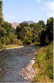
Critique By:
Bee Arthur (K:2259)
7/9/2003 1:54:38 PM
I think the only problem with this is the composition. My first recommendation would definately be a polarizing filter, because it was such a bright day. More importantly, if you think about the fact that this river does bend, and then play with the perspective of the river. I don't know where you were standing but if you could get the river to flow right up to through the whole bottom of the page and then sweep back and slim-up you would create great depth. The angle you are at right now, and the way you cropped the river make it stay the same thickness all the way back. Another idea would have been to set up more of a defined foreground, middle ground, and background. This could simply even in this shot by simply getting lower to the ground and including those reeds or rocks as a larger subject in the front.
I don't mean to tear apart this photo. It is an excellent subject, and I think you have the right eye to know when something should be captured. Also, rarely do I get the right picture on the first shot or first visit. If you have a chance to go back, see what you like and didnt like about the pictures and try them again. I do that all the time.
Keep up the excellent work.
|
| Photo By: David Morris
(K:1404)
|
|
|
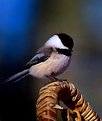
Critique By:
Toni Petersen (K:2404)
6/23/2003 1:15:40 AM
I wish I could see the bird's eye but other than that it's an aesthetically pleasing foto.
|
| Photo By: David Morris
(K:1404)
|
|
|
Critique By:
Evy Johansen (K:667)
6/14/2003 8:21:17 PM
Great shot - beautiful colors! - Evy
|
| Photo By: David Morris
(K:1404)
|
|
|
Critique By:
Jamie Haggett (K:694)
6/14/2003 11:43:08 AM
The composition on this could be better. The tree's up the left side are a little distracting. You should also try a polarizing filter to help deepen the blue sky.
|
| Photo By: David Morris
(K:1404)
|
|
|
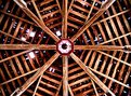
Critique By:
Sue O'S (K:12878)
6/13/2003 8:46:05 AM
I agree with all of the above. When I first saw this, my first thought was it was a picture of some ancient Grecian script or building. Nicely done. Good eye.
|
| Photo By: David Morris
(K:1404)
|
|
|
Critique By:
Chris Lauritzen (K:14949)
6/13/2003 8:17:32 AM
David,
Congrats! This is a good capture and I really don't think anything needs to be changed.
|
| Photo By: David Morris
(K:1404)
|
|
|
Critique By:
Hermen Pen (K:9168)
6/12/2003 2:25:50 PM
The flower is a bit distracting from the main subject. You could make a sense of movement by making longer exposure (i.e. give the frog a swing and open shutter when it is in it most backward position and close it when it is in the equilibrium position) and flash on the second curtain. Maybe take a landscape view to show more of the movement. Your subject is just across the street so maybe you can experiment a little further
|
| Photo By: David Morris
(K:1404)
|
|
|
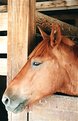
Critique By:
Hermen Pen (K:9168)
6/12/2003 1:45:50 PM
Adding to William's comment: you can still try some post processing in e.g. Photoshop. Reducing the midtones will deepen the colours of the horses head. (The digital analogue of printing it darker). with respect to the composition: the position of the head in the plane is well chosen. I would prefer to have the vertical pole *exactly* vertical, so I would suggest to give it a slight rotation to the left.
|
| Photo By: David Morris
(K:1404)
|
|
|
Critique By:
William Ash (K:443)
6/7/2003 8:04:19 PM
The image is overexposed. If you used negative film, print it darker. The subject appeared dark to your camera's meter and so overexposed the film. The trick is to recognize what situation are going to fool your camera meter and then compensate accordingly. You can also bracket; take a series of exposures below and abouve what your camera says. If you have manual exposure control, use that. If not, use exposure compensation or adjust the film speed setting.
|
| Photo By: David Morris
(K:1404)
|
|
|
Critique By:
Orazio Minnella (K:49417)
5/31/2003 11:22:40 PM
Bella foto
|
| Photo By: David Morris
(K:1404)
|
|
|
Critique By:
Diana Cornelissen (K:26437)
5/31/2003 11:15:37 PM
Beautifl capture and background colors!
Bye, Diana
|
| Photo By: David Morris
(K:1404)
|
|
|
Critique By:
Kajo Buzek (K:1459)
5/31/2003 10:29:39 PM
good job
|
| Photo By: David Morris
(K:1404)
|
|
|
Critique By:
Kim kyungsang (K:14135)
5/31/2003 10:18:33 PM
WOW~~ I like your photo~~ nice shot~~
|
| Photo By: David Morris
(K:1404)
|
|