|
|
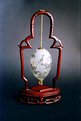
Critique By:
Garry Edwards (K:400)
5/20/2003 12:48:58 AM
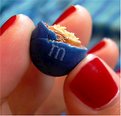
This is a very competent shot, but a couple of suggestions:
1. Use black 'reflectors' (absorbers) just out of shot each side to give a darker edge.
2. Separate the cup and saucer, with saucer perhaps behind and to one side of the cup
3. Photograph on black glass or black melamine to pick up a fairly faint reflection.
4. Position your light a little further back to eliminate the gold reflection on the handle.
Overall, a very good effort
|
| Photo By: Lucas Macedo
(K:12843)
|
|
|
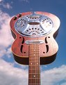
Critique By:
Garry Edwards (K:400)
5/18/2003 3:00:41 PM
A nice shot, well thought out and handled with care, the only problem is that the base is disappearing into the background. This could have been avoided with backlighting.
|
| Photo By: Tommaso Di Falco
(K:23819)
|
|
|
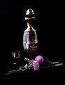
Critique By:
Garry Edwards (K:400)
5/14/2003 8:28:18 AM
A very good idea, and well executed - but I wonder whether it would be better with the guitar pointing upwards?
|
| Photo By: Nicola Vassallo
(K:9801)
|
|
|
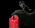
Critique By:
Garry Edwards (K:400)
5/14/2003 4:42:57 AM
Very well thought out and executed, I think I would have used a mildly tinted liquid though - rose perhaps - which would have still shown the background through but would have added a little impact. Also, it's a good idea to use a water spray to bring the fruit to life. Very well done!
|
| Photo By: Suzanne Williams
(K:380)
|
|
|
Critique By:
Garry Edwards (K:400)
5/12/2003 10:12:26 AM
Terrible JPEG artifacts here, it's difficult to see the quality of the original.
Good use of colour and I like the simple, single light. I wonder whether it might have been better with the light lower, to cast a higher shadow from the glass?
|
| Photo By: Bandi Friedmann
(K:1100)
|
|
|
Critique By:
Garry Edwards (K:400)
5/10/2003 3:54:09 PM
The first thing to strike me is the lighting, which I feel is excellent. Maybe I would have positioned it a little higher though. The second thing in the background, which I find a little distracting. Do you think it would be better if it went full width?
The other point, a small one, is that I think the eyes need to be off-centre but perhaps not quite so far off.
The pose is very effective and generally I think you've made a great job of this.
|
| Photo By: Athos Guedes
(K:745)
|
|
|
Critique By:
Garry Edwards (K:400)
5/8/2003 11:22:27 AM
A good idea, but I think the blending could be more subtle
|
| Photo By: Benny Smets
(K:2919)
|
|
|
Critique By:
Garry Edwards (K:400)
5/8/2003 11:20:31 AM
Excellent shot, would have been even better with some backlighting
|
| Photo By: Alan Orr
(K:9671)
|
|
|
Critique By:
Garry Edwards (K:400)
5/8/2003 10:37:24 AM
Excellent choice of camera angle, very good composition
|
| Photo By: Márcio Arruda
(K:45)
|
|
|
Critique By:
Garry Edwards (K:400)
5/4/2003 4:38:49 AM
A very good effort, but I wonder whether it might have been a little better with more DOF but with the two fingers behind the sweet a little further back to increase their unsharpness?
|
| Photo By: Jocelyne A
(K:1974)
|
|
|
Critique By:
Garry Edwards (K:400)
4/29/2003 2:37:58 AM
Understood. You might have found it better to have positioned a light with an ordinary reflector with a honeycomb (grid if you're in America) instead of the softbox.
|
| Photo By: Andrew Michael
(K:86)
|
|
|
Critique By:
Garry Edwards (K:400)
4/28/2003 2:03:54 PM
A difficult subject very nicely captured. I would have cropped it a little both top and left. I find the light area just above the 'water line' on the right distracting, wonder whether you feel that this should be removed?
Overall a very good effort
|
| Photo By: Andrew Michael
(K:86)
|
|
|
Critique By:
Garry Edwards (K:400)
4/28/2003 1:53:35 PM
Very striking shot
|
| Photo By: Pete Pantsari
(K:4196)
|
|
|
Critique By:
Garry Edwards (K:400)
4/28/2003 1:51:36 PM
Composition v. good, although I wonder whether it might look better square.
The lighting is exquisite and the reflections are perfect. I hope to see the others in this series
|
| Photo By: Shari Eicher
(K:23)
|
|
|
Critique By:
Garry Edwards (K:400)
4/28/2003 2:58:58 AM
This is not an easy subject and I think you've done well with it, but a couple of suggestions.... A non-textured background would be better, because with this background it is going in and out of focus, which is distracting. The colour has also reflected on to the ring itself, this can be avoided by a neutral background (preferably black velvet or black glass) or by suspending the item (normally with a wire behind it).
The focussing is also out, although this is easily corrected.
The main problem is the lighting, which is flat. I think you would produce a much better photo using backlighting, with a second light or a small mirror to direct light on to the stone.
Hope this helps.
|
| Photo By: Martin Fisher
(K:5393)
|
|
|
Critique By:
Garry Edwards (K:400)
4/28/2003 2:48:48 AM
I agree with the comments on cropping, also I think I would have cropped this square. Otherwise excellent, I especially like the reclection. Anyone can 'take' a photo, relatively few people can see one.
|
| Photo By: Sandor Szollos
(K:7681)
|
|
|
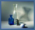
Critique By:
Garry Edwards (K:400)
4/27/2003 2:42:19 PM
Very nice lighting and composition
|
| Photo By: Murat Koc
(K:14)
|
|
|
Critique By:
Garry Edwards (K:400)
4/27/2003 8:57:07 AM
I think you've made a very good effort with this, especially as you have had to use existing light.
Just a suggestion - a little light, reflected from small mirrors on to the dark areas of the bottle and the glass would have helped.
|
| Photo By: Henry Ruiz
(K:113)
|
|
|
Critique By:
Garry Edwards (K:400)
4/26/2003 3:14:40 PM
I like this shot a lot, but can't make up my mind about the differential focussing.... perhaps it would have been even better with the Bishop and Queen sharp, or with them less sharp - either of which could have been achieved easily with a bit of swing.
|
| Photo By: Andrew Haworth
(K:356)
|
|