|
|
Critique By:
Bill McCord (K:269)
4/27/2007 8:43:19 PM
couldn't agree more... excelent comment about the legs.
|
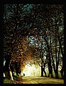
| Photo By: Bill McCord
(K:269)
|
|
|
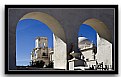
Critique By:
Bill McCord (K:269)
4/26/2007 3:10:36 PM
Very nice...
would like to know more about this place.
|
| Photo By: Akın Yakan
(K:-3)
|
|
|
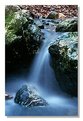
Critique By:
Bill McCord (K:269)
4/12/2007 3:44:09 PM
good use of framing, subject isn't very strong though.
|
| Photo By: Don Loseke
(K:32503)
|
|
|
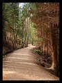
Critique By:
Bill McCord (K:269)
4/12/2007 3:42:58 PM
Strong, I like the leading lines useage. the flair line does lead my eye out of the frame though.
|
| Photo By: Callandra Cartwright
(K:419)
|
|
|
Critique By:
Bill McCord (K:269)
9/14/2004 2:43:23 AM
It was soft and foggy... and my son alex got 6 little fish that morning.
Thanks,
Bill
|
| Photo By: Bill McCord
(K:269)
|
|
|
Critique By:
Bill McCord (K:269)
9/4/2004 3:59:57 PM
would have never guessed digital, great job.
|
| Photo By: Patrick Jacobson
(K:29151)
|
|
|
Critique By:
Bill McCord (K:269)
9/4/2004 3:53:00 PM
Good image, thought the dutch tilt on the angled stairway is hard to look at for any legnth of time. good exposure, great expression!
|
| Photo By: Johan Sorensen
(K:3449)
|
|
|
Critique By:
Bill McCord (K:269)
4/21/2003 8:08:11 PM
Beautiful, and on a digital cam! Good job
BIll McCord
www.greatfolios.com
|
| Photo By: Beverly Gustafson
(K:1572)
|
|
|
Critique By:
Bill McCord (K:269)
4/21/2003 7:57:13 PM
If you look, the branches with the reflections look like 2 fish, heads faceing to the left swiming in the water.... Great job on the EC award! (and great photograph too.
Bill McCord
www.greatfolios.com
|
Photo By: Chelsea Burke
(K:5750)

|
|
|
Critique By:
Bill McCord (K:269)
4/17/2003 7:36:29 PM
This shot was originally shot on a Calumet black beast 8*10 with a 4*5 reducing back shot onto Polaroid black and white film, then scanned at 300 dpi and reduced in size to fit a particular spot on my website, (www.greatfolios.com for the curious) then I blew it up to 600 * whatever at 300 dpi again to upload to the usefilm server, and in that process I think someone knocked it out of focus when I wasn't looking.... (In other words, I'm not to sure, I think it's the scan.)
|
| Photo By: Bill McCord
(K:269)
|
|
|
Critique By:
Bill McCord (K:269)
4/16/2003 8:13:24 AM
I love velvia!
|
| Photo By: Zsolt Sárvári
(K:61)
|
|
|
Critique By:
Bill McCord (K:269)
4/15/2003 5:47:32 PM
Love the S - composition, I would only ask that you look at the shot missing the top inch or so, (bright sky triangle at top, it competes with the winding walkway for power) it will captivate you even more.
|
| Photo By: Joshua Mills
(K:7)
|
|
|
Critique By:
Bill McCord (K:269)
4/15/2003 5:38:47 PM
All in all I do like it, I feel it is a bit too center weighted and a tad right biased, but Capt. Stubbing would be proud.
|
| Photo By: Ervin Levent
(K:-7)
|
|
|
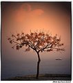
Critique By:
Bill McCord (K:269)
4/15/2003 5:14:59 PM
If I could offer a suggestion, take this into photoshop (paintshop) and play with the crop on it until the center tree is nearer a thirds line and the horizon is also on a thirds line. Compare how the two images look to you, my thought is that the big bulk of trees on the left should be croped out, and the sky should be given more weight. I think you have the basis for a great image here.
|
| Photo By: Mitchell Miller
(K:3009)
|
|
|
Critique By:
Bill McCord (K:269)
4/15/2003 4:14:13 PM
I would like to have seen just a touch of glint in the eyes, but otherwise great job.
|
| Photo By: Javed Rassi
(K:8223)
|
|
|
Critique By:
Bill McCord (K:269)
4/10/2003 7:52:05 PM
The "hot colors" are from the velvia I would think, I like it, like it has been said before, set the scanner resolution at 600* and the resolution at least 300dpi. Nice work.
|
| Photo By: Sylvia Jones
(K:652)
|
|
|
Critique By:
Bill McCord (K:269)
4/9/2003 12:45:54 PM
Thanks to all for the kind comments, more can be seen at www.greatfolios.com/billmccord
See you Thursday,
Bill McCord
billmccord@greatfolios.com
|
| Photo By: Bill McCord
(K:269)
|
|
|
Critique By:
Bill McCord (K:269)
4/9/2003 11:54:16 AM
Very Nice! Good lighting, exposure, shape, form, high impact graphics! only question (underline question) Does the looping pedal seems to create some (small) visual compitition? (side note: my monitor is set at 1024*768 and I still cannot see the whole pix at once.)
Good Job!
|
| Photo By: Jordi Serra
(K:3818)
|
|
|
Critique By:
Bill McCord (K:269)
4/9/2003 11:46:13 AM
My first reaction to this photo was great, looking a couple more times I have come up with the following:
I can see the desk/table underneath the flower, (this hard edge takes away from the soft sureal pedals). The frontal light has taken away some of the texture of the pedals, and I think (the scan?) the black levels could be darker, richer blacks. but all in all a good study.
|
| Photo By: Andy Anderson
(K:1)
|
|
|
Critique By:
Bill McCord (K:269)
4/9/2003 11:13:33 AM
I like the color and the lighting, I thiink it is a bit centered, but all in all a good photo.
|
| Photo By: Philip Vanderlinden
(K:496)
|
|
|
Critique By:
Bill McCord (K:269)
4/9/2003 11:09:26 AM
I like the color and the timing, not too keen on the composition, (seems rather centered) and the lack of emotion. (Perhaps a lower camera position showing the relationship between this and something else, boat, person on beach, lifeguard tower etc. would help.)
|
| Photo By: Guy Tem
(K:747)
|
|
|
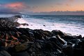
Critique By:
Bill McCord (K:269)
4/9/2003 10:57:48 AM
This reminds me of a small cove area in Makaha, Hawaii near the point. I Like the shot, the thing that sticks on me though is the bright light (foam on water) leading out of the frame on the right side....
|
| Photo By: Steve Mekata
(K:610)
|
|