|
|
Critique By:
Paolo Stefano Amero (K:5607)
6/19/2008 10:52:21 AM
Thank you very much Helea! Very kind of you!
|
| Photo By: Paolo Stefano Amero
(K:5607)
|
|
|
Critique By:
Paolo Stefano Amero (K:5607)
6/19/2008 10:25:49 AM
Thank you Johm, Siamak, Ali and Sounak!
|
| Photo By: Paolo Stefano Amero
(K:5607)
|
|
|
Critique By:
Paolo Stefano Amero (K:5607)
6/19/2008 10:20:04 AM
Ciao Tommaso, sono davvero lontani i tempi di ABPO, accidenti, hai ragione!
Grazie per le parole a questa foto. Rispondo alle tue domande: la foto è stata scattata in una giornata che dal punto di vista meteorologico era di una unicità mai vista. Estate e sole ma con una umidità addensata sul mare che era quasi nebbia. Quello che mi aveva colpito era il fatto che la linea dell'orizzonte fra mare e cielo fosse invisibile, persa nell'umidità. I paletti di segnalazione e i cartelli che vedi sono in acqua e se fai attenzione puoi vedere che, incredibilmente, le nuvole si specchiano nel mare, cosa che non ho mai visto prima. La foto è così come fu scatatta, ho solo virato a questo rosso che mi pareva rendesse bene l'idea. Grazie e a presto!
|
| Photo By: Paolo Stefano Amero
(K:5607)
|
|
|
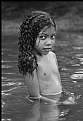
Critique By:
Paolo Stefano Amero (K:5607)
6/18/2008 4:00:44 PM
Bravo Paolo, questa è davvero una fotografia bellissima, intensa, azzeccata nel soggetto, nella luce, nella composizione, nella presentazione generale della stampa. Lo sguardo della bambina è bellissimo, con gli occhi fissi in camera e la posizione di tre quarti del corpo. La goccia che scende dal mento aggiunge vita e dinamicità. La conversione in bianco e nero è eccellente, con i bianchi e i grigi tutti a posto e con i neri belli profondi. Complimenti.
|
| Photo By: Paolo Macchi
(K:700)
|
|
|
Critique By:
Paolo Stefano Amero (K:5607)
6/18/2008 2:33:06 PM
Grazie Alida, molto gentile!
|
| Photo By: Paolo Stefano Amero
(K:5607)
|
|
|
Critique By:
Paolo Stefano Amero (K:5607)
6/17/2008 2:18:48 PM
Yes I understand the problem and the difficulty to manage everything in a studio, Frank. I have attached here, if it doens't bother you, an idea of what I mean. I have only cropped the bottom part and added some black room above the head. Only for curiosity, of course!
|
| Photo By: frank d
(K:1912)
|
|
|
Critique By:
Paolo Stefano Amero (K:5607)
6/17/2008 1:28:23 PM
Helo Celso, a good pic for your personal family album, but colours are really a little dull: some little editing with levels would have helped to give some more brillancy to the whole photo!
|
| Photo By: Celso Innocente
(K:2361)
|
|
|
Critique By:
Paolo Stefano Amero (K:5607)
6/17/2008 1:14:06 PM
Hello Frank, my idea is that for this kind of photography you do not need to make such a close portrait. I mean that there is too much body and too little air above his head. All the body we can see here is really non imporant for the compsition, in my point of view, while some more black background would have been perfect above the model's head. Just a point of view, of course.
|
| Photo By: frank d
(K:1912)
|
|
|
Critique By:
Paolo Stefano Amero (K:5607)
6/16/2008 6:38:37 PM
Thanks for your explanations Helea, its always very interesting to know what there is behind the creative process in a photo. ANd I like those who defend their work:-) Bye and thanks again!
|
| Photo By: helea pusta
(K:1660)
|
|
|
Critique By:
Paolo Stefano Amero (K:5607)
6/16/2008 3:32:58 PM
Perhaps some lack of blacks here? How did you develope the negative here, if i may know? Or is it a scan matter? Or you liked it with no blacks? :-)
|
| Photo By: Bartosz Sobanek
(K:106)
|
|
|
Critique By:
Paolo Stefano Amero (K:5607)
6/16/2008 3:31:24 PM
Ahh, this picture is absolutely wonderful! And I really cannot understand how it come it has no critiques at all: 58 views and 0 comments?! No need to say nothing abut this photo which talks by itself. Compliments for this image and for many others in your portfolio.
|
| Photo By: Bartosz Sobanek
(K:106)
|
|
|
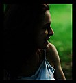
Critique By:
Paolo Stefano Amero (K:5607)
6/16/2008 2:32:16 PM
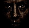
Hello Helea, few words about this work, if you don't mind.
The model is really very cute and has a clean and fresh smile, very photogenic. The green background makes a very nice contrast with the black of her hair and the lateral, diffused light gives a nice morbid effect on her face. Looks like you took this picture in the late afternoon, when light becomes very soft and diffused, and colours get brillant and vibrant.
There are few things which I don't like, though: first, the whole picture looks really too dark, at least with my monitor which seems to be quite well calibrated though: all the left half of the photo looks black, without details and it is a large portion of the composition; still, in the left top corner of the photo is visibile a lighter part that disturbs a little bit. And, being picky, her eye is really too dark: I woulf have liked to see at least some of the white part. Watch also her hair: they seem to come out from the model's mouth... The black frame makes this picture even darker, if possible. Hope these critiques can be helpful!
|
| Photo By: helea pusta
(K:1660)
|
|
|
Critique By:
Paolo Stefano Amero (K:5607)
6/15/2008 12:15:11 PM
Compliments, Bernard. This photo is perfect for a fashion magazine. It is absolutely perfect. The black and white conversion is stunning, look like a real film. Copliments again, also for your whole portfolio.
|
| Photo By: bernard branecki
(K:174)
|
|
|
Critique By:
Paolo Stefano Amero (K:5607)
6/13/2008 1:44:57 PM
I find this photo of you exquisite, as well as the other photos in your portfolio. too bad I have discoevred your work only now. I really hope you will still have the time to post some of your work in a future here in UF. My compliments to a delicate and complete photographer.
|
| Photo By: Claude Tenot
(K:9960)
|
|
|
Critique By:
Paolo Stefano Amero (K:5607)
6/11/2008 2:17:28 PM
Sorry, on hair hand:-)
|
| Photo By: JIAN LI
(K:30)
|
|
|
Critique By:
Paolo Stefano Amero (K:5607)
6/11/2008 2:11:12 PM
I agree abput the good use of the fill flash Paul, but still it gives me an idea of little fake face. Also, the flash created an ugly shadow on her collar.
|
| Photo By: JIAN LI
(K:30)
|
|
|
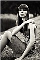
Critique By:
Paolo Stefano Amero (K:5607)
6/11/2008 1:30:40 PM
Lovely composition Jian! You had the wonderful idea to make this picture so singular and different by placing the model with her body following the lines of the spikes. This gives your photo a great dinamism and makes it really interesting.
I know you were probably obliged, but the use of flash here makes the model's face a little fake.
|
| Photo By: JIAN LI
(K:30)
|
|
|
Critique By:
Paolo Stefano Amero (K:5607)
6/11/2008 11:09:11 AM
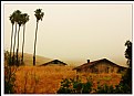
Hi Bhabesh. A few line about this work, if you dont mind.
The first general impression of this photo is extremely positive: eyes are immediately captured by the line which links the trees on the left and the two houses. This line creates a nice diagonal feeling to this composition. Another nice thing is the colour of the houses and grass and the misty background which -at least in my Italian eye- create a strong contrast with the palm trees which are usually considered as trees growing in hot and non misty places.
But there are two things that make this photo not as effective as it might have been, in my point of view: the sky is completely without any detail and, being th4e sky a large part of the photo, it really bother me a little.
The second thing I notice is that those trees on the right are in some way spoiling the composition, adding a disturb. I wish you could have avoided those trees and those bushes in the foreground.
|
| Photo By: Bhabesh Chakrabarti
(K:11394)
|
|
|
Critique By:
Paolo Stefano Amero (K:5607)
6/9/2008 1:45:21 PM
Idea eccellente, Marco. bella resa cromatica e interessante punto di vista con la spiga che si staglia contro il cielo. Forse quell'albero a destra è un po' troppo ingombrante e vuoto di interesse. L'orizzonte purtroppo è deformato dalla lente che hai usato e risulta un po' concavo, forse andava messo a posto, se possibile. Occhio che c'è un errore di battitura nel titolo della cornice.
|
| Photo By: marco diquattro
(K:2357)
|
|
|
Critique By:
Paolo Stefano Amero (K:5607)
6/9/2008 1:41:31 PM
Very fine tones and a perfect work on her skin. But, Larry, my first impression is that her hands really look to big and large. Especially her wrists really look very big, probably due to the position of the arms. Just an opinion.
|
| Photo By: larry white
(K:368)
|
|
|
Critique By:
Paolo Stefano Amero (K:5607)
6/9/2008 11:44:31 AM
Hello István, few lines about this photo, if you do not mind. Something is not working here, I think, even though the subject might have been a very interesting one to take a good photo and the sky was exactly what a photographer needs.
But the image you took doen't have the impact it could have been: the centre of the image is wasted with that big dark tree which covers the main subject of the photo, the bell tower and the church. The foreground gate is really too "important" and kills half of the photo and what we can see beyond the gate is quite uninteresting and a little bit untidy. The tower is also a little bit tilted. I guess you couldnt take a pic from another angle, but I really think this photo is not working.
Om the other side the baclk and white conversion is well made with good deep blacks and brillant whites.
|
| Photo By: István Sándor
(K:2411)
|
|
|
Critique By:
Paolo Stefano Amero (K:5607)
6/9/2008 11:35:45 AM
This is a very interesting work, Carmen. beyond the nice tone treatment, which is very effective, I like a lot the central line created by the nose and the mouth. I see some too hard sharpening somewhere here and there, but the result is still very very interesting.
|
| Photo By: Carmen Fuchs
(K:6967)
|
|
|
Critique By:
Paolo Stefano Amero (K:5607)
6/6/2008 10:47:37 AM
I didn't know Holga is able to give so real colours:-) Missing its acid and wrong colours here:-)
|
Photo By: Alex Zahka
(K:446)

|
|
|
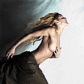
Critique By:
Paolo Stefano Amero (K:5607)
6/4/2008 5:35:48 PM
I love it. The rotation of the picture works a lot here and makes this woman look like a ship figurehead. I particularly appreciate the position of hands which are usually difficult to place in a plesant way. The background in the left part fits perfectly the model's hair waves. Nice colours also, What I only miss is some details in the right part of the photo. COmpliments.
|
| Photo By: sylwia makris
(K:-5)
|
|
|
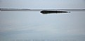
Critique By:
Paolo Stefano Amero (K:5607)
6/4/2008 3:21:11 PM
I gave a look at your portfolio before commenting on this image, Ameer: I was quite surprised in seeing that this very photo is completely different from the others which are colourful and usually describe some street life. I must say I do not find this image as interesting as many others in your portfolio: the horizon is tilted and I do not see a real subject here. It even seems a different photographer took this photo:-) I really like your others 1000 times more:-)
|
| Photo By: Ameer Hamza
(K:248)
|
|
|
Critique By:
Paolo Stefano Amero (K:5607)
6/4/2008 3:15:13 PM
Bello scorcio Nino. Molto classico anche se in realtà non vi è motlo di interessante su cui soffermare lo sguardo: se ci fai caso nel centro della composizione non c'è nulla che possa attirare l'attenzione mentre quella grondaia sulla destra mi pare che disturbi abbastanza. La conversione in bianco e nero mi sembra un po' slavatina, con molti grigioni, pochi neri e con bianchi non brillanti. Il cielo che si vede fra le case risulta invece bruciato, aggiungendo una macchia biancastra prorpio nel terzo superiore dell'inquadratura. La parte più interessante risulta, almeno per me, il terzo inferiore in cui la pavimentazione, la grata e il tombino forniscono un soggetto che spezza col resto della immagine, anche per via della pendenza della strada.
|
| Photo By: Gaetano (Nino) Aievoli
(K:7118)
|
|
|
Critique By:
Paolo Stefano Amero (K:5607)
6/3/2008 10:03:19 AM
Dear Nick, this shot was the last one of a series of about 15 photos I have shot for this friend of mine and was the only one in "my style". The other ones were made like the friend wanted. Mostly poses she saw on some magazine The decision of the DoF was mine as well as to keep her right eye in a soft focus! The decision of the DoF was mine as well as to keep her right eye in a soft focus!
|
| Photo By: Paolo Stefano Amero
(K:5607)
|
|
|
Critique By:
Paolo Stefano Amero (K:5607)
6/3/2008 9:53:57 AM
Nich, thank you a lot for your in deep comments to my photos. Your critiques make Usefilm a even nicer place to stay. It is always very difficult to determine if a photo is skew when the horizon is not clearly well defined but i think that yes, it looks a little tilted! I must also tell you that I miss film very much but I really find difficult to find someone who can develope and print my b/w film photos: though digital cameras have reached great results, i still find these film pictures better than the digital ones!
|
| Photo By: Paolo Stefano Amero
(K:5607)
|
|
|
Critique By:
Paolo Stefano Amero (K:5607)
5/30/2008 10:06:05 PM
Hello Nick, do you perhaps remember what this place is? I am from Milano and i would be curious to know which church this is!
|
| Photo By: Nick Karagiaouroglou
(K:127263)
|
|
|
Critique By:
Paolo Stefano Amero (K:5607)
5/30/2008 11:57:43 AM
Yes I understand the problem about exposure Nick. I do not know the film you have used and I dont know how many stops it can bear in difference between highlights and low lights, but usually films can be correctly exposed even when there is a high range of high and low lights. If you dont trust your film, and you own a tripod you can still use a double exposure:-) two pictures, one exposed on the sky and one exposed on the trees and merge the two shots in PS
Its very difficult to work on a small pic like this, but you can still work on the original and get some deeper blu in the sky. see the attachment:-)
Thank you very much also for the splendid critique you have given to my trees photo.
|
| Photo By: Nick Karagiaouroglou
(K:127263)
|
|


 Das")