|
|
Critique By:
Howard M. Parsons (K:3496)

7/14/2005 4:06:30 AM
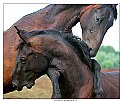
One of the best IR shots I have ever seen
|
| Photo By: Michael Kanemoto
(K:22115)
|
|
|
Critique By:
Howard M. Parsons (K:3496)

5/5/2005 5:00:33 PM
excellent. I like athe comparison idea also.
|
| Photo By: Michael Kanemoto
(K:22115)
|
|
|
Critique By:
Howard M. Parsons (K:3496)

4/25/2005 4:40:12 PM
Interesting pattern
|
| Photo By: Giovanni Guerrieri
(K:1169)
|
|
|
Critique By:
Howard M. Parsons (K:3496)

4/25/2005 4:32:58 PM
I don't know if it could have been taken any other way, but I am not comfortable with water horizons that are not level. This may be my problem not yours. I do think that the sea shells are hard to identify without the title, though.
|
| Photo By: Michael Alexander
(K:5293)
|
|
|
Critique By:
Howard M. Parsons (K:3496)

4/25/2005 4:18:13 PM
I like this shot and the title. One comment (opinion). I don't think the wide black border works as well here, it is effective on your other recent photos.
|
| Photo By: Michael Alexander
(K:5293)
|
|
|
Critique By:
Howard M. Parsons (K:3496)

4/25/2005 1:28:42 AM
I missed your Featured Donor shot - which one was it?
Anyway, belated congrats!
|
| Photo By: Michael Alexander
(K:5293)
|
|
|
Critique By:
Howard M. Parsons (K:3496)

4/25/2005 1:24:31 AM
Colorful!
I think you enjoyed taking this
|
| Photo By: Michael Alexander
(K:5293)
|
|
|
Critique By:
Howard M. Parsons (K:3496)

4/25/2005 1:22:48 AM
Excellent color infared. I don't often try color ones anymore as I was never satisfied with the results. You seem to have found out how to make it work.
|
| Photo By: Michael Alexander
(K:5293)
|
|
|
Critique By:
Howard M. Parsons (K:3496)

4/22/2005 4:20:04 PM
Thank you very much for your comment. The original version (Tower Clockworks #2M) IS still posted on Usefilm. I agree with your suggestions; the spots were white on the previous version and less noticeable.
|
Photo By: Howard M. Parsons
(K:3496)

|
|
|
Critique By:
Howard M. Parsons (K:3496)

4/11/2005 4:24:37 PM
I think I like this better with the people. It MIGHT be an improvement if the figures were smaller; i.e. if you had waited a few moments. But this is just guessing, I wasn't there. In any event, it's a nice photo.
|
| Photo By: Lou Mmm
(K:342)
|
|
|
Critique By:
Howard M. Parsons (K:3496)

4/9/2005 7:42:53 PM
Very clever idea - photo has high impact
|
| Photo By: Michael Kanemoto
(K:22115)
|
|
|
Critique By:
Howard M. Parsons (K:3496)

3/30/2005 5:47:48 PM
Wonderful shot with a very interesting play of light. One thought however. Would the composition be improved with some of the bottom and right hand side cropped off? (Maybe not)
|
| Photo By: Michael Kanemoto
(K:22115)
|
|
|
Critique By:
Howard M. Parsons (K:3496)

3/8/2005 5:10:36 PM
I like this a lot. Composition & mood excellent.
|
| Photo By: Michael Kanemoto
(K:22115)
|
|
|
Critique By:
Howard M. Parsons (K:3496)

3/8/2005 5:05:53 PM
Pleasant mood and good composition
|
| Photo By: Michael Kanemoto
(K:22115)
|
|
|
Critique By:
Howard M. Parsons (K:3496)

2/25/2005 5:30:21 PM
The woman and the flowers give meaning to this photo. Technically good also.
- Howard
|
| Photo By: Naomi Weidner
(K:6636)
|
|
|
Critique By:
Howard M. Parsons (K:3496)

2/25/2005 5:27:48 PM
I think you had fun doing this!
Nice job - high impact photo.
- Howard
|
| Photo By: William R Eastman III
(K:2141)
|
|
|
Critique By:
Howard M. Parsons (K:3496)

2/21/2005 5:39:59 PM
Nice colors. I also like the tight cropping
|
| Photo By: Romy Fabian Garmaz
(K:17105)
|
|
|
Critique By:
Howard M. Parsons (K:3496)

2/21/2005 5:38:29 PM
I like this photo, but (in my opinion) the power lines detract from it. These could be removed in photoshop. Shooting before the sky turned totally dark makes the photo more interesting.
- Howard
|
| Photo By: Romy Fabian Garmaz
(K:17105)
|
|
|
Critique By:
Howard M. Parsons (K:3496)

2/21/2005 5:30:42 PM
Beautiful photo. I like the green trees framing the lake and the yellow tree. The colors and composition work together to make an excellent image.
-Howard
|
| Photo By: Romy Fabian Garmaz
(K:17105)
|
|
|
Critique By:
Howard M. Parsons (K:3496)

2/21/2005 5:23:49 PM
High impact photo with beautiful bright colors.
I like it very much.
- Howard
|
| Photo By: Romy Fabian Garmaz
(K:17105)
|
|
|
Critique By:
Howard M. Parsons (K:3496)

2/21/2005 1:42:00 PM
Excellent shot! I like abstract patterns formed by real objects. I like the composition too - in this case the symmetry helps. Textures and lighting also nice.
|
| Photo By: Mohammad Hamdan
(K:351)
|
|
|
Critique By:
Howard M. Parsons (K:3496)

2/7/2005 5:43:59 PM
Nice composition! Yes the square crop and off centeredness are effective. I don't think burning in the edges would be an improvement, but try it anyway and decide. Personal opinion: I like this image better than the out-of focus color one.
F.Y.I. I think this is what's left of the Detroit, Toledo, and Ironton Railroad, which was once owned and used by the Ford Motor Co. It ran southwest from the Rouge complex to Toledo, then south through Ohio to Ironton which is on the Ohio River. It was built in the 1930's and WAS an electric railroad originally. Later diesel locos were used. It closed around 1950 I think.
|
| Photo By: Michael Alexander
(K:5293)
|
|
|
Critique By:
Howard M. Parsons (K:3496)

2/2/2005 5:17:58 PM
Above comment: "ice" should read "nice". Please xcuse my bad typing. Again, this is a very good and meaningful series of photos.
|
| Photo By: Michael Alexander
(K:5293)
|
|
|
Critique By:
Howard M. Parsons (K:3496)

2/1/2005 3:26:41 AM
This is a very ice series of shots. I think I like this one the best. It captures the sadness of the decay. You have enhanced this by use of monochrome and shooting on a dull day.
|
| Photo By: Michael Alexander
(K:5293)
|
|
|
Critique By:
Howard M. Parsons (K:3496)

1/29/2005 2:08:58 AM
High impact photo, cleverly composed
|
| Photo By: Larry Monserate Piojo
(K:10780)
|
|
|
Critique By:
Howard M. Parsons (K:3496)

1/17/2005 5:54:18 PM
Great shot. out of curiousity, what would this look like inverted?
|
| Photo By: Michael Alexander
(K:5293)
|
|
|
Critique By:
Howard M. Parsons (K:3496)

1/5/2005 3:16:32 AM
To Jurgen Reinold: This was the first slide scanned with my new Minolta Dimage Scan Dual IV. I am very pleased with it.
It might be a solution for you also as it wil handle APS cartridges using an optional adapter. It also handles strips of 35mm negatives. Check the Konica Minolta web site. My unit was ordered from B&H Photovideo - see their web site also
|
Photo By: Howard M. Parsons
(K:3496)

|
|
|
Critique By:
Howard M. Parsons (K:3496)

1/4/2005 1:27:43 PM
I used a polarizer but not a grad filter
|
Photo By: Howard M. Parsons
(K:3496)

|
|
|
Critique By:
Howard M. Parsons (K:3496)

12/31/2004 2:51:13 PM
Clever shot, I like the title. You have a good eye for photo possibilities.
|
| Photo By: Dustin Cowen
(K:2837)
|
|
|
Critique By:
Howard M. Parsons (K:3496)

12/31/2004 2:49:51 PM
Excellent photo with high impact. I have one thought however: Would it be improved if it were a total silhouette, i.e. no detail at all in the dark areas? Maybe or maybe not.
I am not sure whether or not you like to experiment with photo editing, but I see possibilities in this shot: inverting it, changing colors (such as an ice-blue image against a black sky, or others)
Thanks for your recent comments on my photos.
|
| Photo By: Dustin Cowen
(K:2837)
|
|


