"Purper. Dat is een mooie kleur. En de naam is bijpassend mooi. Purper. Stel je een poes voor die op een purperen kussen ligt, voor de open haard. Zij knijpt de ogen toe en spint in opperste tevredenheid de naam van de kleur.purrrrrperrrrrrrrrr. Dan denk je bij jezelf dat die kleur ook niet anders had kunnen heten dan purper, een tevreden spinnende kleur met de koninklijke hooghartigheid van een kat."
Jam tis wel iets voor jouw Meintje prrrrrrrrrrrrrrrrrrrrrrrrrrrr
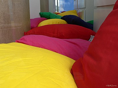
Good idea! The strong colors stand in a good contrast against the blueish grey of the walls. Some problems of lacking details which I think goes back to a too strong light again?
Couldn't that be of a stronger impression if allowing even more of the walls to be present in a less centered image?
Purper. Dat is een mooie kleur. En de naam is bijpassend mooi. Purper Stel je een poes voor die op een purperen kussen ligt, voor de open haard. Zij knijpt de ogen toe en spint in opperste tevredenheid de naam van de kleur purrrrrperrrrrrrrrr Dan denk je bij jezelf dat die kleur ook niet anders had kunnen heten dan purper, een tevreden spinnende kleur met de koninklijke hooghartigheid van een kat.
Oranje. O-ran-je, met de a op een iets verhoogde toon. Wat een vrolijke kleur moet dat zijn en dat is het. En vermiljoen. Als je het hardop zegt, voel je het woord gewoon gloeien. Het móet wel rood zijn. En koningsblauw. En pauwblauw, dat diepblauwe blauw waar je in verdrinken kunt.
Veel mooie kleuren zijn er, met namen die de kleur recht doen. Er zijn ook wel kleuren met weinigzeggende namen. Bruin, bijvoorbeeld. Het klinkt niet echt bruin, maar het klinkt ook niet niet-bruin. Hetzelfde vind ik van groen. Bruin zou ook best groen geheten kunnen hebben en groen zou met dezelfde klank bruin kunnen zijn. Zwart, dat is dan wel weer een donker woord. En indigo is een beetje onverwacht donkerblauw. Toch past het woord wel bij de kleur. Indigo klinkt in mijn oren wat oriëntaals en de kleur komt bij mij ook wat oosters over. Een prachtkleur is het!!