|
|
Critique By:
Gary Dyck (K:12834)
1/8/2007 10:22:42 AM
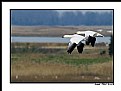
Great shot, John! I don't really see anything to critique about this one. Excellent clarity on the geese with an ideal dof that makes them stand out so well. And I also like the location within the frame as it looks like they are flying into view. The only very minor thing I notice, and it's probably mostly due to lower resolution for posting here, is the faint "ghost" around the edge of the birds. Very nicely presented! Cheers, Gary
|
| Photo By: John-Eric Lemieux
(K:3045)
|
|
|
Critique By:
Elizabeth MVW (K:25)
1/4/2007 8:27:43 PM
Boom. Frozen clouds. A body poised betwixt buildings. The body mass is being held in place by impossible bookends. Falling in on her. She is aligned with the sky, unattached to the ground, unlike these grounded monuments of greed. Only the railing keeps her from dominating the composition. It holds her back, gently laying her dark form down upon the battlefield of the background, where a silent war rages between these dark edifices. A balance of power.
The enormous difference in hue between the sky and the architecture makes the clouds seem wonderfully distant, if we assume the clouds to be the background. Yet as our eyes wander about inside the image, our mind does battle over what is closer - a conflict that is constantly resolving - as it must remind itself repeatedly that the architecture is the primary graphic mass, not the vivid sky. This figure-ground conflict, brought about by heightened contrast, adds shades of complexity to an otherwise basic composition.
Powerful vertical lines demand contextual resolution through horizontal lines, and here the railing provides it. But it is slightly tilted up to the right, creating the subtle tension that underlies the theme. Without it, the image becomes conservative and ordered, as if it was a computer rendering of reality.
The conflict-resolving detail of the buildings in the top half of the composition contrasts nicely with the shadowy purpose-of-concept in the bottom half. The marriage of the two halves is a little off-center, though. This skews the balance away from the idea of the individual and into the idea of the threatening skyscrapers. Then, attacking the leaning threats by leveling the railing seems useful. But that only further defeats the individual by removing both the conceptual focus and the tension derived from the tilt of the all-important railing.
The slant of the whole image is not the problem; in fact, the buildings' respective tilts are appropriately proportioned to their apparent heights. However, the magnetism of the frame is balanced precisely at the included corner of the building on the left. To maximize the distribution of power in the composition (a.k.a. balance), that corner should be at the vertical center, but it is slightly below it. Also, the horizontal thickness of these two infinite bookends should be identical at that point. Yet, at that point, the building on the left is marginally thicker.
Cropping can solve these problems. The left side and the top side can be clipped, placing the corner at the vertical center and evening up the primary graphic masses at that point. Simple enough. But every bit of the building detail is essential for the healthy survival of the figure-ground illusion. So, a much better solution would be to add some blackness (or the original cropped image data, if it still exists) just below the frame and to the right of it. In that way, the problems with the corner and with the graphic masses becomes resolved, the amount of the building detail remains intact, and there's the added benefit of allowing the model's legs to not seem awkwardly truncated.
Such a stark image comments on the place of humans inside a world formed by their own ambitions of immortality. Things seem so much larger when trying to chart a course through them. The model here has found a balanced spot to rest her own overshadowed ambitions. But she cannot stay there long, for the looming buildings and the movement implied by their angles and the railing brings a smothering tension rocketing to the surface. She must be ready to move.
|
| Photo By: Kim Flowers
(K:770)
|
|
|
Critique By:
rebecca claassen (K:12904)
12/27/2006 12:22:51 AM
Beautiful portrait Sascha! The light is perfect and I just love the expression on his face. The nice detail adds depth to this image and makes me wonder what he is thinking as his portrait is being made.
Lovely,
cheers, Bek
|
| Photo By: sascha jonack
(K:19715)
|
|
|
Critique By:
Peter De Rycke (K:41212)

12/23/2006 2:08:38 PM
What a great scene, so well captured in a gorgeous composition .. landscape working well together with an awesome sky, having great light on the grass .. the contrast in the sky might have been a little higher to my taste, but otherwise perfect !
Peter
|
| Photo By: brian underdown
(K:-960)
|
|
|
Critique By:
Giuseppe Guadagno (K:34002)
12/23/2006 8:25:48 PM
The angle of shadows and geometric shapes surround and squeeze the figure cutted out of the world. Very emotive, Filipe.
Warm wishes for a serene and happy Christmastime and a beautiful 2007.
Giuseppe
|
| Photo By: filipe franco
(K:731)
|
|
|
Critique By:
Michele Carlsen (K:146013)
12/23/2006 2:49:55 AM
Hi Phillip,
I like the light, the shadows, reflections and the contrast in this lovely well balenced composition.. Oh and the fog... Smokey light I guess.. it's excellent.
Michele~
|
| Photo By: Phillip Minnis
(K:13131)
|
|
|
Critique By:
Srna Stankovic (K:172232)
12/23/2006 2:33:27 AM
Dear Anastasia, your portfolio is very interesting.
This portrait with a great composition and so many details ... and balance between "dark" and red tones is good and well presented. SHE is sparkling :) Her eyes are beautiful, skin tones smooth, hear perfect, well, exellent done my dear ! All the best wish you SRNA :)
|
| Photo By: Anastasia R.
(K:778)
|
|
|
Critique By:
Peter McDonald (K:4951)
12/23/2006 3:21:40 AM
hi there,
nice tight cropping brings out the emotion and power of the singer.
the deliberate colour cast places the picture into a nice cruisey club type scene.
there are other good photos using the same method in your portfolio.
nice work.
cheers peter
|
| Photo By: elizabeth Blair
(K:2202)
|
|
|
Critique By:
Chris Boivin (K:9030)
12/15/2006 4:54:27 AM
Hi April,
A feastive picture, but it would have been hard for me to tell without your about that is what they were doing. I like how you have some of the music sheets captured in the picture. As a suggestion for the same shot, try a different perspective with maybe the music sheet more in the bottom of the frame and the two children centered behind it. This would definately give the feeling of music or singing in the picture. Also, I think in this picture you only have a portion of the faces and music nothing is fully shown so I don't know what the main subject is. A great idea for a feastive picture and please take this as only suggestions and ideas.
Regards,
Chris
|
| Photo By: April the 1st
(K:24)
|
|
|
Critique By:
Joel Aron (K:14920)
12/14/2006 7:49:41 AM
Hi Shirley!
This works very well!
If you don't mind, i'm gonna put my work hat on, and suggest a few things to help tie these elements together. :) 16 months of working on 'Peter Pan' a few years ago had me seeing Tinkerbell *everywhere* :)
The biggest issue here is that both images were shot with different centers, and focal lengths. Since you're using a zoom lens, this is going to make your blend of the two images very difficult. One trick to do, is to pinch in your background layer a little bit with the lens correction tool (not the pinch distortion filter). This will fake more depth to your background, and help her blend in to the backgrounds depth cleaner.
The other, is my soft spot with all composited images. The black values. It's the give-away that there are two layers. Your model layers' blacks are good in color, however, the background has about 1/2 the color depth in the blacks.. so no matter what, you're going to be spinning color wheels and blurring edges all day long, and the the model layer is always going to float over the bg. For an image like this, I would set a monitor setting that BLAST your screen in gamma to almost 3. Then you see all the black values like someone turned on the lights! This is what we do at work, and it's the best, and most simple tool to match the low end values. Grain is the next big issue...and very easy to match on the layers while you're monitor is blasting at gamma 3.0. Once you have the color, and contrast of the blacks, and mid tones that feed into them... set your monitor back, and like magic, you're images blend in together. Pull the blacks down over all together with the levels, and it's the cherry on the cake!
:) hope you don't mind my input. You're getting very good at comps, and you do so many of them, that I hope to see more!!
...if you can do this kidna work on moving movie footage, then send me a resume'! :) We are always looking project people, and with a project like 'Pirates of the Carribean 3' to get done in the next 5 months, it's all hands on deck matey!
cheers,
-joel
|
| Photo By: Shirley D. Cross-Taylor
(K:173998)
|
|
|
Critique By:
Ardalan Haddad (K:15567)
12/5/2006 12:37:10 AM
Great job, I wish there where some balck crows.
a very nice perspective where I can see the cottage, road,trees and sky at a very resonable and balanced level.
I feel if I was there,and driniking a cup of tea or coffee. wow, it was fantastic.
This also gives me a little bit of sad feeling. Where I can feel loneliness,and isolation.
my the overal impression is good.
Many thanks Pat.
All the best shots,
Ardalan
|
| Photo By: Patrick Ziegler
(K:21797)
|
|
|
Critique By:
Ken Leone (K:350)
12/7/2006 5:21:27 AM
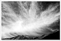
I like this shot. I also appreciate your comments about how you are viewing your art. To me, what I call "strong graphics" is important in a photograph. I see photography as a way to reveal these graphical images to the viewer. Photographs without such characteristic, I tend to find either busy and cluttered, or bland. Photography becomes a way to see elements of reality in a new way. That doesn't mean it needs to be completely realistic, although I like the work of the f/64 group a lot too (super sharp nature shots).
This picture has those strong graphic characteristics in the upper 90% of the frame, which, although obviously clouds, is fairly abstract and very attractive. I like including the bottom 10% to give the picture more context. If you wanted to develop a style that lost the context almost completely, a picture like this would also work. While you can't just crop out the hills in this shot to achieve that without destroying some of the graphic effects, you are on the right track if that's what you want to achieve. By leaving "no room for concept" do you mean images that looks something like the attached alteration of your image? I apologize for doing so; it's just a respectful attempt to better understand your art and vision.
|
| Photo By: Mohammad Porooshani
(K:20765)
|
|
|
Critique By:
Rachel Leah (K:26110)
12/4/2006 11:53:28 PM
WOw, she is a beauty! I love the expression she is making! The angle you took this at is great, and I love your DOF here! The eye-to-eye level you took this at is great, as well as the lighting, contrast, tone, and everything! Excellent work :)
~Rachel~
|
| Photo By: Sheila Carson
(K:5924)
|
|
|
Critique By:
Michael Kenny (K:679)
12/4/2006 6:09:14 AM
Great shot! and more importantly, great portfolio. I haven't explored all the photos quite yet, but i can tell i'm in for a treat. i really like the shadow in this image--very dramatic. and great words as well.
|
| Photo By: Ardalan Haddad
(K:15567)
|
|
|
Critique By:
Olga-Eva Krajciova (K:19240)
12/4/2006 6:50:50 AM
art captured by artist should be said about this image, really very great shot, i wanted to write that it is great black and white but it is not black and white at all..very unusual tone, hm, mysthical with some kind of old tone :)
i like it very much
regards
Olga
|
| Photo By: Suzanne Opitz
(K:91)
|
|
|
Critique By:
David Tasker (K:4281)
11/27/2006 9:26:08 PM
I want this - hahha. Chris - this is fantastic. The framing is perfect what a great choice. I know that Birch and Aspen Fall ( Autumn to us Australians) have been photographed countless times this one of yours stands out. The front to rear sharpness really sets this off. The small patch of sky - well I looked at this both ways - try putting your hand over the corner and your eyes are imemdiately drawn to the centre of the image, when the sky is visible I seem to start at the left am move my eyes to the right - uncanny. This would be proud on any wall.
|
| Photo By: Chris Sitter
(K:2345)
|
|
|
Critique By:
G G (K:61359)
11/27/2006 6:31:29 AM
This is a really original work Khaled and the result in beautiful. I like the frame with the slight deformation dure to the glass, and from the original to the result one can see all the wrk you've done on it and what eye you have.
This is an excellent work.
Congratulations Khaled
|
| Photo By: Khaled Mursi Hammoud
(K:54005)
|
|
|
Critique By:
Hugo de Wolf (K:185110)
11/22/2006 6:43:37 PM
Hi Thilo,
This image reminded me of a photo by a Scott Somebody, who posted a photo of a silhouetted group of people admiring a fiery ball / setting sun through the glass windows of a London Museum (tate modern - I think) Awesome feel.
The comparison is easily made - the almost unreal combination of the people walking about freely in an under-water world - very cool.
The main differnece with the setting sun photo is that the shutterspeeds were undoubedly much slower here - which does show a bit in the edges around the silhouettes, and the motion blur of the fish.
Still, the poses of the people, looing around them in amazement are excellent, and contribute a large deal to the feel of this photo.
In the overall composition, I think the pano-format is very functional here - a pity the pano version is the same size as the one on this page - I'd love to see this one a bit bigger. Also, the clipped off people on the left and (much less so) right of the photo create a minor distraction IMHO
Basically, that's about all I have to say - scrolling back up, I do notice the four brighter spot lights - creating an even stronger surrealism, if not alienated feel to this photo. Very cool!
Cheers,
Hugo
|
| Photo By: Thilo Bayer
(K:50358)
|
|
|
Critique By:
Kevin Lanthier (K:3477)
11/13/2006 10:48:09 PM
Nice exposure to keep detail in some of the shadows with the dramatic sky. Was this shot using some fill flash, or is there some digital work here to create this dynamic range? Only thing I'm not sure about is having the horizon that close to the center of the frame. Moving it up or down might be more effective.
|
| Photo By: F. Monteiro
(K:-188)
|
|
|
Critique By:
Jeroen Wenting (K:25317)
11/12/2006 7:52:18 PM
Excellend composition and tonal range.
Did you use a warming filter on that or apply that later on the computer?
I'd personally have cropped a little more from the bottom to remove those red spots there (whatever they are).
|
| Photo By: Tim Schumm
(K:29196)
|
|
|
Critique By:
Caterina Berimballi (K:27299)
11/6/2006 12:50:22 AM
Wonderful soft portrait again Ray. Love the big woolly jumper and her pose. The only thing I would suggest (and I know you don't like to fiddle too much), is maybe some very careful dodging to lighten the dark circles around her eyes. Alternatively, you can use the healing brush tool, sampling the light area of her cheeks and carefully dab starting from outwards in? It's only a minor thing, but would lift the face enormously.
Hey, hope you're doing ok my cheeky pom. 'See' you again soon!
Cheers
Rina
xxx
|
| Photo By: stingRay pt.4 .
(K:250401)
|
|
|
Critique By:
Marcus Armani (K:36599)
11/3/2006 1:17:38 AM
This is really well done, the golden light is very appealing and looks great against the nice blue sky, the detail and lack of noise is amazing within the dark areas, I really dont think its the camera but the photographer that has shown such imporvement in the flight area, but it will defenitly help sell some D200's! I still think canon would have been a better choice LOL ...
|
| Photo By: Robert Chin
(K:22282)
|
|
|
Critique By:
John Hatz (K:156973)
11/2/2006 6:06:36 PM
Except that I can feel the distance here from the foreground to the background, I like even the sky that looks like...wall!!! A 3D paint, beautiful water and woods and also great deep scales on the colors of the buildings!
Best regards, it's very nice and pleasure to see your works Benedetto!
Hugs!
|
| Photo By: Benedetto Riba
(K:15792)
|
|
|
Critique By:
Joggie van Staden (K:41700)
11/2/2006 5:27:36 PM
A lovely sky and nice repetitive patterns of the masts. I feel that you could tilt the camera slightly to get more of the lovely sky and a bit less of the rather featureless water in the front. It would also add a bit of drama if you could darken the top section of the clouds a bit Otherwise a great image Hilton. Regards.
Joggie
|
| Photo By: hdw Photography
(K:6630)
|
|
|
Critique By:
Michele Carlsen (K:146013)
11/3/2006 12:45:35 AM
Hi Robert ,
Another great moment in this mans expression ! You must be one sneaky photographer as no one ever seems to notice you ...which is GREAT ! Love the atmosphere as if the 'Man' thinks he is spying on others !
Well done ,
Best Wishes,
michele~
|
| Photo By: Robert Kocs
(K:89085)
|
|
|
Critique By:
Dave Holland (K:13074)
11/3/2006 2:26:51 AM
Nigel, way to go. I really like Mary Sue's description of why she likes this photo. It's the way I feel about it as well, put in more elegant terms than I am able. In my opinion this is reaching to a next level of photography, a level to which Freeman Patterson aspires. Imaginative compositions are all around us, though only a few seem to find them. I find it inspiring how you have made something unique from the ordinary.
|
| Photo By: Nigel Watts.
(K:5171)
|
|
|
Critique By:
Jason Mckeown (K:22200)
11/1/2006 11:45:49 PM
Hi Marcus, its time for my two cents worth.
first thing i would of done is to take this a little bit earlier in the evening so to get good separation between the skyline and the sky.
Second thing you could of done is to make the aperature smaller, mine are normally shot at between 15 and 60 second so an fstop of f16 to f22 is perfect and gives you a very sharp image.
If you were after the moon in the shot as is this is a great job for PS, shoot for the moon then shot for the city then merge them in PS.
Last thing Marcus it looks to be oversharpened, that is one of the things i found to be the hardest to come to grips with as at one point it doesn't look sharp then next its oversharp. what way do you sharpen your images?
hope this hepls a bit mate
Jason
|
| Photo By: Marcus Armani
(K:36599)
|
|
|
Critique By:
J S (K:1806)
10/30/2006 2:28:28 AM
Robert,
Lovely image! Beautiful, crisp and sharp!
I love how you played the DOF here, But I have small dislike...
I love the colors, and the dock playing a role here. My dislike is the DOF on the left side of the photo. I belive it would look better if the first part of the dock was in focus. I see a large blur taking up a large proportion of your photograph. My eye wants to follow up the dock, it's just natural for me... I look where I walk. The blur makes me feel lost and confused. I love the background focus, it is Perfect!! Beautifully done.
It's just the way the DOF created an "L" shape of the dock. I would have loved to see more of that white railings. I expect photos to have a flat plane of focus.
Keep up the wonderful work! I love the colors, the setup... infact everything! But the "L" shaped DOF. It's just my personal preference.
Thanks for sharing this with us! Wish you well!
|
| Photo By: Robert Höhne
(K:4290)
|
|
|
Critique By:
Giuseppe Guadagno (K:34002)
10/28/2006 3:53:07 PM
Roby, you capture has surprised the night while it furtively spreads on the earth overwhelming the last, now tired rays of the sun. But the sun still defends the last castle up there, where I would be now.
A beautiful picture!
Have a pleasant weekend Roby.
Giuseppe
|
| Photo By: Roberto Arcari Farinetti
(K:209486)
|
|
|
Critique By:
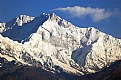
Partha Pal (K:11619)
10/28/2006 12:22:53 PM
Dear Deb,
Brilliantly captured.I alwayas like the views of Mt. Khangchendzonga.Its not easy to retain the colours of the snow but you have done that wonderfully.Its really a close view and the use of tripod definately help You. You are really lucky to have such a view from Derjeeling.
Congrats for BIP.
Have a good day.
Partha
:) :)
|
| Photo By: Debarshi Duttagupta
(K:26815)
|
|
")