|
|
Critique By:
Adam E. J. Squier (K:9803)
11/18/2002 6:06:18 AM
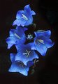
At first I was going to say something like "too bad the orange dusty thing* is right behind the stamen" but now I think that if it weren't, the tip would have been lost in the pale pink.
*TM ;-)
|
Photo By: Mary Sue Hayward
(K:17558)

|
|
|
Critique By:
Adam E. J. Squier (K:9803)
11/18/2002 6:02:52 AM
Very nice. They appear to be glowing. The detail in the shadows is what makes this even more interesting. I mean, the flowers are beautiful, but I find myself spending more time looking at the shadows.
|
| Photo By: Greg Summers
(K:1115)
|
|
|
Critique By:
Adam E. J. Squier (K:9803)
11/17/2002 10:08:42 AM
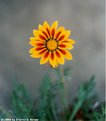
To me, this is a perfect example of simplicity. A lone flower. This could easily be in the "Alone" project but certainly doesn't need to be. The flower looks a bit soft, but it could just be the scan. For this to be a great image, each petal needs to have detail that's so sharp you wouldn't want to touch it for fear of a paper cut (or is that petal cut?).
|
| Photo By: Dimitri G. Varias
(K:255)
|
|
|
Critique By:
Adam E. J. Squier (K:9803)
11/17/2002 8:15:47 AM
The angles, bright colors, and movement really make the image. Bold, simple lines along with haphazard loops and the interesting clouds all somehow come together.
|
| Photo By: Aiman Nassar
(K:11961)
|
|
|
Critique By:
Adam E. J. Squier (K:9803)
11/17/2002 3:49:17 AM
I agree, the lighting looks a little flat. Ha ha ha, I just couldn't resist that one. ;-)
|
| Photo By: Kim Barke
(K:278)
|
|
|
Critique By:
Adam E. J. Squier (K:9803)
11/17/2002 3:45:03 AM
And here I thought it was a night shot and that was a satellite or comet or something. Now that would have been amazing. ;-)
Chris, I'm sure you Photoshopped out the contrail and looked at the two images side by side hundreds of times and finally decided to post this one. I think each way the image would have worked. Not sure what I would prefer, though.
|
| Photo By: Chris Blaszczyk
(K:610)
|
|
|
Critique By:
Adam E. J. Squier (K:9803)
11/17/2002 3:21:55 AM
For some reason, my first reaction to this photo was "Dalmation" and I'm not entirely sure why. I mean, of course, the white and black butterfly but with so much red in there....
Your DOF looks perfect to me. If I could change one thing, I clone out the part of flower that looks like it coming from the butterfly's head. The one that looks like laser eyes.
|
| Photo By: Athoob Abdullah
(K:18)
|
|
|
Critique By:
Adam E. J. Squier (K:9803)
11/16/2002 2:02:11 AM
That's a great idea of using a CD for a background, I'll have to try it sometime. The reflections are really interesting. How did you light this?
|
| Photo By: Jon Rank
(K:683)
|
|
|
Critique By:
Adam E. J. Squier (K:9803)
11/16/2002 1:42:43 AM
Those swirls of white are incredible.
|
| Photo By: michaelle .
(K:3807)
|
|
|
Critique By:
Adam E. J. Squier (K:9803)
11/15/2002 3:49:48 PM
Ah, memories of tar on the beach. Kerosene was always a part of going to the beach when I was young. Had to clean off our feet before walking in the house. I never knew if the tar was because of all the oil derricks or if the derricks were there because of the tar.
The textures in this image are incredible. It doesn't really look like rocks in sand.
|
| Photo By: Rebecca Browne
(K:10)
|
|
|
Critique By:
Adam E. J. Squier (K:9803)
11/15/2002 3:44:20 PM
This is really interesting. The fact that it originated from a photo (or photos) is peculiar, as it's become quite non-representative. I suppose technically it's an abstraction of something, so I'll give that to you, but still, you'd be hard-pressed defending it. ;-)
|
| Photo By: William R Eastman III
(K:2141)
|
|
|
Critique By:
Adam E. J. Squier (K:9803)
11/15/2002 3:39:37 PM
I really like the effect the sun has around it. My only gripe is the contrail just to the right of the sun. I know you like it (as do others) but it seems a bit incongruous to all the other wisps of clouds.
|
| Photo By: Dan Sanford
(K:300)
|
|
|
Critique By:
Adam E. J. Squier (K:9803)
11/15/2002 1:18:22 PM
This is a really interesting photo. Was is solarized? Or is that just how it came out?
|
| Photo By: Terry King
(K:163)
|
|
|
Critique By:
Adam E. J. Squier (K:9803)
11/15/2002 11:57:30 AM
I can't really come to terms as to why I like this image. Maybe because it reminds me of my daughter. It's very captivating.
One nit, and it's really minor, is that the image might have benefited from a lower camera position. Her pose suggests she's in charge but she's looking up to the camera.
|
| Photo By: Larry Edwards
(K:843)
|
|
|
Critique By:
Adam E. J. Squier (K:9803)
11/15/2002 11:42:13 AM
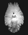
Maybe I'm seeing things again (remember the blue bottle) but it looks like there was some Photoshop erasing going on around the top left but the rest of the image was left intact. Was the owl on a table or something?
The tones are nice but a little hot on the chest and on the right wing.
|
| Photo By: Sheri Moody
(K:16)
|
|
|
Critique By:
Adam E. J. Squier (K:9803)
11/15/2002 11:38:40 AM
So, what did he steal? The highlights are a bit blown out but not distractingly so. I really like images like this. I might have used yellow or red, but that's just me. Images like this tend to make me green with ... oh, never mind. That was just too bad.
|
| Photo By: Bob Hearn
(K:4)
|
|
|
Critique By:
Adam E. J. Squier (K:9803)
11/15/2002 11:32:22 AM
First the bad: Bad scan, not enough contrast, and bad crop.
The good: These can all be fixed relatively easily. Either with Photoshop or at the printer's.
The subject and idea are wonderful. I'd keep trying this with other outfits and lenses. The basket handle is a little distracting. Now, if it were filled with candy, that would be something else.
|
| Photo By: Jake Sieg
(K:673)
|
|
|
Critique By:
Adam E. J. Squier (K:9803)
11/15/2002 11:20:11 AM
Nice shadows. For some reason I always feel there should only be two. ;-)
|
| Photo By: Moises Levy
(K:782)
|
|
|
Critique By:
Adam E. J. Squier (K:9803)
11/15/2002 10:50:15 AM
I like these colors. Makes a good abstract.
|
| Photo By: Howard M. Parsons
(K:3496)
|
|
|
Critique By:
Adam E. J. Squier (K:9803)
11/14/2002 11:48:53 AM
I love all the lines in this image. The arcs, the movement, the diagonal floor. "Way Far Out" -- OK that was bad, I know.
|
| Photo By: Vincent Breen
(K:20)
|
|
|
Critique By:
Adam E. J. Squier (K:9803)
11/14/2002 11:45:15 AM
I'm not sure why this was under "Abstracts" but it is kind of funny. Though without the description, it doesn't make much sense.
|
| Photo By: Andrew Brown
(K:118)
|
|
|
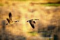
Critique By:
Adam E. J. Squier (K:9803)
11/14/2002 10:31:35 AM
I'm usually not one for nature photos, but this one is really special. I love the way one goose's wings are up and the other's are down. I think Canada Geese are really interesting birds. My kids like to hiss at them.
|
| Photo By: Katie Nielsen
(K:279)
|
|
|
Critique By:
Adam E. J. Squier (K:9803)
11/14/2002 10:06:48 AM
This is a cute photo. If you can, don't use as much flash. Try to cut it down to just a tad of fill. Or don't use the flash at all, though in the woods, you might end up with an image that's too dark.
Also, I don't know about the colors of the frame you chose, but if that's what you wanted, then great.
|
| Photo By: shannon cole
(K:4)
|
|
|
Critique By:
Adam E. J. Squier (K:9803)
11/14/2002 9:50:45 AM
Mmmm. Much better. I like the new version. Maybe even more of a crop would work well, too. To just below the darker stripe of water.
|
| Photo By: Aiman Nassar
(K:11961)
|
|
|
Critique By:
Adam E. J. Squier (K:9803)
11/13/2002 1:05:21 PM
I'll echo the comments about the duck. It looks more like a speck or some mistake while printing. I just wish the left side of the boat's oar wasn't cropped.
While scrolling down just now, the browser "cropped" the top off the image. I thought it was really interesting as a panoramic format -- cropped about half-way between the duck and the bow.
|
| Photo By: Aiman Nassar
(K:11961)
|
|
|
Critique By:
Adam E. J. Squier (K:9803)
11/13/2002 12:56:37 PM
Next time I go out taking pictures of flowers, I'm gonna take me a set of watercolors and a block of paper. Then I can get the background I want. No, it's not my idea. John Shaw talks about doing this behind fish tanks to get nifty, out of focus backgrounds. Though it's faster and easier to do it in Photoshop.
Either way, the image is manipulated. (Now if that's not troll bait, I don't know what is).
|
| Photo By: Anil Nediyara
(K:93)
|
|
|
Critique By:
Adam E. J. Squier (K:9803)
11/13/2002 12:52:12 PM
I suppose I can't add too much more to what's already been said (or is that "written?") about this image. From the thumbnail, it looks like bold, painted strokes, but then there's a weird texture in the foreground.
The full image is, well to quote someone else, Stunning (yes, with a capital "S").
Hmm, Velvia, polarizer, the colors just jump out of the screen. A shame about the contrails. Or is it? I don't know. Maybe they add something. They are going the right way, after all. I take that back. Good thing the contrails were there that day. ;-)
|
| Photo By: Michael Busselle
(K:221)
|
|
|
Critique By:
Adam E. J. Squier (K:9803)
11/13/2002 12:45:30 PM
I'll echo the comments about the duck. It looks more like a speck or some mistake while printing. I just wish the left side of the boat's oar wasn't cropped.
While scrolling down just now, the browser "cropped" the top off the image. I thought it was really interesting as a panoramic format -- cropped about half-way between the duck and the bow.
|
| Photo By: Aiman Nassar
(K:11961)
|
|
|
Critique By:
Adam E. J. Squier (K:9803)
11/8/2002 5:44:38 AM
I knew this had to be a digital capture with the DOF that it has -- even with the thumbnail. What was the focal length of the lens you used. Probably 8mm or so.
It seems a little blown out on the top left of the ridges. Maybe some sort of diffuser (try a piece of paper) to soften it a bit -- but make sure you keep the great modelling you have going here.
|
| Photo By: Paul Brogden
(K:0)
|
|
|
Critique By:
Adam E. J. Squier (K:9803)
11/6/2002 2:50:03 AM
This picture is just screaming for the obvious pun: "Feet Mondrian."
Hey, if I didn't say it, some else would have. ;-)
|
| Photo By: Ariane Drefke
(K:0)
|
|