|
|
Critique By:
James Claiborne (K:3)
6/23/2006 7:21:13 PM
Becky... I went to school with you... jimmy claiborne... jimmyc1030@aol.com
if you are still checking this site
|
| Photo By: Rebecca Ann Bunsick
(K:52)
|
|
|
Critique By:
steve o'hara (K:214)
8/17/2004 11:09:09 PM
hi
good image would be great if we could see texture of the posts. think about using a 2nd remote flash to fill for more detail or reflectors.
love ya dennis
|
| Photo By: Rebecca Ann Bunsick
(K:52)
|
|
|
Critique By:
Simone D'Amato (K:185)
4/21/2004 6:27:51 PM
good work
good idea and nice geometric composition, but darker on the right top and less of detail... it's possible that is a problem of scanner or the quality of printing?
|
| Photo By: Rebecca Ann Bunsick
(K:52)
|
|
|
Critique By:
RC. Dany (K:64104)
2/5/2004 9:51:23 PM
Excellent.
|
| Photo By: Rebecca Ann Bunsick
(K:52)
|
|
|
Critique By:
steve o'hara (K:214)
4/21/2003 3:24:38 PM
good image. really nice shadows
|
| Photo By: Rebecca Ann Bunsick
(K:52)
|
|
|
Critique By:
steve o'hara (K:214)
4/21/2003 3:21:08 PM
nice exposure good capture of clock dial and sky interesting silhouette
|
| Photo By: Rebecca Ann Bunsick
(K:52)
|
|
|
Critique By:
steve o'hara (K:214)
4/20/2003 1:40:51 PM
overall very interesting. high eye appeal.showing this as a negative was very original.
|
| Photo By: Rebecca Ann Bunsick
(K:52)
|
|
|
Critique By:
steve o'hara (K:214)
4/20/2003 1:24:01 PM
no point of interest. poor contrast.too dark.
|
| Photo By: Rebecca Ann Bunsick
(K:52)
|
|
|
Critique By:
Jeroen Wenting (K:25317)

3/9/2003 1:25:33 AM
And whatever you do, don't deface someone elses pictures with comments that are nothing more than a personal attack based on a comment you didn't like.
To me the entire composition, and especially the facial expression of the moden does indeed look more like a corpse than anything angelic.
It's too artificial.
|
| Photo By: Rebecca Ann Bunsick
(K:52)
|
|
|
Critique By:
Ken Alexander (K:3905)
3/8/2003 8:41:33 PM
Interesting idea, but the light areas of the image are too "hot" and lacking in detail.
Jeroen's comment IS constructive, in that it conveys legitimate information about a perception and is not a personal attack. But it's stated much too bluntly, which I guess is what you're reacting to.
|
| Photo By: Rebecca Ann Bunsick
(K:52)
|
|
|
Critique By:
Mike Allebach (K:391)
3/8/2003 6:23:29 PM
It's seemed like constructive criticism to me. I understand Jeroen's point. Don't post pictures that you can't take constructive criticism on.
|
| Photo By: Rebecca Ann Bunsick
(K:52)
|
|
|
Critique By:
Hans-Christian Stoltz (K:331)
3/8/2003 5:05:23 PM
A constructive comment is also what people feel when they look at the image. If Jeroen felt that the photographic angle was kind of strange and what it made him relate to, he just felt it. I don't think he meant something personal towards you, he was just talking about the image. You have to agree on when people from all over the world come together in a place like this, well then we also have a lot of different ways to express ourselves in words. And sometimes words tend to come out the wrong way due to translation problems What he probably meant was that the pose wasn't making him think about angels. I would also like to see more of the models face from a different angle. I would also like to see some arrangements that make me, intuitively, think about angels. The feathers are a nice touch. The tone and the makeup seems also good to me. But like I said a different photograpic angle would probably give more justice to your model and your intentions with this image.
|
| Photo By: Rebecca Ann Bunsick
(K:52)
|
|
|
Critique By:
Rebecca Ann Bunsick (K:52)
3/8/2003 3:42:16 PM
You recently commented on a photo of mine.
"Don't know if it's the angle or what, but it looks to me like a corpse waiting for the people to pay their last respects."
Do you actually think that what you wrote was constructive? Or do you just not know what the word means? You can take your comments elsewhere, because I don't need them. And were you asking is she was an angel or an "angle"?
|
| Photo By: Rebecca Ann Bunsick
(K:52)
|
|
|
Critique By:
Jeroen Wenting (K:25317)
3/8/2003 3:14:33 PM
Don't know if it's the angle or what, but it looks to me like a corpse waiting for the people to pay their last respects.
|
| Photo By: Rebecca Ann Bunsick
(K:52)
|
|
|
Critique By:
Stefano Jemma (K:853)
3/4/2003 4:27:31 PM
good composition, great idea.
|
| Photo By: Rebecca Ann Bunsick
(K:52)
|
|
|
Critique By:
John Doe (K:170)
3/3/2003 8:03:29 PM
WOW, I can't believe this is a self-portrait. I too thought it was water from the thumbnail. Only critique (and it's minor) - black out the light line on the right.
|
| Photo By: Rebecca Ann Bunsick
(K:52)
|
|
|
Critique By:
Chris Whaley (K:3847)
3/3/2003 7:53:23 PM
very cool..actually looks like you are coming out of the water. Nice shot.
|
| Photo By: Rebecca Ann Bunsick
(K:52)
|
|
|
Critique By:
Chris Lauritzen (K:14949)
2/20/2003 7:11:34 PM
Rebecca,
I agree that you need to show more of your face in this shot.
|
| Photo By: Rebecca Ann Bunsick
(K:52)
|
|
|
Critique By:
jan martin petersen (K:356)
2/20/2003 6:12:38 PM
Chopping off the lower part of your face doesn't make a pleasing "portrait".
|
| Photo By: Rebecca Ann Bunsick
(K:52)
|
|
|
Critique By:
Karen L. Hassinger (K:134)
2/20/2003 3:26:11 PM
Hey! When did you get an eyebrow ring? And I didn't take that picture. Ha ha! Interesting shot to whoever took it.
|
| Photo By: Rebecca Ann Bunsick
(K:52)
|
|
|
Critique By:
sam clements (K:265)
2/19/2003 1:23:12 AM
blur captures the momment, was it a good band?
|
| Photo By: Rebecca Ann Bunsick
(K:52)
|
|
|
Critique By:
Mike Scott (K:1817)
2/18/2003 5:07:47 PM
love the colors, motion blur and glimpse of the amp in the background... would like to see a version with his head
|
| Photo By: Rebecca Ann Bunsick
(K:52)
|
|
|
Critique By:
Brian Goff (K:139)
2/18/2003 4:35:58 PM
I really like how you framed the guitarist, you can feel the sway in his body and the motion in his hands. Your try at "interesting" colors paid off beautifully. This shot is extremely, attractively dynamic.
|
| Photo By: Rebecca Ann Bunsick
(K:52)
|
|
|
Critique By:
Aaron Charlton Smith (K:625)
2/14/2003 6:18:20 PM
Ahhh, hehe, you have to look closely. At first, I wasn't sure what this was doing in the Wildlife section.
|
| Photo By: Rebecca Ann Bunsick
(K:52)
|
|
|
Critique By:
Russell Love (K:7006)
2/13/2003 8:48:20 PM
Rebecca,
Nice to see an ol' chevy in that condition. Nice to see you too in the chrome! I wish you had not crop it so tight on the right and the top, get the full effect of the tail light and the chrome that way. Course I 'm kinda partial to the old cars myself, keep 'em coming!
Later my friend,
Russ
|
| Photo By: Rebecca Ann Bunsick
(K:52)
|
|
|
Critique By:
Chris Lauritzen (K:14949)
2/13/2003 8:44:29 PM
Rebecca,
Great shot... BTW I had that exact same car when I was younger. Burned a lot of tires on that one
|
| Photo By: Rebecca Ann Bunsick
(K:52)
|
|
|
Critique By:
Samuel Downs (K:7290)
2/1/2002 6:04:55 PM
As if the color wasn't interesting enough, the composition and subject are wonderful too! Nice shot.
|
| Photo By: Rebecca Ann Bunsick
(K:52)
|
|
|
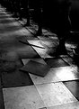
Critique By:
Ted Williams (K:324)
9/13/2001 8:09:14 PM
Just saw this in random images... I like the rhythm and the one forlorn tile popped up. Reminds me of a once grand spot time has forgotten.
|
| Photo By: Rebecca Ann Bunsick
(K:52)
|
|
|
Critique By:
Artie Colantuono (K:12275)
6/14/2001 7:54:59 AM
very creative and very effective image well done.....
|
| Photo By: Rebecca Ann Bunsick
(K:52)
|
|
|
Critique By:
Artie Colantuono (K:12275)
6/14/2001 7:54:59 AM
nice graphic......
|
| Photo By: Rebecca Ann Bunsick
(K:52)
|
|